


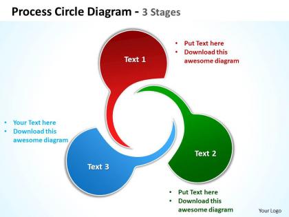
Process circle diagram 3 stages powerpoint templates graphics slides 0712




Try Before you Buy Download Free Sample Product
 Impress Your
 Audience
 100%
100% Editable
 Save Hours
 of Time


Unleash the power of your thoughts. Give them a free run with our process circle diagram 3 stages powerpoint templates graphics slides 0712.
People who downloaded this PowerPoint presentation also viewed the following :
Process circle diagram 3 stages powerpoint templates graphics slides 0712 with all 7 slides:
Our process circle diagram 3 stages powerpoint templates graphics slides 0712 abound with various options. They will assist in absorbing the essence of your thoughts.



FAQs for Process circle diagram 3 stages powerpoint templates
Start with clear steps and use arrows that actually make sense - don't create some weird impossible loop situation. You need decision points where things can branch off or circle back. Keep the labels short though, nobody's trying to read a paragraph in each box. Oh and definitely include start/end points so people aren't confused about where to jump in. The whole flowchart should tell a story that makes sense to someone who's never seen your process before. Honestly? Just draft it first, then grab someone else to walk through it. They'll catch whatever gaps you totally missed.
You know what's brilliant about circle diagrams? They turn messy workflows into something you can actually wrap your head around. Each step connects visually, and you see the whole loop at once instead of getting buried in those awful procedure manuals. Honestly, they're perfect for training new people - way better than dumping a pile of documents on someone's desk. I've started sketching workflows as circles when I'm stuck explaining something complicated. Works every time. You'll catch problems and duplicate steps that you'd totally miss otherwise. Give it a shot next time you're dealing with a confusing process.
You see these circle diagrams everywhere once you start paying attention! Manufacturing uses them for production flows. Healthcare has patient care cycles. Software teams are obsessed with them - agile sprints, DevOps stuff, you name it. Project management too. They're perfect for quality systems like PDCA cycles. Honestly, any industry dealing with continuous improvement processes will have these plastered on conference room walls. The trick is figuring out if your process actually loops back to the beginning - that's when you know a circle diagram makes sense instead of just a regular flowchart.
So basically circle diagrams are for stuff that keeps going round and round - like your product development cycle that never really "ends." Flowcharts? Those are linear. Someone starts at A, moves to B, then C, and boom - they're done. I'd go with circles when you're showing something repetitive and ongoing. Flowcharts work way better for one-off processes where there's a clear finish line. Your onboarding flow is a perfect example of flowchart territory. Honestly, most people overthink this choice but it's pretty straightforward once you think about whether your process actually stops or just keeps cycling.
Honestly, circle diagrams work so well because they turn boring processes into something people can actually follow. Colors are huge - give each step its own shade so folks can track where they are. Icons help too, way better than walls of text that make everyone's eyes glaze over. The circular thing creates this nice flow that keeps people mentally hooked, like they're following a story or something. Don't forget white space though - cramped diagrams are the worst during presentations. When you use clear arrows and good contrast, people can jump around and discuss specific parts without getting confused. Makes meetings way less painful!
Honestly, less is more here - stick to 3-6 steps or people's brains just shut off. Make everything look consistent (same colors, fonts, shapes). Arrows are your best friend for showing the flow, and definitely start at the 12 o'clock spot since that's where everyone looks first. Don't cram everything together either. White space is clutch. Oh, and here's something I learned the hard way - always test it on someone else first. If they squint at it for more than 5 seconds trying to figure out the sequence, you need to simplify. Trust me on that one.
Honestly, color coding is a game changer for process diagrams. Your brain picks up on the visual patterns super fast. I usually do blue for customer stuff, green for internal ops - that kind of thing. Don't go crazy though, like 3-5 colors tops or it gets messy. Different colors for departments or priority levels work great too. Oh and definitely add a legend! I learned that the hard way when someone couldn't figure out my color system at all. It's one of those stupidly simple tricks that actually makes people understand your diagram way quicker.
Honestly, I'd start with **Lucidchart** - their templates are solid and you can collaborate without the usual tech nightmare since it's all web-based. **Visio** is probably the gold standard if you don't mind paying Microsoft, super clean results. But real talk? **Draw.io** (they rebranded to diagrams.net or something) is completely free and looks just as professional. I've wasted way too much time trying to make PowerPoint work for this stuff - don't go down that rabbit hole. Canva's decent if you care more about it looking pretty than being technical. Just grab Lucidchart's free trial first, you'll know pretty quick if it works for you.
Know who you're talking to first. Executives? Skip the weedy details and stick to big picture stuff and decision points. Operations folks need the actual nitty-gritty to get work done. Honestly, I've watched so many gorgeous diagrams flop because no one bothered asking what the users actually needed. Before you finalize anything, grab a few people from your audience and show them a rough version. They'll spot if you're making it too complicated or missing something obvious pretty fast. The whole point is answering their real questions, not creating diagram art.
Honestly, feedback is what saves your process diagram from being totally useless. Your first draft will miss stuff - guaranteed. Share it with your team and stakeholders, and they'll catch the steps you forgot or point out where the actual workflow is different. I can't tell you how many "perfect" diagrams I've seen that completely bombed in real life. People will help you fix wonky connections and add decision points you overlooked. Don't get attached to your first version though - it's just the starting point. Run it by others at least once before you call it finished.
You know those process circle diagrams? They're actually pretty genius for getting your whole team aligned on workflow stuff. Everyone stops having their own weird version of "how we do things" and you get one clear picture showing inputs, outputs, decision points - the works. Honestly, they're great at catching those assumptions nobody talks about. Next time someone's confused or you're training someone new, you can literally point and say "yeah, this is where everything usually falls apart." I'd try making one together in your next team meeting - you'll probably discover some interesting gaps you didn't know existed.
Don't cram every tiny detail into your diagram - that's where most people mess up. Keep each step short and sweet. Stick with the same shapes and colors so it doesn't look like a rainbow exploded on your page. I've seen so many flowcharts that look like spaghetti with arrows flying everywhere. Make sure it actually flows in a circle without random dead ends. Here's what I do: grab someone who's never seen it before and watch them try to follow it. If they're squinting and looking confused, you've got work to do.
Try drawing your process as a circle diagram - it's honestly way better than those linear flowcharts that go on forever. The circular setup makes bottlenecks super obvious, plus you'll spot where handoffs are breaking down or where there's redundant stuff happening. I've found it gets teams aligned quickly since everyone can actually see what's going wrong versus what should happen. Test some fixes, then update your diagram to track if things improve. Honestly, just pick one messy process this week and map it out. You'll be surprised what jumps out immediately.
Honestly, once you notice them, these circular process diagrams are everywhere. Toyota's Plan-Do-Check-Act cycle is probably the most famous one - they use it to keep tweaking their manufacturing. Software teams do something similar with DevOps cycles for deployment stuff. Even habit tracking works this way, like those fitness apps that show your workout patterns in loops. The whole point is that improvement isn't a straight line, it's more like... circles? Sounds weird but it works. You should try sketching out one of your work processes in a circle format. I bet you'll catch inefficiencies you totally missed before.
Dude, multimedia totally transforms those circle diagrams. Videos work great for showing actual steps. Audio helps explain tricky parts. Interactive hotspots? Those are clutch - people can click for extra details without overwhelming the main view. Animations and icons make the flow way clearer too. Match your media to who's watching though. Visual learners love animations, but if it's training material, short demo videos at each stage hit different. Oh and don't go crazy with effects - I've seen diagrams that look like a festival threw up on them. Keep the main message clean.
-
Topic best represented with attractive design.
-
Out of the box and creative design.