

Table of content sample of ppt presentation





Try Before you Buy Download Free Sample Product
 Impress Your
 Audience
 100%
100% Editable
 Save Hours
 of Time


Bring about improvements in critical areas with our Table Of Content Sample Of Ppt Presentation. It will hasten institutional development.
People who downloaded this PowerPoint presentation also viewed the following :
Content of this Powerpoint Presentation
Description:
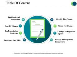
The image is of a PowerPoint slide titled "Table Of Content," which appears to outline the key components of a presentation or a document focused on change management. Each of the eight sections represents a specific topic related to the overarching theme of managing change within an organization.
The topics listed in the table of contents are:
1. Identify The Change:
Recognizing and understanding the need for change within the organization.
2. Vision For Change:
Establishing a clear and compelling vision to guide the change effort.
3. Change Management Agents:
Identifying the individuals or groups who will lead and support the change process.
4. Change Management Framework:
The structure and methodology that will be used to manage the change.
5. Resistance And Risk:
Assessing potential obstacles and risks associated with the change.
6. Implementation Strategies:
Developing approaches for effectively implementing the change.
7. Cost Of Change:
Estimating the financial impact and resources required for the change.
8. Feedback And Evaluation:
Establishing metrics for assessing the progress and impact of the change, and gathering feedback for improvement.
Use Cases:
These slides can be effectively used in the following industries:
1. Consulting:
Use: Structuring change management proposals for clients.
Presenter: Management Consultant.
Audience: Corporate executives.
2. Healthcare:
Use: Managing transitions to new healthcare protocols or systems.
Presenter: Healthcare Administrator.
Audience: Medical staff, hospital management.
3. Finance:
Use: Implementing new financial regulations or systems.
Presenter: Financial Manager.
Audience: Finance team, regulatory compliance officers.
4. Information Technology:
Use: Overseeing the rollout of new IT systems.
Presenter: IT Project Manager.
Audience: IT staff, end-users.
5. Manufacturing:
Use: Guiding operational shifts or the introduction of new manufacturing processes.
Presenter: Operations Manager.
Audience: Production staff, plant managers.
6. Education:
Use: Introducing new curricula or educational technology.
Presenter: Educational Consultant.
Audience: Educators, academic administrators.
7. Retail:
Use: Adapting to changes in retail strategies, such as moving to online platforms.
Presenter: Retail Strategy Advisor.
Audience: Retail managers, e-commerce team.
Table of content sample of ppt presentation with all 5 slides:
Our Table Of Content Sample Of Ppt Presentation give good value for money. They also have respect for the value of your time.
FAQs for Table of content sample
So for your table of contents, definitely include section titles and time estimates for each part. Page numbers help if it's long. Don't use boring headers like "Overview" - be specific about what you're actually covering. Oh, and mark where breaks or Q&A happen because honestly, people want to know when they can zone out for a sec. Add quick one-liners under sections if the topic isn't super obvious. The real test? Someone should read your TOC and know exactly what they're getting into without any guesswork.
Honestly, just throw a table of contents on your second slide - it's like giving people a roadmap so they're not sitting there wondering where the hell you're going with all this. People actually pay more attention when they can see what's coming. Keep it simple though, maybe 3-5 points tops. You can circle back to it during your presentation too, which gives everyone those nice "okay we're making progress" moments. Makes you look way more organized than you probably are. Trust me, the difference in how engaged people stay is pretty obvious once you start doing it.
Okay so first thing - don't center everything! Left-align looks way cleaner. Use lots of white space and keep your fonts consistent. Different text sizes help show what's a main section vs subsection. Most people just slap text on a slide and call it done, but you can actually make yours interesting. Try subtle color coding for different sections or throw in some simple icons. Those little dots connecting topics to page numbers? Super helpful. The whole point is someone should be able to scan it quickly and find exactly what they need. Nothing worse than squinting at a messy TOC during a presentation.
Yeah, totally depends on the audience! Tech companies put all the implementation stuff right at the front since developers just want to get coding. Legal firms? They're all about compliance checklists early on. Medical docs are smart - they stick safety warnings at the very top because honestly, who has time to hunt for that when someone's life depends on it. Financial companies do the same with risk stuff. Oh, and educational materials are weird - they organize by skill level instead of just topics, which actually makes sense when you think about it. It's really about knowing what people need to find fast vs. what they'll browse through later.
Honestly, think of it like a roadmap for your audience. Stick it on slide 2 or 3 so people know what's coming. Super helpful for longer presentations when attention starts wandering (we've all been there). You can reference it throughout too - "we just finished talking about X, now let's jump into Y." Keeps everyone tracking with you instead of getting lost. Oh, and make it clickable if you can. Trust me on this one - during Q&A you'll want to hop around to different sections without awkwardly scrolling through everything. Makes you look way more prepared than you probably are.
Honestly, a table of contents is like having a GPS for your presentation. You can map out how many minutes each section should take, then peek at it while you're talking to see if you're way behind schedule. Trust me, it's saved me from those moments when you get excited about one topic and suddenly realize you've been rambling for 20 minutes. Your audience will appreciate knowing what's ahead too - nobody likes sitting there wondering if this thing will ever end. Oh, and definitely pad some extra time between sections because something always takes longer than expected.
Honestly? InDesign's your best bet if you want something that looks really professional - the typography control is insane. Canva's surprisingly good too and way easier to jump into, plus their templates don't look cheesy anymore. Word and Google Docs have built-in TOC tools but they're pretty meh visually. Oh, and if it's for web stuff, Notion actually makes really clean clickable ones. I'd probably just start with whatever you're already comfortable using. You can always upgrade to InDesign later if you need that extra wow factor, but honestly most people won't even notice the difference.
Digital presentations need way more interactive stuff than print - clickable links, buttons that actually jump to sections. Super obvious but people forget this all the time. Print versions can be detailed since you can flip pages easily, but keep digital ones short and visual. Maybe add a nav bar that stays put so people don't get totally lost clicking around. Honestly, digital is all about instant jumps while print helps you plan what to read. Just map your content first, then figure out how people will actually click through it.
Honestly, most people mess up their table of contents by going way too granular or being super vague. Like, don't list every tiny sub-point - that's just overwhelming. But also don't just slap in boring headers like "Introduction" and call it a day. I've seen this happen so many times. Your headings need to actually tell people what you're covering without being a novel. Here's what I always do: read just the table of contents back to yourself. Can you follow the main argument? Does it flow logically? If not, fix it before you write anything else.
Honestly, bullet points can be super helpful in a table of contents - especially for complex stuff. I use them when I need to show multiple topics under one main chapter, or when there's things like case studies or exercises that need to stand out. Works really well for training manuals too, since people want to find specific info fast. The main thing is keeping your bullet format consistent throughout (sounds obvious but you'd be surprised how many people mess this up). Just indent them a bit under your main headings so it doesn't look messy. Makes the whole hierarchy way easier to scan.
Honestly, color schemes can make or break your TOC. You want high contrast - dark text on light backgrounds or the other way around. Those gray-on-gray designs might look modern but they're terrible after scanning for like 30 seconds. Keep your colors consistent too. Main headings get one color, subheadings another. Creates patterns that make navigation way easier. Here's a trick I learned - print it in black and white. If you can still see the hierarchy clearly, you're good to go. Works every time.
Dude, you should definitely include a table of contents - it's like giving people a map before they get lost in your content. Your brain basically sets up little folders when it knows what's coming. Short sentences help too. Readers can jump around and revisit stuff they missed, which honestly saves everyone time. The visual layout shows how everything connects, so information actually sticks instead of just floating around uselessly. I learned this the hard way after watching people's eyes glaze over during presentations. Trust me, front-loading that structure makes a huge difference in whether people remember anything you're saying.
Oh man, this is way more complex than most people realize! Western readers want detailed numbered sections going specific to general, but East Asian cultures flip that - they prefer big categories first. Germans absolutely love cramming every detail into their table of contents (honestly, sometimes it's overkill), while Scandinavians keep things super clean and minimal. Right-to-left languages need special consideration too, obviously. But here's what really matters: you've got to test your TOC with actual native users from each region early on. Don't just assume what works - cultural preferences around information density vary wildly.
Oh, interactive navigation is everywhere right now! You'll see clickable visual maps, progress bars showing exactly where you are, sections that collapse and expand. Some people go crazy with animated timelines or video thumbnails as chapter markers - honestly gets overwhelming sometimes. Sidebar navigation that sticks around is pretty popular too. Those breadcrumb trails are actually super helpful for jumping back to stuff. I'd probably start with just a basic interactive sidebar though - way better than boring slide numbers and not too complicated to set up.
Stick to 5-7 main points tops. Ditch boring headers like "Introduction" - go for something with punch like "Why This Matters Now" or "Three Key Changes." Think movie trailer vibes, you know? Give enough to hook them but don't spoil everything. Skip sub-bullets unless you absolutely have to. Here's my test: read just the headings. Do they tell a story? If someone can't follow the flow, you need to fix it. Oh, and don't start every header the same way - I see people do "How to..." for everything and it gets old fast. Mix it up.
-
The Designed Graphic are very professional and classic.
-
Top Quality presentations that are easily editable.