

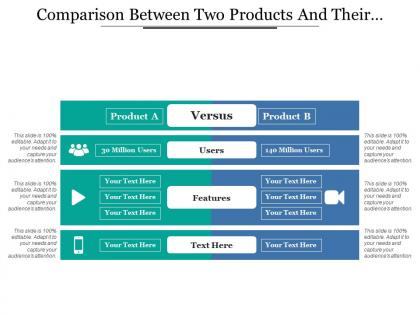
Comparison between two products and their features


Try Before you Buy Download Free Sample Product
 Impress Your
 Audience
Editable
of Time


Drive desire with our Comparison Between Two Products And Their Features. Generate a demand for your commodities.
People who downloaded this PowerPoint presentation also viewed the following :
Comparison between two products and their features with all 5 slides:
Give your ideas some penetration. Hone them on our Comparison Between Two Products And Their Features.


FAQs for Comparison between two products
So I'd definitely test out the design quality and how much you can actually customize stuff. Some templates look amazing but then you can't change anything without breaking them - learned that the hard way lol. Check if they work well for collaboration too, especially if you're sharing with teammates. Export options matter more than you'd think. Honestly? Just grab a few free templates from different platforms and try making something quick. You'll know pretty fast which one clicks for you. Oh and make sure fonts/colors are easy to swap out.
Honestly, good design is what keeps people from scrolling their phones while you're presenting. White space is your friend - cramped slides make everyone's brain hurt. Stick with the same fonts and colors throughout (seriously, don't throw in random Comic Sans). Use bigger text for important stuff so people know where to look first. Animation can be cool for emphasis, but I've seen too many presentations ruined by spinning text... it's painful. Find a template that doesn't scream "I downloaded this five minutes ago" and matches your vibe. Clean beats fancy every time.
Honestly, you really can't just throw your logo on a template and call it done. I mean, we've all been there though! But your audience will spot that cookie-cutter vibe instantly. The colors, fonts, layout - tweak those to match your actual brand voice. Content structure matters too. Even just changing the slide flow makes a huge difference. I always tell people to spend time on the visual stuff at minimum because it's so obvious when someone didn't. Worth the extra work, trust me.
Honestly, just grab some free samples and actually mess around with them for like 15 minutes - that'll tell you way more than any description. See how easy it is to swap out their stock photos for your stuff and change the text without everything going haywire. Some templates look amazing but are total nightmares to customize (learned that the hard way). Also test what happens when you add more content - do they break or adapt? The editing interface matters too. Can you find what you need quickly or are you clicking through a million menus? Trust me, use your real content for testing, not their perfect placeholder stuff.
Honestly, post-download surveys work great, but timing is everything. Hit them right after they finish customizing - that's when they're most engaged. Usage analytics are where you'll find gold though. See which templates people abandon halfway through vs ones they actually complete and share. Way more telling than basic ratings. I'd also send follow-up emails with specific questions like "Did this save you time?" Generic satisfaction surveys are pretty useless tbh. Oh, and don't ask for feedback the second someone downloads something. Wait until they've actually done something meaningful with your templates first.
Honestly, it's all over the place price-wise. Canva's free for basic stuff but their premium is like $12-15/month. Envato Elements is around $16/month for unlimited downloads - that's actually a pretty sweet deal if you're constantly needing templates. Creative Market does one-time purchases, usually $15-50 per pack, but that gets expensive quick. Some bigger companies have custom pricing based on team size and whatnot. If you're doing this regularly, definitely go subscription route. For occasional stuff though, just buy individual ones or use free options.
Look for crisp, high-res images that won't get pixelated when you resize them. Consistency matters too - make sure the graphics follow the same style and color scheme throughout. I swear, half the templates out there still use those cheesy stock photos from like 2005! Check that the visuals actually support what you're trying to say instead of just being random filler. Oh, and definitely preview how everything looks at your final size before you buy. Nothing worse than realizing your presentation looks blurry on the big screen. Trust me on this one.
Template compatibility is honestly huge - it can totally mess up your workflow if you get it wrong. First thing I'd do is check if they work with whatever software your team already uses daily. You don't want to find the perfect template then realize it needs some expensive upgrade or just won't cooperate with your current setup. Future-proofing matters too - will they still work if you switch platforms down the road? Oh, and definitely test a few sample templates first before buying anything. Always peek at their supported file formats list while you're at it.
Honestly, premium templates are just way better if you can swing it. Free ones work fine for basic stuff, but literally everyone's used them already - your boss has probably seen that same layout like 50 times. With premium you get way more customization options, better graphics, and fonts that don't look like they're from 2010. They usually throw in customer support too which is nice when things break. If you're presenting to anyone important, I'd totally spend the money. The extra slide variations alone make it worth it, and you'll actually look put-together instead of... well, cheap.
Oh man, you absolutely need mobile-friendly templates! I made this mistake once and felt so dumb when half my audience couldn't even read the text on their phones. People check presentations everywhere - on the bus, during lunch breaks, whatever. If your template doesn't scale right, everything looks cramped and unprofessional. The text becomes microscopic and the layout gets all wonky. Honestly, even amazing content won't matter if nobody can actually see it properly. Quick tip: always preview it on your phone first. Takes like 30 seconds but saves you from looking like a total amateur.
Honestly, go minimal right now - clean layouts with tons of white space are everywhere. Custom fonts are way better than those generic templates everyone uses. Interactive charts tell better stories than bullet points too, which is smart since people actually pay attention to data that moves. Sustainability stuff is trendy if that works for your company. You definitely need mobile-first design though. Half these presentations end up viewed on phones anyway, which is kinda annoying but whatever. Look for flexible layouts that won't break on different screens and have some animation built in. Just pick something current that won't look ancient next year.
Yeah, your industry totally matters for template choice. Finance folks need super clean layouts with tons of charts - they're all about looking credible and professional. Tech companies? They can do whatever they want basically - bold colors, animations, weird layouts because that's their whole vibe. Healthcare has to stay pretty conservative since you don't want flashy stuff distracting from important medical info. Creative agencies though... honestly they go nuts with colors and crazy designs. I'd just peek at what the big players in your field are doing in their public decks and steal that aesthetic.
Honestly, start with free trials - you can't beat actually testing them out yourself. User reviews on template sites give you real feedback, but skip the obvious fake 5-star ones. Design blogs and YouTube videos show you how templates look in action, which is super helpful. Those comparison tools are decent for checking pricing and features side by side. Oh, and I always end up going down rabbit holes watching tutorial videos even when I'm not shopping for templates lol. But seriously, don't buy anything without trying it first. Most places let you download samples or do trial runs.
Honestly, good customer support can totally save your butt with presentation templates. Live chat and quick response times are clutch when you're scrambling before a big meeting. Check their support hours first though - learned this the hard way when I was stuck at midnight with broken slides and zero help available. Most decent template companies have video tutorials and solid documentation too. Worth looking into if you're doing anything complex or working crazy deadlines. Oh, and response guarantees are nice but don't always mean much in practice.
Look for clean templates that won't fight your content for attention. Color customization is key - you'll want to match your branding. Font sizing matters way more than people think, especially for big rooms where people are squinting from the back. Good animation presets save tons of time too. Most templates come with built-in structures for common formats like problem-solution or data stories, which honestly helps when you're rushing to prep. Oh, and make sure it exports nicely to PDF since someone always asks for handouts later. High contrast backgrounds are your friend - trust me on this one.
-
Informative presentations that are easily editable.
-
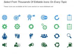
Use of icon with content is very relateable, informative and appealing.