


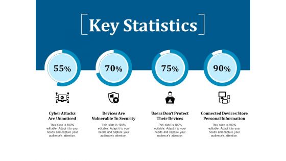
Key statistics ppt show deck




Try Before you Buy Download Free Sample Product
 Impress Your
 Audience
 100%
100% Editable
 Save Hours
 of Time


Achieve common ground with our Key Statistics Ppt Show Deck. Be able to arrive at a consensus.
People who downloaded this PowerPoint presentation also viewed the following :
Key statistics ppt show deck with all 5 slides:
Attempt the jigsaw with our Key Statistics Ppt Show Deck. Get all the ingredients to fit exactly.
FAQs for Key statistics
You'll definitely want conversion rates, CAC, and LTV - those are like the holy trinity. ROAS is huge too if you're running ads. Traffic stuff like page views matter, but honestly bounce rate gets misunderstood constantly. Click-through rates and engagement are pretty standard. Most people also toss in growth numbers - monthly revenue, user growth, whatever makes sense. Oh, and cost per lead if that's your thing. Here's what I'd actually do though: just pick 3-5 that align with what you're trying to accomplish. Don't go crazy cramming everything in there.
Honestly, data viz is a game changer because our brains are wired to process visuals way faster than text - like 60,000 times faster, which is wild. Charts and graphs let you instantly catch trends and weird outliers that would take forever to spot in a spreadsheet. Plus nobody wants to sit there squinting at rows of numbers all day. When you're presenting to your team or boss, visuals tell the story without making everyone's eyes glaze over. I'd start with basic bar charts or line graphs first. You can always get fancier later once you've got the basics down.
So sample size matters because it tells you how much you can actually trust your results. Bigger samples = more reliable data that represents what's really happening. With tiny samples, you might think you found something groundbreaking when it's just weird coincidence. I learned this the hard way in college, honestly. Your audience needs to know your sample size upfront so they can judge whether your conclusions hold water. Don't hide it in footnotes or whatever - put it right there. And yeah, if your sample's small, just own it and mention the limitations.
So here's the thing - you gotta match your stats to whoever's listening. Healthcare folks want patient outcomes and mortality rates, that kind of heavy stuff. Tech companies? They're obsessed with user engagement and whether people actually stick around (retention is everything to them). Financial services will bore you with risk assessments and compliance numbers, but hey, that's their world. Retail's all about sales data and figuring out when customers buy what. Honestly, don't just dump random impressive numbers on people. Pick the ones they actually give a damn about.
Honestly, stick to the basics - revenue, profit margins, cash flow, and maybe debt-to-equity ratio. Revenue's your growth story. Profit margins show if you're actually making money efficiently (shocking how many people skip this). Cash flow is huge though - I've literally watched profitable businesses fail because they couldn't cover payroll. Throw in some year-over-year comparisons so people see trends. Oh, and whatever KPIs matter for your specific industry. Just don't go crazy with like 20 different metrics. Pick maybe 6-8 that actually tell your story and call it good.
Honestly, treat your data like you're telling a friend an interesting story. Hook them with the weirdest stat first - nobody wants a boring list of numbers. Charts and visuals are your best friend here. I've sat through way too many presentations where someone just reads percentages... ugh. Compare your data to stuff people actually know. Before/after examples work great too. Oh, and ditch the corporate speak! Start with something like "Here's what blew my mind" or "This is crazy but..." Your audience needs to understand what these trends actually mean for them.
So predictive analytics lets you figure out what your audience will actually care about before you build the whole thing. You're not just dumping historical data on them - you can spot trends and forecast what's coming next. Honestly, it's way more engaging than just rehashing old numbers. The trick is structuring everything around forward-looking questions instead of "here's what happened last quarter." Focus on predictions that tie directly to whatever challenges they're facing. It's like having a crystal ball, minus the weird fortune teller vibes. Your audience will thank you for it.
Dude, infographics are a game changer for boring stats. People's brains just shut off when you show them spreadsheets, but give them the same numbers with some colors and icons? Suddenly they're paying attention. Pick your top 3-5 numbers that actually matter and build around those. Consistent colors help - like blue for all your sales stuff or whatever. I learned this the hard way after watching everyone zone out during presentations lol. Oh and start with your most impressive stat right at the top. Hook them early, you know?
Honestly? Start with Excel if you've got it - most people don't even scratch the surface of what it can do with pivot tables and stuff. Google Sheets works great too for basic charts and analysis. If you want something fancier later, Tableau and Power BI are pretty sweet for interactive dashboards. Python's amazing if you don't mind coding (pandas library is clutch). R's good for stats work but kinda clunky imo. Oh, and if you need to collect data from people, SurveyMonkey or Typeform make it super easy. But seriously, don't overthink it - Excel handles like 80% of what you'll probably need.
Dude, don't mess around with sketchy statistics - it'll destroy your credibility fast. Cherry-picking data or showing correlation like it's causation? People might believe it at first, but someone always calls you out later. Then you look like you're trying to manipulate them. Honestly, even accidental misleading stats make audiences question everything else you say. The worst part is how the damage follows you around. I learned this the hard way in college actually. Just double-check your sources and be upfront about any limitations. Your reputation depends on it.
Look, just be upfront about what your data actually shows - don't pick and choose stuff that backs up what you want to say. Context matters big time: sample sizes, error margins, when it was collected. Those charts with chopped-off axes that make tiny differences look huge? Ugh, such a pet peeve. Share your sources and methods so people can judge for themselves whether it's legit. Really though, you should aim to actually inform people instead of trying to trick them. Before you share anything, think: would I be pissed if someone showed me data this way?
Dude, real customer data makes presentations so much better. Grab stuff like retention rates, satisfaction scores, usage patterns - actual numbers hit way harder than just saying "customers love us" or whatever. Match the stats to who you're presenting to though. Executives? Show them revenue impact. Product team? User behavior trends work better. Oh and make sure your data isn't from like 2019 - nobody wants stale numbers. The trick is weaving those metrics into your story naturally instead of just dumping spreadsheets on people.
Put the source right on the slide where you show the stat - like "Source: Pew Research, 2024" in smaller text below. Don't hide it in footnotes nobody checks anyway. Stick with legit sources too - government data, established research places, peer-reviewed stuff. I've watched people panic during Q&A because they forgot where their numbers came from, and it's painful to watch. Multiple sources on one slide? List them all. Your audience will actually trust you more when they can easily verify what you're saying. Makes the whole presentation feel more solid.
Know your audience first - I literally just ask people what stats they're comfortable with instead of playing guessing games. Executives want the bottom line upfront, so hit them with percentages and simple comparisons. Technical folks? Go wild with methodology and confidence intervals. Mixed groups are trickier - start basic then add layers. Define terms the first time you use them. Visuals help tons. Oh, and test your explanation on someone similar to your actual audience beforehand. Honestly saved me from bombing presentations more times than I can count.
Oh man, the worst thing you can do is throw out stats with zero context. Like saying "sales jumped 50%" when you're comparing to literally your worst month ever lol. Also don't cherry-pick timeframes that make everything look amazing when it's... not. I see people do this constantly. Cramming too many numbers into one slide will just confuse everyone, and those misleading chart scales? Total credibility killer. Here's my test: would a random person look at this data and think the same thing you do? If not, you're probably overselling it. Just be straight with people - they'll trust you way more.
-
Awesome use of colors and designs in product templates.
-
Great designs, really helpful.