


Statistical Analysis Powerpoint Presentation Slides


Try Before you Buy Download Free Sample Product
 Impress Your
 Audience
Editable
of Time


Analyze your business data and its effectiveness with our specially designed statistical analysis PowerPoint presentation slides for identifying or measuring the growth and developments of your business. The term statistical analysis involves the process of examining or analyzing the business data to take an effective business decision on the basis of data results through this PPT template. Define the process with this presentation template which involves the stages like defining the business project, collecting business data, data integration, its analysis, effects, and then making the predictive analysis based on the said analysis. You can use this PowerPoint template to give a presentation on various management related topics also such as market analysis, products analyses, growth analyses of the organization etc. as it also helps you to make impeccable presentation to make your target audience to stick to your presentation till its last word. Therefore, just simply start working over this fantastic PPT designs and start exploring more with theses exclusive PPT template now. Feel cosy and comfortable with our Statistical Analysis Powerpoint Presentation Slides. They are like a fitting fur coat.
People who downloaded this PowerPoint presentation also viewed the following :
Content of this Powerpoint Presentation
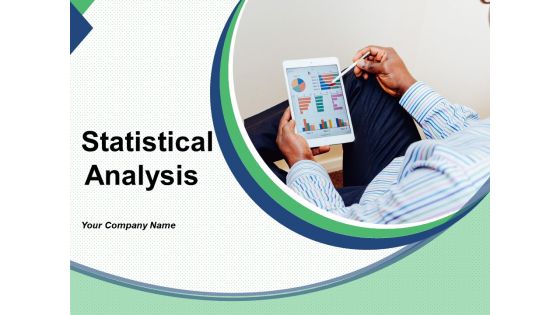
Slide 1: This slide introduces Statistical Analysis. State Your Company Name and get started.
Slide 2: This is Our Agenda slide showing- Welcome Message, About Us, Meet the team, Result.
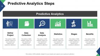
Slide 3: This slide shows the Predictive Analytics Steps. The listed steps are- Define Project, Data Collection, Data Analysis, Statistics, Stages, Benefits.
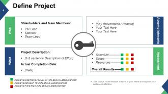
Slide 4: This slide shows Define Project with the following subheadings- Project Description, Actual Completion Date, Stakeholders and team Members, Key deliverables / Results, Overall Results.
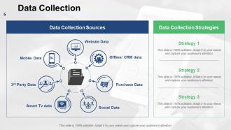
Slide 5: This slide showcases Data Collection Strategies. The listed sources are- Website Data, Mobile Data, 3rd Party Data, Smart Tv data, Social Data, Offline/ CRM data, Purchase Data, Data Collection Sources, Data Collection.
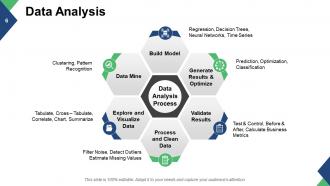
Slide 6: This slide shows Data Analysis in process with the following subheadings- Process and Clean Data: Filter Noise, Detect Outliers, Estimate Missing Values. Explore and Visualize Data: Tabulate, Cross – Tabulate, Correlate, Chart, Summarize. Data Mine: Clustering, Pattern Recognition. Build Model: Regression, Decision Trees, Neural Networks, Time Series. Generate Results & Optimize: Prediction, Optimization, Classification. Validate Results: Test & Control, Before & After, Calculate Business Metrics.
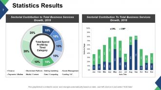
Slide 7: This slide presents Statistics Results with the main subheading- Sectorial Contribution to Total Business Services Growth explained in terms of Total Spend Profile by Tired Category.
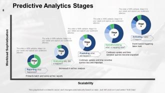
Slide 8: This slide showcases Predictive Analytics Stages in terms of- Workload Sophistication and Scalability. The stages are- Reporting what happened? Analyzing why did it happen? Predicting what will happen? Operationalizing what is happing now? Activating make it happen!
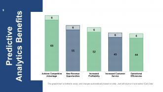
Slide 9: This slide shows a Predictive Analytics Benefits in graph form.
Slide 10: This is a Coffee Break slide to halt. You may change the slide content as per your need.
Slide 11: This is a Statistical Analysis Icons Slide. Use them as per requirement.
Slide 12: This slide is titled Additional Slides to move forward.
Slide 13: This is an About Us slide. State team/company specifications here.
Slide 14: This is Our Team slide with name, designation and image boxes.
Slide 15: This is a Target image slide. State targets, goals etc. here.
Slide 16: This is a Venn diagram slide to show information, specifications etc.
Slide 17: This is a Lego diagram slide to show information, specifications etc.
Slide 18: This is a Quotes slide to convey company message, beliefs, etc. You may change the slide content as per your need.
Slide 19: This is a Puzzle image slide to show information, specifications etc.
Slide 20: This is a Notes image slide to mark reminders, events etc.
Slide 21: This is a Bulb/Idea image slide to show information, specifications, innovative aspects etc.
Slide 22: This is a Magnifying Glass image slide to show information, specifications etc.
Slide 23: This slide is titled Charts & Graphs to move forward.
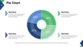
Slide 24: This is a Pie chart image slide to show information, specifications etc.
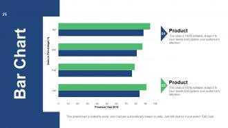
Slide 25: This is a Bar Chart slide to show information, product/entity comparison etc.
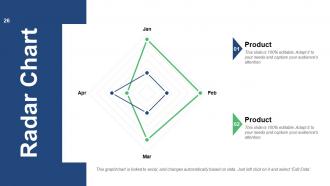
Slide 26: This is a Radar Chart slide to show information, product/entity comparison etc.
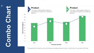
Slide 27: This is a Combo Chart slide to show information, product/entity comparison etc.
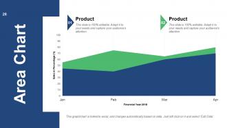
Slide 28: This is an Area Chart slide to show information, product/entity comparison etc.
Slide 29: This is Contact Us slide with- Address(# street number, city, state, Contact Number, Email Address.
Slide 30: This is a Thank You slide for acknowledgement.
Statistical Analysis Powerpoint Presentation Slides with all 30 slides:
Our Statistical Analysis Powerpoint Presentation Slides help the process of elimination. Work your way through to the best option.


FAQs for Statistical Analysis
Okay so basically - descriptive stats just tell you what's in your data. Like averages, medians, all that stuff. Pretty straightforward. Inferential stats are where it gets interesting though. You're using your sample to make guesses about the bigger population. Hypothesis testing, confidence intervals, that whole mess. Think of it this way: if you're just reporting what happened, stick with descriptive. But if you want to predict something or test whether two things are actually related? That's when you need inferential methods. Honestly, most people start with descriptive anyway since it's easier to wrap your head around.
So basically, t-tests are for when you're comparing averages - like test scores between two classes or blood pressure before/after treatment. Chi-square is totally different though. You'd use that for categories and counts, like survey answers or seeing if job satisfaction connects to which department people work in. The easiest way to decide? If you can actually calculate a meaningful average from your numbers, go with a t-test. Categories and frequencies = chi-square territory. Honestly, I mixed these up constantly when I first learned stats - you're definitely not alone if this feels confusing!
Outliers are such a pain - they totally throw off your means and make standard deviations way bigger than they should be. Regression gets hit the worst though. One weird data point can flip your correlation from weak to strong, which is honestly pretty scary when you think about it. Your confidence intervals blow up too, and hypothesis tests just... don't work as well. I always plot everything first now (learned that the hard way). Once you spot the weird points, figure out if they're real or just mistakes before deciding whether to ditch them.
Hey! So basically, bigger sample sizes = way more reliable results. Small samples are like judging a whole restaurant from one bad appetizer - you're just guessing at that point. Your confidence intervals get crazy wide with tiny samples, plus you'll miss real patterns that are actually there. Honestly, I've seen too many studies fall apart because someone got cheap with their sample size. Calculate what you need upfront (there are calculators online), then add a bit more if you can swing it budget-wise. The extra data will save you headaches later when people start poking holes in your conclusions.
Okay so basically you wanna figure out what kind of data you're working with first - like is it numbers, categories, or ranked stuff? Then think about your actual question. Are you comparing groups? Looking for connections? Sample size is kinda crucial too, especially if it's small (which honestly makes everything more annoying). Check if your data's normal or weird-shaped. T-tests work great for comparing group averages, chi-square for categorical stuff, regression if you're trying to predict things. My advice? Just write down exactly what you're testing in plain English first. That usually makes the right test pretty obvious.
So basically, knowing your data's shape matters because it decides which stats tests actually work. Most tests expect normal distribution - if yours is wonky or has weird outliers, you're gonna get garbage results. I learned this the hard way in grad school, ugh. Your distribution shows you central tendency and variability stuff, plus helps catch data problems early. Just plot everything first! Histograms and box plots are lifesavers. Sounds boring but trust me, this one step prevents you from drawing totally wrong conclusions later.
Honestly, just start by making some basic charts - line graphs, scatter plots, whatever. You'll be surprised how much you can see just by looking at the data laid out visually. From there, try moving averages or trend lines to confirm what your eyes are telling you. Regression analysis works great too if you want to get more technical about it. I always look for patterns like steady increases, drops, or stuff that repeats seasonally. Don't rely on just one method though - combine a few different approaches. Time series analysis is solid if you're dealing with data over time. Trust me, visualization first, then layer on the math.
Be transparent about your methods and sample sizes - don't hide the messy parts. Honestly, the worst thing you can do is cherry-pick data or mess with chart axes to make results look more dramatic than they are. State your limitations upfront and don't oversell uncertain findings. If there's funding or bias involved, just say so. I always think: would I be okay if someone made a big decision based on this? Also confidence intervals matter way more than people realize. Short version: present it like you'd want someone to present data to you.
So confidence intervals are way better than just looking at p-values. They show you the actual range where your real effect probably sits. Like if you get a 95% CI of [0.1, 0.3], that tells you so much more than "p = 0.02" - you can see the effect is small but pretty consistent. P-values just give you yes/no on significance, but CIs show if your result actually matters in practice. Honestly, I think more people should use them by default. Always throw them in with your point estimates when you're presenting stuff. Makes everything way clearer for understanding both size and precision.
So p-values show you the odds of getting your results (or crazier ones) if nothing's actually happening. They help figure out if your findings are just random chance or legit meaningful. That 0.05 cutoff? Honestly pretty random when you think about it, but everyone still uses it. Below 0.05 means you reject the null hypothesis - boom, statistically significant. Oh and here's the thing though - just because something's statistically significant doesn't mean it matters in real life. Always check your effect sizes too, they're super important for context.
So basically regression analysis fits a line through your data to show how one thing predicts another. Like if marketing spend goes up, sales probably go up too. I'm obsessed with it because you can actually see the relationships visually - way better than just staring at spreadsheets. Watch your R-squared (tells you how much variance gets explained) and p-values for significance. Start with simple linear stuff between two variables first. You can get fancy later. Oh and don't fall into the correlation vs causation trap - just because things move together doesn't mean one causes the other.
Okay so normalization is huge for stats - it can totally flip your results. Here's the thing: if you don't do it, whatever variable has the biggest numbers will basically bulldoze everything else. Like income vs age - income's in the thousands so it'll completely overpower age data. Normalization fixes that by putting everything on the same scale. Most techniques like clustering or PCA actually need this, otherwise you'll miss patterns that are definitely there. I learned this the hard way once! Just double-check if your method requires it first.
Dude, start documenting everything NOW. Git for version control, comment your code like crazy, and write a decent README with your data sources and methodology. Trust me - I couldn't figure out my own analysis after 6 months because I was lazy about this stuff. Random seeds are clutch for anything with randomization. Keep raw data separate from the processed versions (learned that one the hard way too). Jupyter notebooks or R Markdown are pretty solid since they mix code with actual explanations. Basically, pretend you're writing instructions for someone who's never seen your project before.
Dude, visualization tools are total game-changers for stats work. Raw data tables? Nobody's got time for that - your brain just glazes over. But throw that same info into a chart and boom, patterns jump right out at you. Scatter plots are my go-to honestly, they show relationships super clearly. You'll catch outliers and weird trends immediately instead of missing them in spreadsheets. Great for presentations too since most people aren't stats nerds like us. I always start simple with bar charts, then get fancier if needed. Trust me, even helps you spot data problems early on.
Your test results are basically garbage if you don't check assumptions first. It's like using a broken thermometer - you'll get numbers, but they won't mean anything useful. Most tests need things like normal data or equal variances to work properly. Skip this step and you might think you found something significant when you didn't, or miss real patterns entirely. Honestly, I've seen people waste weeks because they ignored this part. Just run the diagnostic plots first - takes like two minutes and saves you from looking foolish later.
-
Visually stunning presentation, love the content.
-
Appreciate the research and its presentable format.