Comparison of the products with its competitors powerpoint slide clipart
Try Before you Buy Download Free Sample Product
Audience
Editable
of Time
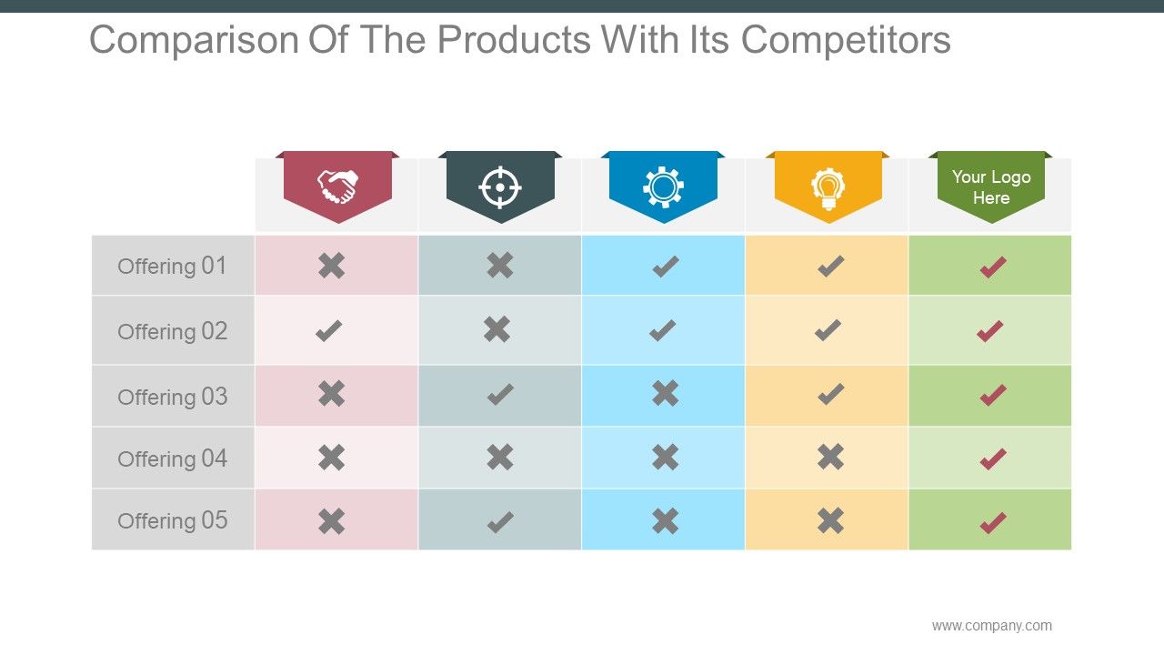
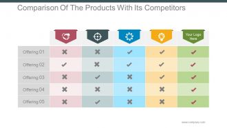
Browse through this unique Product Comparison PowerPoint Presentation slide. This five box PPT design has been designed to showcase five different products and let the viewer identify and compare the products features. Our PPT presentation template aims to provide you an opportunity to highlight the offerings which you are providing in comparison to your competitors. Many organizations use comparison table as a tool for ecommerce platform however it can also be used to highlight the features of a new product. This PowerPoint graphic has been crafted to highlight features. Any stakeholder will only invest in your business if you are able to showcase the product in the right manner. If your product has the potential to make an impact on the end user then you will be able to sustain in the market. Analyze your product potential using this presentation template and be aware of your strengths and weaknesses. Download this awesome PowerPoint design now. Head off distractions with our Comparison Of The Products With Its Competitors Powerpoint Slide Clipart. Avoid factors that dilute the focus.
People who downloaded this PowerPoint presentation also viewed the following :
Content of this Powerpoint Presentation
Description:
The image displays a "Comparison Of The Products With Its Competitors" slide, designed to contrast the features or offerings of a company's products against those of its competitors. There are five columns, each representing a different product or company, as indicated by the unique shield-shaped icons at the top. The column on the far right is presumably for the presenting company's product, as suggested by the "Your Logo Here" placeholder. Each row represents a different offering, and the presence of a feature is indicated by a checkmark, while its absence is denoted by a cross.
Use Cases:
This type of slide is useful for demonstrating competitive advantages or identifying areas for improvement. It can be utilized across various industries:
1. Technology:
Use: Comparing software features.
Presenter: Product Manager.
Audience: Customers, Sales Teams.
2. Consumer Goods:
Use: Showcasing product differentiators.
Presenter: Marketing Specialist.
Audience: Retailers, Distributors.
3. Automotive:
Use: Highlighting vehicle specifications.
Presenter: Sales Executive.
Audience: Dealerships, Consumers.
4. Pharmaceuticals:
Use: Detailing drug efficacy and approvals.
Presenter: Medical Affairs Director.
Audience: Healthcare Providers, Stakeholders.
5. Finance:
Use: Benchmarking service offerings.
Presenter: Financial Advisor.
Audience: Clients, Investors.
6. Real Estate:
Use: Comparing property features.
Presenter: Real Estate Agent.
Audience: Potential Buyers, Investors.
7. Education:
Use: Evaluating educational program offerings.
Presenter: Academic Coordinator.
Audience: Students, Parents.
Comparison of the products with its competitors powerpoint slide clipart with all 5 slides:
Crowds find our Comparison Of The Products With Its Competitors Powerpoint Slide Clipart a dazzling attraction. They ensure greater footfalls.
FAQs for Comparison of the products with its competitors
Honestly? Skip the flashy stuff and go for clean templates with good visual hierarchy. You want dedicated spots for your problem, solution, and what's next - basically how people actually think through things. I've watched so many presentations bomb because someone picked something that looked cool but had zero room for actual content. Make sure there's space for charts and data viz. Oh, and test that it's readable on different screens - nothing worse than squinting at tiny text. Start simple first. You can jazz it up later once you've got the story down, but nailing that flow is everything.
Your presentation template actually matters more than you think. People zone out fast when there's visual clutter or they're squinting at tiny fonts. I learned this the hard way during a client pitch once - half the room couldn't read my slides! Good contrast and clean layouts keep everyone focused. Colors and spacing create this emotional vibe that helps info stick in people's heads. Short sentences work. But you also want some flow between ideas so it doesn't feel choppy. Pick something that matches your content's mood and definitely test it beforehand. Trust me, you don't want to discover readability issues mid-presentation.
Honestly, it's all about who you're talking to. Corporate stuff needs to look super polished - clean fonts, lots of white space, colors that don't make anyone nervous. Educational templates? Go wild with colors and fun elements because you're fighting a losing battle against phones anyway lol. Your corporate audience expects charts and bullet points everywhere. Students need more visuals and interactive stuff to stay engaged. Oh, and corporate people get weird about too much creativity - they want "professional" which usually means boring but trustworthy. Just match whatever vibe your audience is expecting.
Look, the whole point is making the template work for YOU instead of the other way around. Change colors to match your brand, swap those awful stock photos for something that actually makes sense. Honestly? There's something weirdly satisfying when it all comes together visually - like solving a puzzle or whatever. Focus on tweaking layouts so your main points really pop. When you let your content drive the design choices, people can tell. It feels way more genuine. Oh, and don't go crazy - just pick 2-3 things that back up your main argument and customize those first.
Dude, colors actually matter way more than you'd think for presentations. Blue makes people trust you - super useful for work stuff. Red grabs attention but can feel aggressive if you go overboard. Green screams "growth" so it's perfect for anything financial or eco-related. I thought this was total BS until I ditched my boring gray templates and suddenly everyone seemed way more engaged. Match your colors to what emotion you want people to feel. Also stick to your brand colors if you have them - your boss will notice that kind of detail.
Honestly? Go with minimal templates. They make you look way more professional and people actually focus on what you're saying. Those super fancy ones with all the animations and graphics? Total distraction. Plus they scream "I'm overcompensating for boring content" - which maybe isn't the vibe you want. Simple designs just feel more trustworthy somehow. Like you're confident enough in your message that you don't need all the bells and whistles. Start clean, then maybe add one or two visual elements if they actually help make your point. Way better strategy than going overboard from the start.
Honestly, templates are lifesavers when you're in a crunch. You'll finish your presentation in like a third of the time since all the design work is already done for you. Colors, fonts, layouts – it's all handled by actual designers (thank god because I have zero artistic talent lol). The downside? Your presentation might look similar to everyone else's, and you can't customize everything exactly how you want. But if you're presenting standard stuff and need it done fast, templates are the way to go. Only go custom when you really need something that screams your brand.
Ugh, definitely check what formats the template works with first - PPTX, KEY, Google Slides, whatever. Template sites usually mention it in the description. I made this mistake once and got stuck with a Keynote-only file that looked terrible in PowerPoint. So annoying! Download free samples if you can before buying anything. Fonts and animations get super weird when you switch between programs. Honestly, just search for ones that say "cross-platform" from the start. Way easier than dealing with formatting disasters right before your presentation. Trust me on this one.
Okay so minimalism is huge right now - tons of white space, bold fonts, super clean layouts. Dark mode templates are everywhere and honestly they look amazing compared to those awful bright blue corporate slides we all hate. Interactive stuff is getting really popular too, like clickable menus and videos that don't freeze up. Oh and data viz is way better now - animated charts that actually make sense instead of boring people to death. You should definitely try some of this cleaner, visual stuff in your next deck. Trust me, it'll look so much more professional.
So basically, good animations keep people following your logic without getting distracted. Simple fades or slide transitions work way better than those crazy spinning effects - honestly, those make presentations feel like 2005 PowerPoint hell. You want subtle stuff that creates a natural flow, especially for product comparisons where focus matters. Too much flashy animation? Your audience will zone out completely. The content should shine, not the effects. Look for templates that feel smooth but don't scream "look at me!" - think invisible but purposeful. Trust me on this one.
So you'll want high contrast colors and big fonts - like 18pt minimum. Alt text on every image too. For videos, add captions or transcripts. Test it with colorblind viewers because honestly, so many people skip this step and it shows. Structure everything with clear headings and bullet points instead of wall-of-text paragraphs. White space is your friend here - cramped slides are the worst. Oh, and definitely run it through screen reader software before you call it done. Send materials early if you can!
Start by swapping in your actual logos, colors, and fonts right away - don't wait until you're halfway done. Set up guidelines for your image style and messaging tone too. Honestly, I've seen way too many presentations that scream "I used the default PowerPoint template." Stay consistent with how you show data and use white space. Oh, and structure your slides the same way every time. The smart move? Create one master template your whole team can grab and use. That way everyone's stuff looks cohesive without starting from scratch each time.
Dude, check the reviews before downloading anything - they're super helpful for seeing what actually works vs what just looks pretty. Look for patterns about which ones are easy to use and don't glitch on different devices. The highest-rated ones sometimes aren't what you'd expect, honestly. I always read reviews from people in similar fields since they'll catch stuff I might miss. Oh, and filter for recent ones (like past 6 months) because older feedback gets outdated fast. Read both the glowing 5-star reviews AND the more critical 3-star ones. You'll get the real story that way.
Okay so here's how I think about it - infographics are clutch when you've got data comparisons, step-by-step stuff, or feature breakdowns. Basically anything where visuals do the heavy lifting. Text-heavy designs? That's your go-to for detailed specs, policy comparisons, or when people actually need to read and process complex info. Honestly, I just ask myself: could someone get my main point in like 10 seconds from charts and icons? If yes, infographic all the way. If they need to sit there and really absorb dense information, go text-focused. Quick test that works for me - try explaining it without words. Can't do it? You'll probably want the text template.
Honestly, templates are game-changers. They keep you from wandering off into random tangents and missing the important stuff. Less time stressing about structure, more time making your content actually good. Your whole team will look way more put-together too since everyone's following the same format. The visual flow helps people focus on what matters instead of getting lost. Oh, and comparing different options becomes so much clearer when everything's laid out consistently. Just grab a solid template and tweak it for each pitch - seriously, don't make your life harder than it needs to be.
-
Content of slide is easy to understand and edit.
-
Best Representation of topics, really appreciable.