


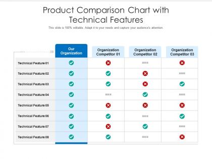
Product comparison chart with technical features




Try Before you Buy Download Free Sample Product
 Impress Your
 Audience
 100%
100% Editable
 Save Hours
 of Time


Our Product Comparison Chart With Technical Features are topically designed to provide an attractive backdrop to any subject. Use them to look like a presentation pro.
People who downloaded this PowerPoint presentation also viewed the following :
Product comparison chart with technical features with all 2 slides:
Use our Product Comparison Chart With Technical Features to effectively help you save your valuable time. They are readymade to fit into any presentation structure.
FAQs for Product comparison chart
Honestly, it comes down to design quality and how much you can actually tweak things. Canva's super convenient but yeah, it can look pretty cookie-cutter. Some companies go all-in on that sleek minimalist vibe, others stick with classic corporate looks. What really matters is customization - can you mess with fonts, colors, layouts? Do they throw in decent icon libraries or stock photos? Oh, and industry-specific stuff is clutch if you're in something like healthcare or finance. My advice? Grab free samples from like 3-4 different providers and actually try customizing them for whatever presentation you've got coming up. You'll figure out which one doesn't make you want to throw your laptop pretty quick.
Oh totally, you definitely get what you pay for with these templates. The expensive ones come loaded with tons of slide options, clean typography, and all sorts of customization stuff. Cheap templates are basically bare bones - like maybe 10 slides and that's it. Honestly though, mid-range ones are probably your sweet spot unless you're doing something super fancy. I learned this the hard way after buying a $5 template that looked identical to everyone else's presentation lol. Just think about what you actually need before spending $50 on features you'll never touch.
Start with contrast and hierarchy - your important comparisons need to jump off the page. Color-code different products so people can scan fast. Don't cram everything together (white space actually helps). Stick to 2-3 fonts max and keep them readable. Charts beat walls of text every time for comparison stuff. Honestly, I've seen too many presentations fail because someone thought more text = more professional. Wrong. Test it on someone first though - what's obvious to you might be total gibberish to others. That's saved me more times than I can count.
Honestly, just dive straight into the user reviews - they're pure gold for this stuff. People will call out everything from tiny fonts that nobody can read to whether the animations are actually helpful or just annoying. I always check the 3-star reviews first since they're usually more honest about the downsides. Look for reviewers who do similar presentations as you. Watch for complaints about customization being a pain or files not working with certain software. Also pay attention to how templates actually look when projected (apparently this is where a lot fall apart). If you see the same technical issues mentioned repeatedly, just skip it and find one where people actually had success stories.
First thing - make sure your software can actually open the file type. Like if it's a .psd but you don't have Photoshop, you're screwed. Version stuff matters too because some templates need newer software than what you've got. Fonts are probably the biggest pain though - missing ones will wreck your entire layout and it's super annoying to fix. Oh, and some templates use weird plugins you might not have. Honestly, I always check the specs first now because I've been burned before. Maybe try it on something small first?
So each industry template is built differently based on what that field actually wants. Tech ones are super clean and minimal - all that white space and sleek fonts giving off major Silicon Valley energy. Healthcare goes the opposite direction with calmer colors and professional photos since people need to trust you with their health info. Plus they've got HIPAA-compliant forms built right in. Education templates are all about making things readable for different age groups - honestly, some of the navigation on these is pretty clever. Pick whatever matches your industry's vibe and you'll be good to go.
Your color scheme is honestly huge for presentations. It sets the whole vibe and helps people follow along. I'd go with dark themes for business stuff, brighter colors for creative projects - just don't blind everyone with neon lol. Most important thing? Make sure your text actually shows up against the background. Nothing worse than squinting at gray text on white. Stick to 2-3 colors that work together and match your brand. Oh, and definitely test it on different screens first - learned that one the hard way when my "perfect" slides looked terrible on the projector.
Templates are like guardrails for your brand. They lock down colors, fonts, logo spots - basically everything visual so your presentations don't look random. Trust me, you don't want Karen from accounting picking neon green text again. Your design stays consistent even when someone with zero taste creates the deck. Time-saver too since the formatting's already handled. I'd start with maybe 2-3 templates for your main presentation types. You'll notice the difference right away - everything just looks more professional and put-together.
Honestly, it comes down to what you want your audience doing. If you're going interactive, grab templates with polls and clickable stuff - Mentimeter's great for this. Those can look busier since people expect to participate anyway. But traditional presentations? Keep it clean with basic PowerPoint or Google Slides themes. Good text hierarchy, solid visuals, nothing distracting. I learned this the hard way - used to overthink template choices way too much. Really just ask yourself: are you presenting TO people or WITH them? Interactive = buttons and talking. Traditional = they sit back and absorb. Makes the choice pretty obvious once you frame it that way.
So responsive templates automatically adjust to whatever screen size someone's using - phones, tablets, desktops, whatever. Your layout and text resize properly so everything actually works. Non-responsive ones? Ugh, they're awful on mobile. Tiny text you can't read, broken buttons, the whole thing looks like garbage. Since most people browse on their phones now, you'll lose visitors fast if your site doesn't work right. Honestly, I wouldn't even consider a template that isn't responsive anymore - learned that lesson the hard way once. It's just not worth dealing with.
Honestly, customizable templates are worth the extra work. You get total control over your brand - colors, fonts, the whole vibe. Pre-made ones are quicker but they always feel kinda... meh? Like everyone else is using the same boring layouts. With custom ones you can build reusable pieces that actually fit your content style. Yeah it takes longer upfront, but once you've got a few solid templates in your back pocket, you're set. Way better than trying to force your message into someone else's cookie-cutter design.
Dude, those data viz templates are game-changers. Nobody wants to stare at endless spreadsheet rows - your audience will literally fall asleep. But throw in some clean charts or interactive dashboards? Now they're actually paying attention and asking real questions. Heat maps especially work great for comparisons. Visual stuff makes complicated data way easier to digest, plus people remember it better. Oh, and definitely lead with your strongest visual on slide one. That'll grab them right away. I learned this the hard way after watching too many eyes glaze over during presentations.
So for accessibility, you'll need really good contrast between text and backgrounds - honestly, those gray-on-white combos look sleek but they're awful for readability. Pick templates with clean fonts (skip the fancy script stuff) and make sure they support alt text for images. Don't rely just on color coding since colorblind folks will miss it - add icons or shapes too. The template should have proper heading structures and enough white space so everything doesn't feel squished together. Oh, and test it with your accessibility checker first if you've got one!
Oh totally! Design trends completely change how presentation templates look. Remember when everything had those awful gradients and drop shadows? Ugh. Now it's all about clean layouts with tons of white space and bold fonts - basically copying what you see on Instagram and modern websites. The corporate world finally ditched those cluttered, busy slides too. My advice? Go for cleaner designs over flashy ones. They age better and won't make you cringe in six months when the next trend hits.
Hey! Start with the beginner tutorial series - it's way less overwhelming than jumping into the advanced stuff. Our video walkthroughs are honestly clutch, saved me so many headaches when I was figuring things out. The community forums are solid too, people actually give decent feedback there. Oh and we do these monthly workshops that are pretty hands-on, you can ask questions without feeling dumb. I'd probably do tutorials first, then hit up a workshop once you're not completely lost. The design library has step-by-step guides too if you're more of a reader.
-
Really like the color and design of the presentation.
-
Amazing product with appealing content and design.