


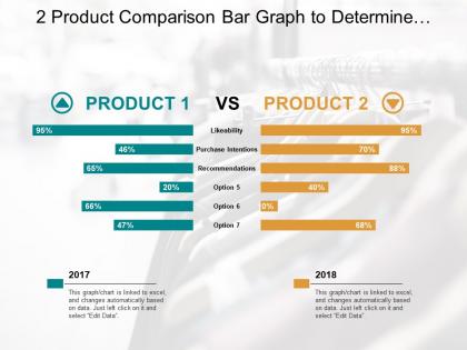
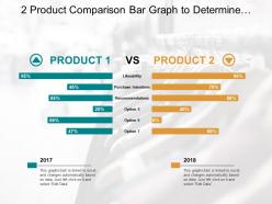
2 product comparison bar graph to determine different features




Try Before you Buy Download Free Sample Product
 Impress Your
 Audience
 100%
100% Editable
 Save Hours
 of Time


Get to find out what best applies to you with our 2 Product Comparison Bar Graph To Determine Different Features. Be able to function with freedom.
People who downloaded this PowerPoint presentation also viewed the following :
2 product comparison bar graph to determine different features with all 6 slides:
Judge the fallout with our 2 Product Comparison Bar Graph To Determine Different Features. Assess the aftermath of the event.
FAQs for 2 product comparison bar graph to
Honestly, I'd start with whether the template actually fits your brand - colors, fonts, that whole vibe. You want tons of layout options too. Title slides, charts, timelines, all that stuff. Font size is weirdly important (nobody wants to squint at your slides). Make sure it works with whatever software you're stuck using at work. The big thing is finding something that looks professional without you having to rebuild everything from scratch. Time saved = sanity saved, you know? Just don't pick something too generic or your presentation will look like everyone else's.
Honestly, template customization is a game changer for keeping everyone on-brand. When you build your colors, fonts, and logo right into the template, people literally can't mess it up - even if they wanted to use Comic Sans or whatever. Way better than just handing out brand guidelines and crossing your fingers. You want maybe 3-4 different template options so people don't feel boxed in. Make them comprehensive but not too rigid. I learned this the hard way after seeing too many presentations that looked like they came from different companies entirely. Trust me, it's worth the upfront work.
Honestly, free templates are pretty basic - limited fonts, boring layouts, standard color options. Premium ones? Way better graphics, smooth animations, tons of customization. You can tweak literally everything. Also - and I learned this the hard way - free templates sometimes have sketchy licensing for business use. Premium gives you proper commercial rights. The quality difference is actually pretty obvious once you see them side by side. Free works fine for team meetings or just messing around, but if you're presenting to clients or something important, definitely spring for premium. Worth the money.
Honestly, bold headlines are everything - they literally control where people look first. Make sure you've got interactive stuff like buttons and hover effects so people actually click instead of bouncing. White space is so underrated btw, cramped layouts are the worst. Stick with your brand colors but use contrast strategically for call-to-action buttons. Your images need to actually support what you're saying, not just look pretty. Oh and don't overthink it initially - pick one template and A/B test tiny changes. You'll figure out what works for your audience way faster that way.
Dude, colors totally set the vibe before you even open your mouth. Blues and grays scream "trust me, I'm professional" while reds and oranges bring energy but can look sketchy for serious stuff. I once watched someone torpedo their budget pitch with neon green slides - brutal to witness. Dark themes look cool but good luck reading them in bright conference rooms. Short version: match your palette to your content. Boring colors for boring corporate stuff, brighter ones when you're trying to pump people up. It's honestly that simple.
Honestly, I'd focus on template flexibility and whether stuff actually works across devices. Cross-platform compatibility is huge - I've been burned by presentations that looked amazing on my laptop but turned into a mess when I opened them elsewhere. The editing tools need to be intuitive too, obviously. Font selection and built-in design elements matter more than you'd think. Oh, and if you're working with others, decent collaboration features are a lifesaver. My advice? Test out a few templates with whatever workflow you use most before picking a platform.
Think of themes like specialized toolkits for different businesses. E-commerce ones come with all the shopping cart stuff built in. Portfolio themes? They're all about clean galleries that let your work shine. Restaurant themes have menus and booking systems ready to go - which honestly saves you tons of time. Corporate sites need that professional look with testimonials and trust signals everywhere. The trick is finding one that already handles most of what you need. Don't waste time trying to force a generic theme to work. Pick something that's like 80% there already, then tweak the rest.
Zoom in on a few slides first - if they look pixelated or blurry, that's your red flag right there. Good templates have crisp graphics that scale nicely, plus the colors and fonts should feel cohesive throughout. I always do the gut check thing too - if something feels weird or amateur, it probably is. Check that all the icons match each other stylewise (nothing worse than mixing flat design with 3D effects, ugh). Oh, and definitely test how it looks projected or on different screens before you commit. Quick hack: open everything at 100% zoom. Does it still look intentional and polished? Then you're good.
Typography can totally make or break your whole template - seriously, I've seen good content ruined by terrible font choices. Skip the fancy scripts unless you're doing wedding stuff. Clean, readable fonts are your friend. You want a solid hierarchy too - headings, subheadings, body text that flows naturally. Consistent spacing makes everything look intentional instead of messy. Oh and stick to 2-3 fonts max or it'll look chaotic. Good typography shows you actually care about the details. Trust me, people notice when things look professional vs thrown together last minute.
Most template sites update quarterly, but the premium ones? They're usually faster - monthly updates to stay trendy. You'll see new stuff every 3-4 months with fresh colors, fonts, whatever's hot right now. Honestly, the smaller providers are kinda slow about it - maybe twice a year, which can make your presentations look outdated. I always peek at the "recently added" section once a month to snag the good stuff before everyone else does. Oh, and the paid platforms definitely prioritize staying current since people are actually paying for that fresh look.
Honestly? Don't get sucked in by flashy designs that clash with your actual content - learned this when I used some artsy template for a budget presentation and it looked ridiculous. Complex layouts are the worst because they totally overshadow your message. Also check if you've got enough slides for everything you need to cover. Those fancy fonts might look cool but half the time they won't even show up right on someone else's computer. Test the whole thing with real content first - empty templates always look amazing until you actually try using them. Trust me on that one.
Just grab your phone and pull up the template - can you actually read everything without zooming in like crazy? That's honestly the best test. Most templates will say "responsive design" somewhere, which basically means mobile-friendly. You can also try resizing your browser window to see how it adapts. Make sure the buttons aren't stupidly small and the text stays readable. I hate when sites make you pinch and zoom constantly just to click anything. If you can navigate it easily on your phone without getting annoyed, you're probably good to go.
So it totally depends on what kind of template you grabbed. Most of the time you'll need Canva - seriously, that thing is perfect for people who can't design to save their lives. Just drag stuff around and you're done. If you're feeling fancy, there's Adobe Creative Suite or Figma, but honestly that might be overkill. Web templates are different though - you might need some HTML/CSS skills or just use WordPress/Squarespace. Oh, and definitely check what file format your template comes in first! Nothing worse than downloading something you can't even open.
Honestly, user reviews are where you'll find the real truth about templates. Skip the fancy marketing shots and dive into what people actually say. I always hit up the 3-star reviews first - they're way more honest than the 5-star cheerleaders. Recent reviews matter most since support can totally tank over time. Watch for complaints about mobile issues, terrible docs, or customization nightmares. The star average is basically useless tbh. You want the actual comments to see if someone's dealbreaker matches your situation. Pay attention to loading speed gripes too - nobody wants a slow site.
Totally! Educational templates are usually way more visual and interactive - think step-by-step stuff that keeps people engaged. Corporate ones? Clean, professional, lots of white space for data. I made the mistake once of using this super colorful template for a work presentation and... yikes. My advice would be to test your actual content in the template first. You'll know pretty quick if it fits your audience. Some templates just scream "elementary school" while others are all business. Pick whatever matches the vibe you're going for.
No Reviews