


Price comparison chart powerpoint shapes




Try Before you Buy Download Free Sample Product
 Impress Your
 Audience
 100%
100% Editable
 Save Hours
 of Time


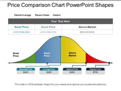
If you are to determine the price of your product or service you first analyze it on the basis of competitive pricing going on in the market. In price comparison chart PowerPoint shapes there are four sections highlighted with four different bright colors. Green denotes great price, blue denotes good price, yellow denotes above market price and red denotes bad pricing. Price comparison graph PowerPoint template as designed by our team of experts lets the marketer determine an appropriate price of his product while taking care of the prices brimming in the market. And since it is a predesigned presentation graphic, your time and efforts will not get wasted in designing the PPT from scratch. So, quickly click on this link provided below for the download of the presentation and save it works future customization and presentation. Be acknowledged as a good holiday guide with our Price Comparison Chart Powerpoint Shapes. Elaborate on your favorite destinations.
People who downloaded this PowerPoint presentation also viewed the following :
Price comparison chart powerpoint shapes with all 5 slides:
Our Price Comparison Chart Powerpoint Shapes get you counted among the best across continents. Global acceptance will definitely follow.
FAQs for Price comparison
Key features include clear product names, prominent pricing tiers, feature availability indicators, highlighted recommendations, and visual differentiation elements like colors or badges. These components work together by enabling quick scanning, facilitating direct comparisons, and guiding decision-making, with many businesses finding that strategic highlighting and intuitive layouts significantly increase conversion rates.
Visual design enhances price comparison charts through strategic color coding, clear typography, intuitive layouts, and highlighting key differentiators that guide customer decision-making. These design elements streamline information processing by reducing cognitive load, emphasizing value propositions, and creating scannable formats, with many retailers finding that well-designed comparisons increase conversion rates and customer confidence significantly.
Common mistakes include overcrowding with excessive features, using inconsistent formatting, failing to highlight key differentiators, and presenting biased information that favors one option. These errors undermine clarity and credibility, with many businesses finding that clean, objective comparisons with strategic feature selection ultimately deliver better customer decision-making and enhanced trust in their pricing transparency.
Effective price comparison charts cater to different audiences through tiered information hierarchy, visual differentiation, and strategic data grouping that highlights key decision factors like cost per unit, feature comparisons, and value propositions. These presentations enable technical buyers to analyze detailed specifications while allowing executives to quickly identify strategic advantages, ultimately streamlining decision-making processes across organizational levels.
**INPUT**: What tools or software are recommended for professional price comparison charts? **OUTPUT**: Recommended tools include Microsoft Excel, Google Sheets, Tableau, Canva, and PowerPoint, along with specialized platforms like PriceGrabber and CompetitorMonitor. These solutions streamline data visualization by offering customizable templates, real-time integration, and automated updates, with many businesses finding that professional charts enhance customer decision-making and ultimately drive higher conversion rates.
Data accuracy in price comparison charts requires implementing automated data feeds, regular validation checks, multiple source verification, and real-time updates from verified vendors. These systems streamline information gathering while minimizing human error, with many retail and e-commerce organizations finding that combining automated scraping with manual audits ultimately delivers reliable comparisons and enhanced customer trust.
Best practices for labeling and organizing categories in price comparison charts include using consistent terminology, logical hierarchical grouping, clear visual hierarchy, standardized units of measurement, and intuitive left-to-right flow. These approaches streamline decision-making by eliminating confusion, reducing cognitive load, and enhancing data accessibility, with many organizations finding that well-structured comparison charts accelerate purchasing decisions and improve stakeholder buy-in.
Customer reviews and testimonials integrate into price comparison charts through star ratings, review summaries, customer satisfaction scores, and highlighted testimonial snippets alongside pricing data. This strategic combination enables businesses to present comprehensive value propositions beyond cost alone, with many retailers and service providers finding that displaying social proof directly within pricing comparisons significantly enhances customer confidence and conversion rates.
Industries that benefit most from price comparison charts include retail, telecommunications, software services, insurance, and financial services. These sectors leverage comparison charts by demonstrating competitive pricing, highlighting value propositions, and simplifying complex product decisions, with many companies finding that transparent pricing comparisons enhance customer trust and accelerate purchasing decisions.
Animated price comparison charts enhance user engagement by drawing attention to key differences, guiding viewers through data progressively, and making complex pricing information more digestible and memorable. These dynamic visualizations help presenters control narrative flow while highlighting competitive advantages, with many sales and marketing teams finding that animated comparisons increase audience retention and facilitate more productive pricing discussions.
Color psychology significantly influences price comparison chart interpretation by affecting attention, emotion, and decision-making through strategic visual cues, contrast levels, and subconscious associations. Through deliberate color choices, businesses enhance data clarity, guide customer focus toward preferred options, and reduce cognitive load, with many retailers finding that warm colors increase urgency while cool tones build trust and credibility.
Quantifying value proposition in price comparison charts involves including feature-to-cost ratios, total cost of ownership calculations, performance metrics per dollar spent, and ROI projections alongside basic pricing. These comprehensive comparisons enable businesses to demonstrate superior value through quality indicators, warranty terms, and long-term benefits, ultimately helping customers make informed purchasing decisions based on strategic value rather than price alone.
Creative applications include using product silhouettes, feature-specific icons, checkmarks and X symbols for inclusions, tier badges, and visual progress bars for value metrics. These visual elements enhance comprehension by replacing text-heavy descriptions, enabling faster decision-making across pricing tiers, with many businesses finding that strategic iconography increases conversion rates and streamlines customer comparison processes.
Mobile responsiveness in digital price comparison charts can be optimized through collapsible sections, horizontal scrolling for data tables, touch-friendly navigation buttons, and simplified layouts that prioritize essential information. These design strategies streamline user experiences by reducing cognitive load, enabling faster decision-making, and maintaining functionality across devices, with many e-commerce and financial services platforms finding that mobile-optimized charts significantly increase conversion rates.
Effective strategies include automated data feeds from supplier APIs, scheduled weekly or monthly reviews, real-time competitor price monitoring, dynamic pricing algorithms, and regular market research validation. These approaches enable businesses to maintain accurate pricing intelligence by streamlining data collection, minimizing manual errors, and ensuring competitive positioning, with many retail and e-commerce organizations finding that automated systems deliver faster market responses and improved profitability.
-
Very unique and reliable designs.
-
The content is very helpful from business point of view.