

Pie chart with comparison between peoples powerpoint slides




Try Before you Buy Download Free Sample Product
 Impress Your
 Audience
 100%
100% Editable
 Save Hours
 of Time


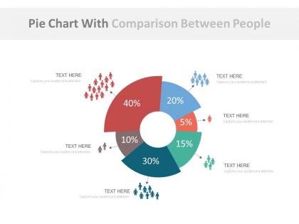
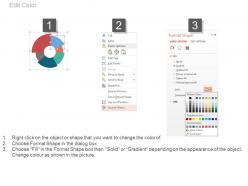
Pie charts are a potent force if used for specific tasks. They are universal in nature and can be found in every sphere of work and business. Take the advantage of our custom-made pie chart with comparison between people PPT slide Not only will this PowerPoint theme help you in displaying the data in a lucid way but also help you and your clients make business decisions quickly. This slide is highly customizable and makes use of vivid colors to distinguish one representation of people with another. Change colors at your will to make one group different than another, thereby diverting the attention of your audience to where you want. Furthermore, Impress them with beautifully designed presentation graphics. This is an example of a PPT theme where you can easily decipher the group size by merely looking at the slide. Save time and effort by downloading this slide and make professional decisions smoothly and effectively. Ascend away with our Pie Chart With Comparison Between Peoples Powerpoint Slides. You won't cease to climb in your career.
People who downloaded this PowerPoint presentation also viewed the following :
Pie chart with comparison between peoples powerpoint slides with all 4 slides:
Get thousands of hours of design work into your next presentation. Pie Chart With Comparison Between Peoples Powerpoint Slides are at your fingertips mere seconds away.
FAQs for Pie chart with comparison between
Honestly, pie charts are perfect when you want to show how different pieces make up the whole thing - like what percent each slice takes up. Bar graphs work better for comparing individual numbers, but pies are clutch for proportions since everything adds up to 100%. Most people can read them instantly too. Just don't go crazy with too many slices or it gets confusing fast. I'd say 5-6 categories tops. They're solid for stuff like market share, how you spent your budget, or survey results where you're trying to show that "part of the bigger picture" angle.
Honestly, stick to like 3-5 segments max. More than that and it gets super cluttered - I've seen pie charts with 12 tiny slices and they're completely pointless. Can't tell what's what. If you've got a bunch of small categories, just lump them into "Other" or maybe try a bar chart instead? Way easier to read. The whole point is people should be able to glance at it and actually understand the differences between segments. Those microscopic slivers everyone loves to include are basically decorative at that point. Focus on your main categories first, then see what else fits.
Honestly, color makes or breaks a pie chart. You need serious contrast between slices or people can't tell where one section ends and the next starts. I've made this mistake before - used similar shades of blue and the whole thing looked like mush. Go for totally different hues that actually pop against each other. If your data has some logical order, maybe use colors that progress naturally. Oh and definitely check how it looks for colorblind people. Quick test: print it in black and white first. If you can still read it easily, you're golden.
Don't use 3D pie charts - they totally screw up how your data looks! The perspective thing makes slices appear way bigger or smaller than they actually are. Like, the ones in front look huge while the back ones get squished, even if the percentages are the same. It's this weird optical illusion that works against you. The tilted angle makes comparing sizes almost impossible since you can't see the real proportions. I know they look cool and all, but honestly? They're terrible for actually showing data. Just go with regular flat pie charts if you want people to get what your numbers mean.
Don't go crazy with slices - 5 or 6 tops. Always start at 12 o'clock, not some weird random spot. Make sure your slices are different enough sizes that people can actually tell them apart. Skip the 3D effects completely - they're so 2005 and just mess up how people read the data. Honestly, pie charts suck for comparing stuff over time anyway. If your data isn't parts of a whole, don't force it into a pie. Here's the test: if you're squinting to see differences, so will everyone else. Just use a bar chart instead and save yourself the headache.
Pie charts are great when you've got 5 categories or less and you're showing parts of a whole - like budget breakdowns or market share stuff. The percentages should add up to 100% obviously. Here's what drives me crazy though: people always cram way too many tiny slices in there! If your biggest slice is under 25%, just use a bar chart instead. Those paper-thin slivers are impossible to read anyway. Oh, and they're perfect for survey results too. Your audience won't have to squint at microscopic pieces, and the comparison actually makes sense.
Just do the math on each slice - if something's 25% of your data, it needs to be 90 degrees (quarter of the 360° circle). Double-check that all your percentages add up to 100% first though. Most chart tools handle this automatically, but honestly I've seen some pretty terrible charts where the visuals were completely off from the actual numbers. Kinda defeats the whole purpose, right? Definitely throw some data labels on there with the percentages or values so people can see what's what without having to guess.
Honestly, Excel or Google Sheets are your best bet if you just need something quick. Their pie chart templates don't suck anymore - actually pretty solid now. Canva's great for making them look fancy if that matters. Tableau and Power BI are overkill unless you're dealing with tons of data (though they're admittedly awesome). I know some Python people who love matplotlib but that's probably more work than you want. Oh, and Illustrator if you're feeling fancy. Just use whatever you already have installed - most tools handle basic pie charts fine these days.
Try animating your pie slices to grow from zero - keeps people focused on one piece at a time instead of info overload. Sequential reveals work great too. The classic spinning intro is honestly still a crowd pleaser, don't @ me. For before/after stuff, you can morph one pie into another which looks pretty slick. Just don't go too fast or people get lost trying to follow the numbers. Oh, and those fly-in animations where slices zoom in one by one? Perfect for walking through each data point while you're presenting.
Make sure you put both the category name and percentage on each slice - saves people from guessing what they're looking at. For bigger segments, stick the labels right on them. Smaller ones? Use those little lines that connect to labels outside the chart. Honestly, nothing's more annoying than squinting at a pie chart trying to decode it! Keep text horizontal if you can since tilted labels are a pain to read. Oh, and if you've got a million tiny slices, just use a legend instead. Start labeling from the top and go clockwise - that's how most people scan charts anyway.
Sunburst charts are perfect for this - they're like pie charts but with rings inside rings showing your different levels. The inner circle has your main categories, then each ring going outward breaks those down further. Super clean looking when done right. You could also just make separate pie charts for each level and put them next to each other, or set up a click-through thing where people drill down. Tableau and D3.js handle this stuff well, Excel too if you're not getting fancy. Fair warning though - anything past 3 levels deep turns into a hot mess. I'd start simple and see what actually tells your story best.
Ugh, pie charts can be such a pain sometimes! Bar charts are honestly your go-to - they're so much clearer when you've got tons of categories or values that are super close together. Line charts work better for time stuff (like, why would you even put that in pie slices?). Horizontal bars are nice if your labels are really long. Oh, and treemaps are pretty cool for hierarchical data - kind of underrated honestly. Sometimes just a boring old table does the trick when you need people to see exact numbers. Just try a couple different ones and see what clicks.
Yeah, pie charts work great when people already know how to read them - which honestly, everyone does at this point. Your audience will instantly get the proportions without any explanation needed. No learning curve means you can dive right into what the data actually shows instead of explaining how charts work. But here's the thing - just because people know pie charts doesn't mean you should go crazy with them. I've seen some truly awful ones with like 12 tiny slices that are impossible to read. Stick to 3-5 segments tops and you'll be golden.
Dude, pie chart size matters way more than you'd think! Tiny charts are the worst - you can't see the skinny slices and the labels turn into microscopic ant writing. Bigger is definitely better here. You get room for actual readable text, plus people can actually tell the difference between segments. I learned this the hard way making charts that looked fine on my laptop but were useless when projected. Go for at least 400-500 pixels wide if it's digital. Trust me, your audience will thank you for not making them squint.
Honestly, interactive pie charts are a game changer. Your audience can hover over slices to see exact numbers instead of guessing percentages. Click-to-drill features let them explore subcategories too. People love being able to toggle segments on and off - way better than staring at cluttered static charts. Don't go overboard though (I've seen some truly awful ones with too many features). Pick one or two interactions that actually support your main point. It'll feel more engaging and modern, plus viewers can focus on whatever data matters most to them.
-
Unique design & color.
-
Appreciate the research and its presentable format.