

Data comparison chart powerpoint slide




Try Before you Buy Download Free Sample Product
 Impress Your
 Audience
 100%
100% Editable
 Save Hours
 of Time


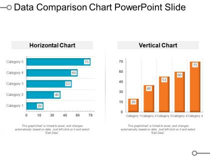
It becomes really difficult to decide between two things. Especially when both are really good. The horizontal-vertical design chart slide represents infographic visualize information by using combination of visuals like charts, and decorative fonts. The comparison infographic PowerPoint template summarizes the information can make it a lot easier for viewers to wrap their heads around different options. Visualize the pros and cons in the data comparison chart presentation slide to encourage smart decision-making. As you can write down your options and it becomes easy to weigh aspects of each. The comparison report template helps a user to compare products to highlight features as well as persuade buyers. A presenter can use the data size comparison chart PPT template to highlight superiority of the product he is selling or to help people in picking the best product for their needs. You can create a visually-appealing chart to make information easy to understand to viewers by using the data plan comparison chart presentation slide. You can represent desired data in our comparison report template since the template gets linked with Excel data sheet and suggest viewers how to differentiate between the two. Increase the intensity with our Data Comparison Chart Powerpoint Slide. Enhance the desire to bring about good.
People who downloaded this PowerPoint presentation also viewed the following :
Data comparison chart powerpoint slide with all 5 slides:
Leave nothing to chance with our Data Comparison Chart Powerpoint Slide. Give your ideas the surety of success.
FAQs for Data comparison
Okay so first things first - your titles need to actually tell people what they're looking at. Label your axes properly and stick with the same units throughout (I've seen people mix percentages with raw numbers and it's a mess). Don't just throw random colors everywhere because it looks cool - make them mean something and contrast well. If you're showing multiple things, add a legend. Always cite your source at the bottom too. Oh, and keep gridlines light so they don't fight with your data. Honestly, sketch it out on paper first before opening Excel. Makes a huge difference in catching weird stuff early.
Honestly, design is everything with comparison charts. Bad colors and tiny fonts will kill your message instantly - I've seen charts that look like someone threw up a crayon box. Start simple: pick 2-3 colors max and make your text big enough to actually read. Whitespace is your friend here; it separates data groups so people aren't drowning in information. Guide their eyes to what matters most first, then let everything else support that main point. Think about the story you're telling and design around that.
Oh man, the classic mistakes? Don't mix up your scales - that's confusing as hell. Also avoid cramming everything into one chart because nobody can read that mess. Wrong chart types are another big one. The y-axis thing kills me though - people start at like 50 instead of 0 and suddenly a tiny difference looks HUGE. Pick colors that make sense, label everything clearly with units and dates. I swear, half the charts I see would confuse someone seeing them fresh. Just pretend you're showing it to your mom - would she get it?
Pick colors that actually contrast - like dark blue and orange, not two shades of blue that look identical from across the room. I learned this the hard way when my boss kept asking "which line is which?" For categories, use totally different hues. Showing progression? Stick to one color family, light to dark. Oh, and don't forget colorblind people exist - ColorBrewer's great for accessible palettes. Quick test: squint at your chart or make it grayscale. If you can't tell the difference, neither can anyone else.
Use comparison charts when you've got numbers that actually compare to each other - sales data, survey results, budget breakdowns, stuff like that. Time series work great too (probably my go-to honestly). The data needs to be on the same scale so it makes sense side by side. Like revenue by quarter or traffic by source. Don't just throw random numbers together though. Ask yourself what specific comparison you want people to see. What's the "this beats that" story you're trying to tell? That's what'll make your chart actually useful instead of just pretty.
Honestly, bar charts are clutch for comparing stuff across different categories - you can instantly see what's bigger. For tracking things over time though? Go with line charts since they show trends way better. Pie charts look nice but they're actually pretty useless for real comparisons (our brains just can't handle comparing those slice angles properly). Stick with bars when you've got categories to compare, lines for time-based data. Trust me, people will get your point way faster and you won't have them squinting at confusing charts.
Honestly just use Excel or Google Sheets for quick stuff - Excel's way better than people give it credit for. Tableau makes the prettiest charts if your company pays for it, same with Power BI. Google Sheets is solid for free work and super easy to share with people. Oh and Canva has some nice templates if you want it to look more designed. I'd say start with whatever you already know though, like don't learn new software just for one project. The story you're telling with the data matters way more than having the fanciest tool.
Hover tooltips are your best friend here - super easy to add and people actually use them. Most tools like Tableau or Power BI let you show exact values without making your chart look messy. Clickable legends are solid too since viewers can hide data they don't care about. If you want to get fancy, drill-downs work great - click something and boom, more detailed info appears. D3's amazing if you're into coding, though honestly it's kind of overkill for most stuff. I'd just start with basic hover effects first. They're dead simple but make charts feel way more professional.
Know your audience first - it's literally the make-or-break thing for data charts. Some people want the big picture trends, others need every tiny detail broken down. Are they data nerds who love diving into specifics, or do they glaze over if there's too much info? I always think about what decision they're actually trying to make with this data. Showing percentage changes works great for some groups but totally confuses others. Also consider how much time they have - executives scrolling on phones need different visuals than analysts doing deep dives. Just figure out what they need to learn and work backwards from there.
Okay so for accessible charts, start with high contrast colors - but don't just rely on color alone. Add patterns or direct labels because colorblind users will thank you. Your alt text needs to actually describe the insights, not just say "chart showing data" (that's useless honestly). Keyboard navigation is huge too - people should be able to tab through data points without a mouse. I'd probably throw in a data table below the chart as backup since screen readers handle tables way better. Oh and actually test this stuff with accessibility tools before going live, don't just assume it works.
Put your main variable on the y-axis with clear units - "Revenue in $M" beats just "Revenue." Your x-axis needs comparison categories or time periods in logical order. Legends go where they won't block data (top-right or bottom usually works). Keep legend text short but descriptive enough so people get it without the chart title. Here's what I do - show it to someone for literally 5 seconds and see if they understand immediately. That's honestly the best test. If you've got more than 5 data series though, just split it into multiple charts. Nobody wants to decode a rainbow mess.
Try framing your chart around a story - like "how we crushed the competition" or "why customers jumped ship." Give people context first about why they should care. Then walk them through the data like you're solving a mystery. Honestly, the best charts feel like mini thrillers! Point out the juicy moments where lines cross or gaps appear, and explain what drove those shifts. Oh, and make sure there's a clear arc - beginning, middle, end. People need to walk away knowing not just what happened, but what it means for your next moves.
Okay so first thing - find your biggest differences, like what's way higher or lower than everything else. Those usually make the best story. Then scan for patterns, maybe there's steady growth or weird seasonal stuff happening. But honestly? The outliers are where it gets interesting because everyone's gonna wonder what the hell happened there. Also look, don't just dump numbers on people - connect it to what they should actually do about it. Short sentences work. Mix them with longer explanations so you don't sound like a robot reading data.
Go with tables when people need the exact numbers - like if they're gonna reference specific data points later or compare precise values. Charts get cluttered fast when you've got tons of categories or complex relationships. Plus tables handle mixed data better (think percentages next to dollar amounts). If your audience needs to sort or filter stuff themselves, charts are pretty useless for that. Honestly, I see people forcing charts when a simple table would've saved everyone time. Tables win when accuracy beats pretty visuals.
Honestly? Update them whenever your data actually changes in a meaningful way. Weekly, monthly, quarterly - whatever matches how fast your numbers move. I learned this the hard way when I showed up to a meeting with charts from like 3 weeks ago... super awkward. Match your refresh schedule to how often people need to make decisions with your data. If your metrics are pretty stable, monthly works fine. But if things shift quickly, you'll want weekly updates. Set calendar reminders so you're not frantically updating stuff 5 minutes before presenting. Trust me on that one.
-
Informative presentations that are easily editable.
-
Unique design & color.