

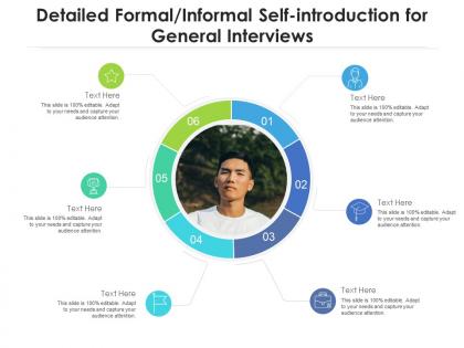
Detailed formal informal self introduction for general interviews infographic template




Try Before you Buy Download Free Sample Product
 Impress Your
 Audience
 100%
100% Editable
 Save Hours
 of Time


Derive factual results using this Detailed Formal Informal Self Introduction For General Interviews Infographic Template. Deploy this PowerPoint template to make and display prospective strategies using impressive graphics that enhance the visual quotient of the presentation. This infographic template also helps in elevating the aesthetic appeal of the presentation, making it useful for every organization. Apart from this, things and projects can be visualized from the onset using this PPT design. As this PowerPoint visual provides an abundance of information in a single layout, it can impress any viewer or higher managerial staff. It also boosts business actions by presenting flawless presentations. The biggest advantage of this slide is that it can be reproduced in various formats, including Google Slides. Therefore, download it now to present a unique presentation every time.
People who downloaded this PowerPoint presentation also viewed the following :
Detailed formal informal self introduction for general interviews infographic template with all 2 slides:
Use our Detailed Formal Informal Self Introduction For General Interviews Infographic Template to effectively help you save your valuable time. They are readymade to fit into any presentation structure.
FAQs for Detailed formal informal self introduction for general
Put your name big at the top, then your current job title and company. Definitely get a good headshot - people actually connect way better when they can see your face. List 3-4 main skills, your education, and a couple achievements that matter. Contact info goes at the bottom obviously, plus your LinkedIn or whatever. Oh, and throw in something personal like what you do for fun. Makes you way more memorable than just another boring resume card. Keep it clean though - white space is your friend so people can actually read the thing quickly.
Honestly, visuals are a game-changer for intros. People absorb images way faster than text - like ridiculously faster. A simple timeline showing your career path says more than three paragraphs ever could. Same with those skill bar things, though I know they're kinda cheesy. But here's the thing - visuals let your personality come through in ways plain text just can't. They break up complicated stuff about yourself into bite-sized pieces. Icons and charts create this emotional connection that's hard to explain. Start with one solid visual that captures your main vibe, then build everything else around that.
Okay so first thing - make your name huge. People need to spot the important stuff right away. Stick to maybe 2-3 colors tops because anything more looks like a rainbow threw up on your resume. Give everything room to breathe with white space - cramped text is the worst. Use the same fonts throughout (don't go crazy mixing them) and organize stuff logically, like top to bottom flow. Oh and those little icons? They should help, not turn your resume into a weird infographic. Here's the thing though - you've got maybe 10 seconds before someone tosses it, so make it scannable. That's literally it.
Colors totally matter - people judge you before reading a word. Red and orange make you look energetic and friendly, while blue screams trustworthy professional. I'm obsessed with forest green because it gives off creative vibes. Purple can look innovative, but steer clear of anything too neon or you'll look amateur. Match your colors to what vibe you're going for. Stick to 2-3 max that fit your personality and field, then use them everywhere. Consistency is everything here.
Honestly, just go with Canva first - it's super easy and has a bunch of templates you can swap your info into. Adobe Illustrator will give you more control but it's kind of a pain if you're not used to it. Figma's cool too, works right in your browser which is nice. Oh, and Piktochart exists specifically for infographics if you want something in between. I'd mess around with Canva's free stuff first though. Why make it harder than it needs to be? You can always upgrade later if you hate the limitations.
Honestly, these work amazing for networking events and job fairs - way better than awkward small talk. Visual learners eat them up, plus busy people who just scan stuff instead of reading everything. Creative fields especially love good design, and students use them all the time to avoid those cringy "introduce yourself" moments we all hate. Remote teams getting to know each other? Perfect. Freelancers pitching clients? Also great. Just match your style to whoever's looking at it and don't cram too much info in there. Oh, and they're killer on social media too.
Ditch the boring bullet points and turn your infographic into an actual story! Pick your "origin story" - where you started - then choose 2-3 pivotal moments that changed everything. Maybe a career switch, a major challenge, or that moment when everything clicked. Honestly, these are way stickier in people's minds than random facts. Sketch out those 3-4 plot points first - that's your foundation. Then use timelines, icons, or a simple roadmap to walk people through chronologically. Oh, and connect each story beat to skills or values you want to highlight. It'll feel so much more authentic than the typical resume-style approach everyone else uses.
Don't cram everything onto one page - like, I get you want to show off but pick your top 5-7 wins and call it good. The fonts need to be readable too (I swear half the ones I see require a magnifying glass). Colors are great but don't let them steal the show from your actual accomplishments. Skip those cheesy stock photos of people in suits shaking hands - they're so overdone. Proofread twice because one typo makes people question everything else. Quick test: show it to someone for 10 seconds then see what stuck.
Honestly, visual hierarchy is everything here. Group your skills and hobbies into clear sections with icons or progress bars - way better than boring bullet points. I'd do rating bars for skills instead of just listing them out. Hobbies are perfect for little icons that show what you're into at a glance. Don't cram everything together though, white space actually helps. Try categories like "Technical Skills" or "Creative Pursuits." Keep your colors consistent throughout. Oh, and start with a basic template - you can always customize it later once you've got the layout down.
Timeline formats are seriously underrated - show your journey visually instead of boring bullet points. Dashboard-style grids work well too, especially if you're presenting digitally with interactive stuff. I'd skip the typical skills wheel thing unless it actually fits your vibe. Comic strip style can be cool if you're more creative. Day-in-the-life layouts grab attention way better than standard resume formats. Pick something that matches how you actually talk to people. Detail person? Go with the dashboard approach. More of a storyteller? Timeline's your best bet. Just make sure it's scannable with good visual hierarchy so people don't zone out.
Okay so this is actually super important - cultural stuff completely changes how you should design that infographic. Americans love seeing bold achievements and flashy designs, but if you're targeting more collectivist cultures, dial it back. Focus on team wins instead of personal ones, and honestly? Use way more white space. Colors are tricky too - red screams "lucky!" in China but feels dangerous elsewhere. Also don't forget some cultures read right-to-left, which totally messes with your layout flow. My advice? Find someone from that culture to give it a quick look before you finalize anything.
Dude, typography can totally make or break your infographic. Stick with clean sans-serif fonts - they're way easier to read when people are scrolling fast. I made this mistake once where I used this gorgeous script font and nobody could read it on their phones lol. Size hierarchy is huge too. Big headers, smaller subheads, then readable body text. Don't go crazy with too many different fonts either - maybe 2 or 3 max. Oh and definitely shrink it down to phone size before you're done. You'd be shocked how many look great on desktop but are unreadable mobile.
Honestly, those infographics work great as conversation starters at networking events. Way better than regular business cards because people actually remember the visual stuff. For interviews, you can walk through it when they ask "tell me about yourself" - shows you're creative and organized. Interviewers usually keep them too, which is pretty helpful for follow-up. Just don't go overboard with the design. Match your industry's vibe and keep everything on one page. Focus on your biggest wins and key skills. Oh, and make sure it doesn't look too flashy if you're in a conservative field.
So I've been seeing tons of these lately! Personal brand consultants love doing those timeline graphics showing how they got where they are. Freelancers are big on the skill percentage charts with little icons - you know the type. LinkedIn designers are constantly posting colorful "About Me" templates that blow up engagement-wise. Instagram stories with those swipeable intro cards work great too. Job seekers make infographic resumes now that show personality stuff alongside work experience. Honestly, browse
-
Understandable and informative presentation.
-
Very well designed and informative templates.
-
Great designs, Easily Editable.