


Series a financing pitch deck problem statement ppt slides example file




Try Before you Buy Download Free Sample Product
 Impress Your
 Audience
 100%
100% Editable
 Save Hours
 of Time


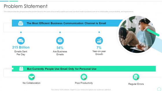
This slide provides the glimpse about the problem faced by the users since email is used for personal use which leads to problems such as no collaboration, poor productivity, and regular errors.
People who downloaded this PowerPoint presentation also viewed the following :
Series a financing pitch deck problem statement ppt slides example file with all 6 slides:
Use our Series A Financing Pitch Deck Problem Statement Ppt Slides Example File to effectively help you save your valuable time. They are readymade to fit into any presentation structure.






FAQs for Series a financing pitch deck problem statement ppt
For your Series A, you gotta nail the basics: problem/solution, market size, business model with actual revenue streams. Show your traction - revenue numbers, user growth, partnerships, whatever you've got. Include team bios and competitive analysis too. Financial projections are expected, obviously. The funding ask is huge though - be super specific about where the money goes. Nobody wants to hear "general growth stuff." Go-to-market strategy matters if it's solid. Unit economics too if they look good. Keep it under 15 slides because investors zone out fast. Honestly, just tell a good growth story with real data backing it up.
Okay so first 2-3 slides are make-or-break time. Hit them with the problem that's actually driving your customers crazy, then boom - here's how you fix it better than everyone else. Don't dance around it with fancy language. Just say what you do and why they should care. I swear, half the pitch decks I see hide the good stuff under tons of fluff. Give them real numbers - "we cut churn by 40%" hits way harder than some vague "improved retention" nonsense. Wrap up your problem/solution with one killer sentence about what makes you different. That's your anchor for everything else.
Aim for 15-20 slides tops - that's maybe 10-12 minutes of talking. VCs usually give you 20-30 minutes, but here's the thing: save half for Q&A. That's honestly where deals get made or broken. Hit your main beats (problem, solution, market, traction, team, money stuff, the ask) but don't drag it out. These people sit through pitch after pitch all day, so don't be that founder who goes over. Keep slides simple, practice till you're smooth, and - oh, this is clutch - always have a 5-minute version ready. You never know when they'll be running behind.
Look, everyone throws around "$100B market" nonsense and investors are totally over it. Break yours down properly - TAM, SAM, SOM - so you actually look like you get it. Bottom-up works way better than top-down. Like "we've got 5,000 potential customers who'd pay $10K each year" hits different than some massive theoretical number. Explain why timing matters now. What's changed? Growth drivers need to feel real, not made up. Honestly, the whole thing should feel inevitable when you're done - like of course this market exists and of course you can grab a piece of it.
So you definitely want to track MRR, CAC, and LTV first - that LTV:CAC ratio should hit 3:1 minimum. Burn rate matters tons since investors panic if you're broke in 6 months. Churn is obviously huge for SaaS. I'd also watch gross margins and YoY growth, though honestly the growth trend beats raw numbers right now. Oh and make sure your unit economics aren't completely broken - investors can smell that from miles away. Even if profitability is like 2 years out, just show there's actually a path there. Growth trajectory trumps everything else at your stage.
Dude, visuals are what separate the decks VCs actually remember from the boring data dumps they forget five minutes later. Charts showing your hockey stick growth? Yes. Product mockups that make everything feel real? Absolutely. Clean icons to guide people through your story? Perfect. I've sat through way too many presentations that were just walls of text – instant snooze fest. Here's the thing though: use visuals to create those emotional moments. Show the pain point, then the relief your solution brings, then that sweet momentum you're building. Every visual needs to either prove something or move your story forward. Don't just make it pretty for pretty's sake.
Dude, the worst thing you can do is be super vague about your numbers. Like throwing out these huge market size stats but having zero clue how you'll actually grab any of that pie. Can't tell you how many times I've seen that bomb. Also, don't spend forever talking features - investors want to see growth metrics and proof you can scale this thing. Your path to making money better be crystal clear too. Keep the deck short (seriously, not 25 slides), focus on what makes you different from competitors. And practice that pitch until you're not just reading off slides like a robot.
Don't just dump a feature comparison chart on investors - they've seen a million of those. Show them what makes you fundamentally different. Maybe it's your tech approach, or you're targeting a market others ignore, or your business model just works better. Skip the generic "we're faster and better" stuff (honestly, every startup says that). Instead, explain the specific problem competitors are missing or some insight about the market that only you've figured out. The real question you're answering: why would customers pick you, and what stops competitors from just copying what you do?
Yeah, team background is huge for Series A. Investors are literally betting on whether you guys can actually pull this off at scale. Skip the boring job title lists though - show specific wins that prove you can handle what's coming next. Your backgrounds should directly connect to the problem you're solving. Oh, and if there are obvious skill gaps? Address them upfront with your hiring plan. Trust me, investors will spot those gaps anyway, so you might as well get ahead of it. Previous domain experience or startup wins are gold if you've got them.
Investors want to see how you'll actually get paying customers, not just vague promises. Get specific about which acquisition channels you've tested and what's working. Your sales process matters too - walk them through how leads become customers and how long it takes. Pricing strategy is huge. Don't just say "digital marketing" because literally everyone does that. Show the math on customer acquisition cost vs lifetime value - that ratio needs to make sense or they'll tear you apart. Oh, and make sure you actually understand how your customers make buying decisions. That comes up more than you'd think.
Start with your best numbers right up front - revenue growth, new users, whatever's crushing it. Charts and graphs are your friend here since investors just scan through decks super fast. I swear, so many founders hide their wins in boring text paragraphs and it drives me nuts. Show growth rates instead of raw numbers, especially early on. Honestly, seeing "grew 40% last quarter" hits different than "we have 1,000 users." Throw in 2-3 realistic future goals with actual dates. Oh, and don't cram like 8 metrics on one slide - keep it to 3-4 max so people can actually absorb what matters.
Investors want proof your business can grow without costs spiraling out of control. Break down your unit economics - show how each new customer gets more profitable over time. Track stuff like how much you're spending to acquire customers, their lifetime value, and where your fixed costs start getting spread thinner. Your tech setup needs to handle way more users without falling apart (honestly, this trips up so many startups). The real trick is showing you've already nailed some early wins, then connecting the dots on how those same patterns will explode with their money behind you.
Honestly just stick with PowerPoint or Google Slides - investors are used to them and they work fine. Canva's solid if you want something prettier without paying a designer (some of their templates are actually fire). Figma's good too if you're into design stuff and want more control. There are newer ones like Pitch and Beautiful.ai that do the formatting for you automatically. But here's the thing - VCs don't really care about fancy animations or whatever. Your numbers and story matter way more. Pick whatever feels easiest and focus on nailing the content instead.
Honestly, yes - design matters way more than founders realize for Series A decks. VCs are drowning in pitches every week, so clean visuals immediately show you've got your shit together. Messy slides with random fonts? That's an instant red flag about execution before you even start talking. Don't go nuts with fancy animations though - that screams amateur hour. You want polished but simple. Let your numbers do the talking, not some distracting graphics. I learned this the hard way actually. Spending a few hundred on a solid template or designer is totally worth it to remove any visual friction.
Do your homework first - check their website, recent deals, and LinkedIn to see what sectors they're into and their typical check sizes. Partners matter more than the firm sometimes, so dig into who you'd actually be working with. Hunt down any interviews or blog posts where they talk about what gets them excited. Oh, and definitely check if they've already invested in a competitor - that's awkward territory you don't want to stumble into. Then tweak your deck to match their vibe. Use their language, pick comparable companies they'd recognize, even frame your problem differently if needed. It's like speaking their dialect, you know?
-
Use of different colors is good. It's simple and attractive.
-
Helpful product design for delivering presentation.