


Six points spiral shell graphic




Try Before you Buy Download Free Sample Product
 Impress Your
 Audience
 100%
100% Editable
 Save Hours
 of Time


Make a statement about business communication with our six points spiral shell graphic PowerPoint design. This PPT diagram assist you to understand that every aspect of your work depends upon the way you are presenting it. The presentation slide will be useful to show that to make a business successful it is important that you pitch it in the right manner. When you are planning to pitch your idea to your investors, shareholders, business partners or even your client then focusing on the professional design is not just a need of the hour, but it can also be make or break factor for you. With the use of this PowerPoint graphic you analyze every single aspect of your information before sharing it with your audience. The spiral shaped PPT graphic has been designed in an innovative way that makes it look attractive and more meaningful for your communication. Our six points spiral shell graphic presentation diagram has been designed to display your creative side to the world as well as your professional approach. Arrive at generally acceptable conclusions with our Six Points Spiral Shell Graphic. It helps get over the impasse.
People who downloaded this PowerPoint presentation also viewed the following :
Content of this Powerpoint Presentation
Description:
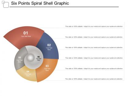
The image showcases a PowerPoint slide with the title "Six Points Spiral Shell Graphic." This graphic representation is a creative take on a traditional pie chart or cycle diagram, having a spiral shell shape with six distinct colored segments that appear to fold into or out of the central starting point. Each segment is labeled from 01 to 06, and alongside each label, there is placeholder text reading "Your Text Here," suggesting a customizable format where users can enter their specific information relevant to each point.
The slide header and the repetitive footers on the right emphasize the ease of customization: "This slide is 100% editable. Adapt it to your needs and capture your audience's attention." These phrases suggest that this slide template is designed to be highly adaptable to a broad array of presentations, allowing for the tailoring of content to fit different industry needs, from explaining sequential steps in a process to showcasing proportional data in an aesthetically pleasing, circular spiral.
Use Cases:
This unique spiral shell graph is versatile, suitable for illustrating steps, data segmentation, or business strategies across diverse industries.
1. Marketing:
Use: Depicting campaign phases
Presenter: Marketing Coordinator
Audience: Marketing Team
2. Education:
Use: Illustrating learning cycles
Presenter: Educator
Audience: Students or Faculty
3. Project Management:
Use: Outlining project stages
Presenter: Project Manager
Audience: Project Stakeholders
4. Finance:
Use: Showing financial breakdown
Presenter: Financial Analyst
Audience: Investors or Management
5. Healthcare:
Use: Presenting patient care steps
Presenter: Healthcare Administrator
Audience: Medical staff or Stakeholders
6. Software Development:
Use: Software feature rollouts
Presenter: Lead Developer
Audience: Development Team
7. Manufacturing:
Use: Showing production stages
Presenter: Operations Manager
Audience: Production Team
Six points spiral shell graphic with all 5 slides:
Folks agree to ally due to our Six Points Spiral Shell Graphic. Enhance their belief in your cause.


FAQs for Six points
Essential design elements for spiral shell graphics include balanced proportions, smooth curved lines, natural color gradients, appropriate scaling, and strategic placement within slide layouts. These elements work together by creating visual flow that guides audience attention, establishing organic metaphors for growth or evolution, and maintaining professional aesthetics, with many presenters finding that well-designed spiral shells effectively communicate concepts like development cycles, natural processes, or progressive business strategies.
The Fibonacci sequence enhances spiral shell graphics by creating mathematically precise proportions that mirror natural growth patterns, delivering visually harmonious curves, balanced spacing, and organic authenticity that resonates with viewers. Through these proportional relationships, designers achieve compelling visual flow, enhanced aesthetic appeal, and professional polish, with many graphic designers finding that Fibonacci-based spirals significantly elevate presentation impact and audience engagement.
Neutral tones like cream, beige, and soft gray work best for spiral shell graphics in professional presentations, alongside ocean-inspired blues, teals, and seafoam greens that maintain visual appeal without overwhelming content. These color schemes enhance readability while delivering sophisticated aesthetics, with many organizations finding that muted palettes streamline audience focus and ultimately support clearer communication across diverse business contexts.
Adobe Illustrator, CorelDRAW, Inkscape, Blender, and Procreate are highly recommended for designing spiral shell graphics, offering specialized vector tools and organic modeling capabilities. These platforms enable designers to create precise mathematical spirals, apply realistic textures, and develop scalable graphics, with many creative agencies finding that vector-based approaches deliver superior flexibility for both digital and print applications.
Spiral shell graphics help convey complex data by creating intuitive visual hierarchies, enabling layered information display, and guiding viewers through sequential processes naturally. These organic designs streamline data comprehension in presentations, research reports, and strategic planning materials, with many organizations finding that spiral patterns enhance audience engagement while making intricate concepts more accessible and memorable.
Spiral shell graphics in marketing presentations include visualizing customer journey stages, showcasing product evolution timelines, illustrating growth trajectories, demonstrating iterative processes, and representing organic brand development cycles. These natural design elements enhance audience engagement by creating memorable visual metaphors, while many organizations find that spiral imagery effectively communicates continuous improvement, sustainable growth, and customer lifecycle management in increasingly competitive markets.
Spiral shell graphics illustrate balance and harmony through their natural golden ratio proportions, radial symmetry, and progressive growth patterns that create visual equilibrium. These organic forms help designers demonstrate how mathematical principles like Fibonacci sequences translate into aesthetically pleasing compositions, with many branding and architectural projects finding that spiral motifs enhance visual flow and create subconscious feelings of natural order.
Spiral shell graphics evoke feelings of natural growth, evolution, and organic progression, making complex information feel more intuitive and less overwhelming to audiences. These nature-inspired visuals enhance cognitive processing by creating visual metaphors for development cycles, with many presenters in consulting, education, and strategic planning finding that spiral imagery helps audiences better retain multi-stage concepts and process flows.
Spiral shell graphics can be adapted by adjusting complexity, color schemes, labeling approaches, and contextual framing to match audience needs and expectations. For scientific presentations, these graphics emphasize anatomical accuracy, mathematical proportions, and educational annotations, while artistic applications focus on aesthetic appeal, creative interpretations, and emotional resonance, ultimately delivering targeted communication that enhances audience engagement.
Spiral shell graphics enhance presentation storytelling by visualizing growth processes, evolutionary development, cyclical patterns, and progressive transformation concepts. These natural metaphors help audiences understand complex narratives involving continuous improvement, organizational maturity, or product development cycles, with many presenters finding that spiral imagery effectively communicates forward momentum while acknowledging iterative, organic business processes.
Cultural perceptions of spirals significantly influence spiral shell graphic design through symbolism, aesthetic preferences, and contextual applications across different societies. In Western cultures, spirals often represent growth and innovation, while Eastern traditions emphasize harmony and life cycles, with designers adapting colors, proportions, and styling to resonate with specific cultural values, ultimately delivering more meaningful and culturally relevant visual communications.
Common pitfalls include using overly complex spiral designs that distract from content, poor color contrast that reduces readability, and misaligning spiral elements with your message's logical flow. These graphics work best when they enhance rather than overwhelm your presentation, with many organizations finding that simple, strategically-placed spiral shells effectively guide audience attention while maintaining professional credibility and visual clarity.
Animations enhance spiral shell graphics by creating visual flow that mirrors natural growth patterns, emphasizing key data points through sequential reveals, and guiding audience attention along the spiral's progression. These dynamic presentations enable presenters to build complex concepts gradually, demonstrate cyclical processes more effectively, and maintain audience engagement through movement, with many finding that animated spirals significantly improve comprehension and retention rates.
Historical references alongside spiral shell graphics include Fibonacci sequences in mathematics, nautilus fossils from paleontology, ancient Greek spiral architecture, Renaissance golden ratio studies, and maritime navigation traditions. These elements enhance presentations by connecting natural patterns with human innovation, mathematical principles, and cultural heritage, ultimately delivering deeper storytelling resonance and educational value for audiences.
Spiral shell graphics facilitate learning by illustrating natural mathematical concepts like Fibonacci sequences, golden ratios, and exponential growth patterns across science, mathematics, and biology curricula. These visual tools enhance student comprehension through biomimicry lessons, geometry demonstrations, and evolutionary studies, with many educators finding that organic spiral patterns help students grasp abstract mathematical relationships more intuitively.
-
Out of the box and creative design.
-
Colors used are bright and distinctive.