

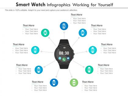
Smart watch working for yourself infographic template




Try Before you Buy Download Free Sample Product
 Impress Your
 Audience
 100%
100% Editable
 Save Hours
 of Time


Our Smart Watch Working For Yourself Infographic Template are topically designed to provide an attractive backdrop to any subject. Use them to look like a presentation pro.
People who downloaded this PowerPoint presentation also viewed the following :
Smart watch working for yourself infographic template with all 2 slides:
Use our Smart Watch Working For Yourself Infographic Template to effectively help you save your valuable time. They are readymade to fit into any presentation structure.
FAQs for Smart watch working for
Key features to highlight include health monitoring capabilities, connectivity options, battery life, fitness tracking functions, and customization features. These elements should be presented through clear visual hierarchies, compelling data visualizations, and intuitive layouts that showcase technical specifications alongside user benefits, ultimately helping manufacturers and retailers communicate value propositions effectively to increasingly tech-savvy consumers.
Color theory enhances smartwatch infographic templates by creating visual hierarchy, improving readability, guiding user attention, and establishing brand consistency through strategic hue selection. Through complementary colors for contrast, analogous schemes for harmony, and psychological color associations, designers streamline information processing, reduce cognitive load, and ultimately deliver more engaging presentations that resonate with tech-savvy audiences.
Essential smartwatch statistics include market size and growth projections, user demographics and adoption rates, health monitoring accuracy metrics, battery life comparisons, and feature utilization data. These statistics enhance communication by providing concrete evidence of market opportunity, user behavior patterns, and competitive positioning, with many technology companies finding that combining usage analytics with demographic insights ultimately delivers more compelling investor presentations and strategic planning outcomes.
A smartwatch infographic template attracts fitness enthusiasts by showcasing key health metrics, workout tracking capabilities, heart rate monitoring features, step counting accuracy, and calorie burn visualization through compelling visual data representations. These templates effectively demonstrate real-world fitness scenarios, progress tracking dashboards, and performance analytics that resonate with health-conscious consumers, ultimately highlighting the smartwatch's value in achieving personal wellness goals.
Smartwatch infographics differentiate through wearable-specific visuals like wrist mockups, health data visualizations, fitness tracking charts, app interface screenshots, and battery life indicators. These design elements emphasize portability, health monitoring capabilities, and daily integration scenarios, with many presentations showcasing real-time data displays and lifestyle contexts that standard tech presentations lack, ultimately delivering more targeted consumer engagement.
Icons and illustrations enhance smartwatch infographic comprehensibility by providing visual shortcuts for complex features, creating intuitive recognition patterns, and bridging language barriers through universal symbols. These visual elements streamline information processing by making abstract concepts like heart rate monitoring, GPS tracking, and app notifications immediately recognizable, with many viewers finding that well-designed icons reduce cognitive load and improve feature understanding.
Including user demographics in smartwatch infographics enhances targeting accuracy, improves marketing relevance, and enables data-driven design decisions that resonate with specific audience segments. These demographic insights streamline product positioning by revealing age preferences, lifestyle patterns, and usage behaviors, with technology companies finding that targeted presentations deliver significantly higher engagement rates and ultimately drive more strategic product development and market penetration.
Storytelling integrates into smartwatch infographics through user journey narratives, day-in-the-life scenarios, problem-solution sequences, and progressive data reveals that mirror real experiences. These approaches enhance audience connection by showcasing relatable fitness transformations, productivity improvements, and health monitoring successes, ultimately delivering more memorable presentations and stronger emotional engagement with smartwatch capabilities.
**INPUT**: What types of data visualization methods work best for representing smartwatch functionalities? **OUTPUT**: Effective smartwatch functionality visualization includes feature comparison charts, user journey flowcharts, circular progress indicators, icon-based interface mockups, and performance metrics dashboards. These methods streamline complex technical specifications through visual storytelling, with technology companies and healthcare organizations finding that intuitive infographics enhance user understanding while ultimately delivering clearer product communication and stronger market positioning. **Word count: 57 words**
Comparative charts enhance smartwatch infographic appeal by enabling clear feature-to-feature analysis, highlighting competitive advantages, and simplifying complex technical specifications into digestible visual formats. These visualization tools help consumers evaluate battery life, health tracking capabilities, and price points across brands, while manufacturers showcase superior performance metrics, ultimately delivering more persuasive marketing materials and informed purchasing decisions.
Typography significantly impacts smartwatch infographic readability through clear font hierarchy, appropriate sizing for small screens, strategic color contrast, and consistent spacing between elements. These design principles enhance user comprehension by ensuring key information stands out, data flows logically, and text remains legible across different lighting conditions, ultimately delivering better user experiences and more effective information communication.
Trends in smartwatch technology directly influence infographic design through smaller screen requirements, touch-friendly interactions, simplified visual hierarchies, and data-centric layouts that prioritize key metrics. These design considerations streamline information presentation by emphasizing concise content blocks, bold typography, and intuitive navigation patterns, with healthcare and fitness sectors finding that wearable-optimized templates deliver enhanced user engagement and accessibility.
Accessibility considerations for smartwatch infographic templates include high contrast colors for visual clarity, readable font sizes despite small screens, voice-over compatibility, simplified navigation elements, and color-blind friendly palettes. These design principles enhance user experience by ensuring information remains accessible across diverse audiences, while streamlining content delivery and ultimately expanding market reach for organizations targeting inclusive digital experiences.
Smartwatch infographic templates can be optimized for social media sharing by using square or vertical formats, bold typography, high-contrast colors, and mobile-friendly sizing. These design elements enhance visibility across platforms like Instagram, LinkedIn, and Facebook, while incorporating clear value propositions and branded elements ensures consistent messaging, ultimately delivering higher engagement rates and broader reach for technology companies showcasing their wearable innovations.
Common mistakes include overcrowding the display with excessive data, using fonts too small for mobile viewing, neglecting color contrast for readability, ignoring brand consistency, and failing to prioritize key information hierarchy. These design flaws significantly impact user engagement and comprehension, with many technology companies finding that streamlined, visually balanced infographics enhance customer understanding and drive higher conversion rates.
-
Great product with effective design. Helped a lot in our corporate presentations. Easy to edit and stunning visuals.
-
Very unique and reliable designs.
-
Qualitative and comprehensive slides.
-
Easily Understandable slides.
-
Really like the color and design of the presentation.
-
Very unique, user-friendly presentation interface.
-
Out of the box and creative design.
-
Informative presentations that are easily editable.