


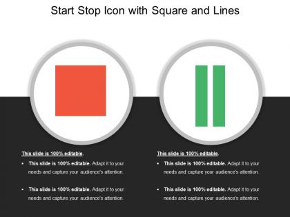
Start stop icon with square and lines




Try Before you Buy Download Free Sample Product
 Impress Your
 Audience
 100%
100% Editable
 Save Hours
 of Time


Dark clouds float away due to our Start Stop Icon With Square And Lines. The horizon appears bright and clear again.
People who downloaded this PowerPoint presentation also viewed the following :
Start stop icon with square and lines with all 5 slides:
Clearly explain company guidelines with our Start Stop Icon With Square And Lines. It helps convey instructions.
FAQs for Start stop icon with
**INPUT**: What design principles should be considered when creating a start-stop icon for presentations? **OUTPUT**: Start-stop icon design principles include visual clarity, consistent sizing, intuitive symbolism, appropriate contrast ratios, and scalable vector formatting. These design elements enhance presentation flow by ensuring immediate recognition, maintaining professional aesthetics, and supporting seamless audience engagement, with many presenters finding that well-designed icons ultimately streamline communication and reinforce key messaging points. [Word count: 54 words]
Color psychology significantly influences start-stop icon effectiveness through universal associations, emotional responses, and cultural interpretations that guide user behavior and comprehension. Red universally signals urgency and stopping across industries like automotive interfaces and emergency systems, while green conveys safety and permission to proceed, with many digital platforms finding that strategic color choices enhance user response times and reduce interface confusion.
Common misconceptions include that start-stop icons are only for video content, appear unprofessional in business settings, complicate navigation, require technical expertise to implement, and distract from main content. These interactive elements actually enhance professional presentations by enabling presenter control, improving audience engagement, and streamlining complex information delivery, with many organizations finding that strategic icon placement ultimately delivers clearer communication and more dynamic presentation experiences.
Cultural differences significantly impact start-stop icon interpretation through varying reading patterns, color associations, and symbolic meanings across regions. While Western audiences typically read left-to-right associating green with "go," Asian markets may interpret directional flows differently, and Middle Eastern users process right-to-left layouts, with many global organizations finding that localized icon testing enhances user engagement and reduces operational confusion.
Best practices for incorporating start-stop icons into animated presentations include strategic placement for intuitive user control, consistent visual design that matches your brand aesthetic, appropriate sizing for easy accessibility, clear labeling or tooltips for functionality, and smooth hover effects that enhance user experience. These design elements streamline viewer interaction by providing seamless navigation control, reducing confusion during complex presentations, and ultimately delivering professional polish that keeps audiences engaged, with many presenters finding that well-integrated controls significantly improve presentation flow and viewer retention.
The size and placement of a start-stop icon significantly impacts content comprehension by directing attention, establishing visual hierarchy, and signaling interaction priority within presentations. Strategic placement in consistent locations, such as bottom-right corners or centered positions, combined with appropriately scaled sizing, enhances user navigation flow, reduces cognitive load, and ultimately delivers clearer communication outcomes across business presentations and digital interfaces.
Adobe Illustrator, Figma, Sketch, Canva, and IconScout are recommended for designing custom start-stop icons, offering vector-based precision, scalability, and professional-grade features. These platforms enable designers to create consistent, brand-aligned icons through intuitive interfaces, extensive symbol libraries, and collaborative workflows, with many organizations finding that standardized icon systems enhance user experience and operational efficiency across digital platforms.
Start-stop icons enhance user engagement by providing intuitive visual controls, creating interactive navigation points, enabling self-paced learning experiences, and offering clear presentation flow management. These interface elements streamline audience participation by allowing viewers to control content timing, pause for questions or discussions, and revisit key sections, ultimately delivering more personalized and engaging presentation experiences across educational and business environments.
Industries commonly utilizing start-stop icons include manufacturing and production, media and entertainment, project management, healthcare and medical services, and automotive sectors. These visual elements streamline complex operational presentations by clearly indicating process states, workflow transitions, and system controls, with many organizations finding that consistent iconography enhances audience comprehension and professional presentation flow.
Start-stop icons vary significantly across platforms, with play/pause symbols differing between media players, system controls, recording applications, and industrial interfaces. While streaming services like Netflix use circular designs and smartphones employ minimalist triangles and bars, manufacturing systems often utilize red/green color coding with text labels, ultimately requiring platform-specific design considerations for optimal user recognition and operational efficiency.
User feedback drives start-stop icon evolution by revealing usability issues, accessibility concerns, cultural preferences, and platform-specific requirements through testing and analytics. This feedback enables designers to refine visual clarity, optimize touch targets, and enhance intuitive recognition, with many media platforms and software companies finding that iterative design improvements significantly boost user engagement and reduce interface confusion.
Simple shapes like triangles, circles, and squares create recognizable start-stop icons through intuitive visual associations, consistent geometric proportions, strategic color contrast, and cultural familiarity with universal symbols. These foundational elements enable designers across industries, from software interfaces to manufacturing controls, to communicate immediate functionality while maintaining visual clarity, ultimately delivering seamless user experiences and reducing operational confusion.
The play triangle and pause bars evolved from 1960s tape recorder controls, where triangular "play" buttons indicated forward motion and parallel lines represented the pause mechanism on magnetic tape systems. This audio-visual language transferred seamlessly to digital interfaces across entertainment, software, and presentation platforms, with many organizations finding that these universally recognized symbols enhance user experience by eliminating confusion and streamlining content control across diverse applications and demographics.
Start-stop icons can effectively convey complex ideas through strategic visual storytelling, sequential processes, and contextual grouping within presentations and infographics. These icons enhance comprehension by breaking down multi-step workflows, project phases, and decision trees into digestible visual elements, with many organizations finding that combining start-stop indicators with supporting graphics streamlines communication across departments while reducing misunderstandings.
Icon animations significantly enhance audience understanding of start-stop functions by providing visual feedback, reducing cognitive load, and creating intuitive user experiences that mirror familiar digital interfaces. These animated elements help presenters maintain engagement while clearly signaling content transitions, with many organizations finding that strategic animation use improves comprehension rates and audience retention during complex presentations.
-
Designs have enough space to add content.
-
Great designs, Easily Editable.