


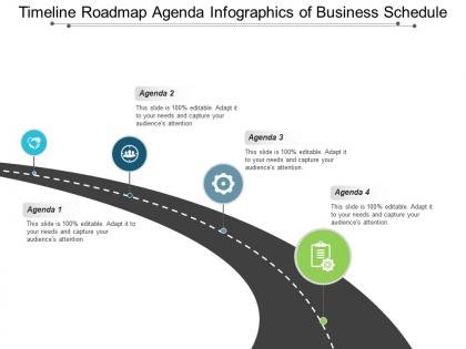
Timeline roadmap agenda infographics of business schedule




Try Before you Buy Download Free Sample Product
 Impress Your
 Audience
 100%
100% Editable
 Save Hours
 of Time


Folks find our Timeline Roadmap Agenda Infographics Of Business Schedule to be inherently inspiring. It is invariably attractive.
People who downloaded this PowerPoint presentation also viewed the following :
Timeline roadmap agenda infographics of business schedule with all 5 slides:
Go for broke with our Timeline Roadmap Agenda Infographics Of Business Schedule. You will be happy with your decision.
FAQs for Timeline roadmap agenda infographics
Pick the big moments that actually changed your trajectory - founding the company, major product drops, key partnerships, funding rounds. Growth milestones matter too, like breaking into new markets or hitting revenue goals. Honestly, the struggles and pivots often make better stories than just listing wins. Employee stuff can work if it's meaningful (hitting 100 people feels significant). Don't overdo it though - maybe 5-8 solid moments max? Each one should move your story forward instead of just padding the timeline. Quality over quantity here.
Colors totally change how people read your business timeline. Warm ones like orange and red scream energy and fast growth. Blues and greens feel more stable and trustworthy. Though honestly? I'm so over seeing another boring blue corporate timeline. Here's what works: use a progression from dark to bright colors. It naturally shows positive momentum over time. Clashing colors make everything look chaotic, even if your growth was actually super steady. Just pick something that matches the story you're trying to tell about where your company's been.
Lead with your biggest moment - that'll grab people immediately. After that, stick to chronological order and don't jump around with dates (seriously, it's confusing as hell). Try using consistent time chunks like quarters or years so it flows better. The mistake I see constantly? People cram all their recent stuff together instead of spacing things out proportionally. You want those time gaps to actually show. Throw in clear date labels and maybe some quick context for each milestone. Someone should be able to follow your whole business story without getting lost, so test it on a friend first.
Timeline infographics work because they turn boring data dumps into something your eyes can actually handle. Color coding shows different phases, icons mark big milestones, and the spacing lets you see time relationships instantly. Way better than reading through paragraphs of dates and numbers - honestly, who has time for that? It's like comparing sheet music to hearing the actual song. Your eye follows the story chronologically without getting lost. Just keep your visual elements consistent so everything flows smoothly. Makes complex business stuff way less painful to understand.
Honestly, just start with Canva - their timeline templates are pretty decent and you won't spend forever figuring stuff out. Adobe Express works too if you're already in that ecosystem. PowerPoint is actually way better for this than most people realize (I know, I know, but hear me out). Once you get comfortable, maybe check out Adobe Illustrator for more control over the design. Lucidchart's solid if you want something between basic and fancy. Don't overthink it though - pick one and just start making stuff. You can always switch later once you figure out what style you're going for.
Honestly, just make two different versions. Investors want to see the money stuff - revenue growth, funding rounds, those crazy hockey stick charts they obsess over. Customers? They couldn't care less about your Series B. Show them product launches, new features, anything that actually affects what they're using. Same brand look is fine, but the messaging needs to hit different. I learned this the hard way trying to make one timeline work for both - it just ends up boring everyone. Way better to speak their specific language than confuse people with generic stuff.
Your timeline needs branding - otherwise it'll look super generic. Pick 2-3 of your brand colors as the main palette, then use your usual fonts for headers and body text. Honestly, I've seen way too many timelines that just blend into the background because they forgot about this stuff. Your logo should be there too, but don't go crazy with it. The whole point is making it feel connected to your other content while still letting the actual timeline info shine. It's like... you want people to recognize it's yours without the branding taking over completely.
So you'll want clickable hotspots and hover effects - those are game changers. Pop-up detail boxes when people click milestones, maybe some embedded videos at key moments. Animated progress bars look slick too. Filters for different business areas or time periods are super useful, plus scroll-triggered animations as they move down the page. Oh, and hover animations honestly make everything feel way more professional. I'd start basic with click-to-expand stuff first though - you can always add the fancy features later once you see what people actually use.
Start with their annual reports and SEC filings - that's where the real stuff is. Company press releases work too, but they're obviously gonna spin things their way. Bloomberg and Reuters have exact dates for big moves like acquisitions or CEO changes, which is super helpful. Forbes and HBR are decent, though honestly they can be a bit dramatic sometimes. Oh, and check the company's actual website - their history page might surprise you. Just make sure you're checking two sources for each date because getting timelines wrong is the worst.
Honestly, just go with something super clean like Helvetica or Arial for the main text. Sans-serif is your friend here - stays readable when you shrink it down. I learned this the hard way when my last timeline looked like garbage once I actually printed it lol. Maybe get fancy with the title if you want, but that's it. Use like 2-3 font weights tops (regular, bold, whatever) so it doesn't look chaotic. People will literally stop reading if they can't make out the dates easily. Oh and definitely check how it actually looks at real size before you call it done!
Oh man, I've seen so many timelines that are just disasters! Don't cram everything on there - pick your best milestones. Tiny fonts are the worst, nobody's squinting at your timeline. Also those color-crazy designs? Skip it. Stick to 2-3 colors max. Make sure people can actually follow the flow - left to right or top to bottom, whatever works. But here's the thing that bugs me most: when people just throw dates around without explaining WHY that moment mattered to their business. Context is everything! Test it on a friend first because what makes sense to you might be confusing to everyone else.
Timeline infographics are perfect for showing off your company's growth story or hitting those big product milestones. People absolutely eat up that progression-over-time stuff, especially on social media and investor decks. Honestly, they're everywhere right now - seems like every brand's doing them. Map out your biggest wins first, then turn those into a clean visual that screams success story. Perfect for positioning yourself as the industry veteran or just proving you've got staying power. The visual thing makes all that complex info way more digestible too. Plus they're super shareable, which doesn't hurt.
Check out Apple's product timeline and Airbnb's milestone infographic - they nail the balance between looking good and being readable. Tesla's got this cool startup-to-major-player story, but honestly it gets a bit too techy for my taste. Google's "moments that matter" thing is solid. Same with Spotify's growth story - they both make data feel actually personal instead of boring corporate stuff. The color coding and icons really help guide you through different phases. Oh, and pay attention to how they break up the information visually.
Honestly, animations can totally change how people experience your timeline. Instead of hitting them with everything at once, you reveal stuff chronologically - maybe fade in each milestone or use sliding effects to show how one thing led to another. I've seen some where simple animations made all the difference in how viewers actually absorbed the info. It's like having someone guide you through the story step by step. Just don't get carried away with crazy effects that end up being distracting - nobody cares about your fancy transitions if they can't focus on the actual data. Test it with a few people first to make sure it actually helps.
Start with your alt text - actually describe what's in the timeline instead of just naming it "timeline.jpg." File names matter too. I always mess this up, but adding structured data markup helps search engines figure out what your timeline's about. Mobile optimization is huge since everyone's on their phones anyway. Also compress that image or it'll load like molasses and tank your rankings. Oh, and sprinkle keywords in the title and text around it. The whole point is making it easy for both people and search bots to understand what they're looking at.
No Reviews