


Transformation Map Powerpoint Presentation Slides




Try Before you Buy Download Free Sample Product
 Impress Your
 Audience
 100%
100% Editable
 Save Hours
 of Time


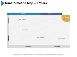
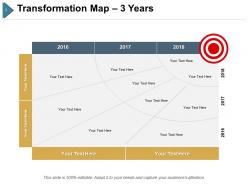
Select Transformation Map PowerPoint Presentation Slides to create and execute a transformation strategy. Transformation chart PPT slides can be used for visual representation of goals and strategic planning process. Furthermore, business transformation chart presentation design is perfect to communicate your change strategy. Showcase all important elements of strategic change like actions, milestones, timelines results, etc using t-map PowerPoint templates. This is a powerful tool to drive your strategic planning process. Our professionally designed T-chart PowerPoint presentation is sure to impress executives, inspire team members and other audience. The T-map presentation design will assist you in the visual depiction of the plan for implementing a strategy or goal. The presentation deck is fully editable so that users can alter text, color, font size if they wish to, and present it in the shortest possible time. The content is extensively researched, and the designs are professional. Download our content ready transformation map PPT visuals for successful business transformation.
People who downloaded this PowerPoint presentation also viewed the following :
Transformation Map Powerpoint Presentation Slides with all 18 slides:
Our Transformation Map Powerpoint Presentation Slides are empowering assets. Employ them to fashion your career.
-
Transformation Map Powerpoint Presentation Slides
-
Transformation Map Powerpoint Presentation Slides
-
Transformation Map Powerpoint Presentation Slides
-
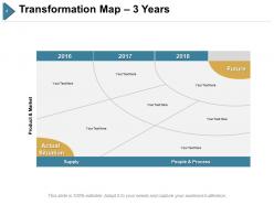
Transformation Map Powerpoint Presentation Slides
-
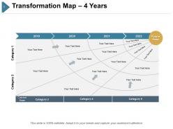
Transformation Map Powerpoint Presentation Slides
-
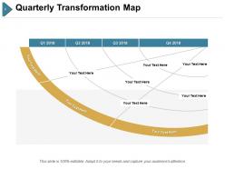
Transformation Map Powerpoint Presentation Slides
-
Transformation Map Powerpoint Presentation Slides
-

Transformation Map Powerpoint Presentation Slides
-
Transformation Map Powerpoint Presentation Slides
-
Transformation Map Powerpoint Presentation Slides
-

Transformation Map Powerpoint Presentation Slides
-

Transformation Map Powerpoint Presentation Slides
-

Transformation Map Powerpoint Presentation Slides
-
Transformation Map Powerpoint Presentation Slides
-
Transformation Map Powerpoint Presentation Slides
-
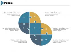
Transformation Map Powerpoint Presentation Slides
-
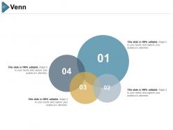
Transformation Map Powerpoint Presentation Slides
-

Transformation Map Powerpoint Presentation Slides
FAQs for Transformation Map
Okay so you need four main things: where you are right now, where you want to end up, the big projects that'll bridge that gap, and realistic timelines with checkpoints along the way. Here's what kills me though - everyone wants to jump straight to dreaming about the future without actually figuring out their starting point first. Don't do that. Map your current situation before anything else. Also make sure you know which projects depend on others finishing first, and put someone's name next to each piece. The whole thing works best when you can actually see how everything connects. Trust me on the current state thing - it's boring but you'll thank yourself later.
So basically it's like a roadmap showing how to get from point A to point B in your company. Map out your current situation first, then figure out where you want to end up. The tricky part? Working backwards to connect all the dots - what changes need to happen with processes, tech, people, whatever. I'd definitely focus on spotting the dependencies between projects because that's where things usually get messy. It helps everyone see the bigger picture instead of just their little piece. Honestly, it's way more useful than those generic strategy docs that just sit in folders gathering digital dust.
Dude, visual maps are a game changer for this stuff. Nobody wants to wade through endless spreadsheets - that's torture. When you map things out visually, gaps and bottlenecks just jump out at you. Flowcharts work great, or even basic timelines if you're keeping it simple. Your stakeholders will actually pay attention too since they can see the whole picture without squinting at tiny text. Honestly, I'd grab a whiteboard first and sketch it out before you make anything fancy. Way easier to move things around and think through the connections.
Honestly, any industry that's getting completely turned upside down benefits most - healthcare, finance, retail, manufacturing. The messier your situation, the more you need that visual roadmap. Manufacturing teams crush it with digital transformations, healthcare focuses on patient stuff. But here's the thing - regulatory changes or new tech hitting your space? That's when these maps really shine. Even had a friend in logistics use one for supply chain chaos (worked great). Start with whatever's keeping you up at night and work backwards from there.
Look, regular project management is all about checking boxes - did we finish X by Tuesday, are we on budget, that kind of stuff. Transformation maps are completely different. They're focused on the human side - like, how will people actually feel about this change? What's gonna make them resist? It's less "here's your deadline" and more "here's why Sarah from accounting will probably hate this at first." Honestly, I think most project managers miss this entirely. Instead of just tracking deliverables, you're mapping out the emotional roller coaster your stakeholders will go through. Way more useful than another Gantt chart.
Your stakeholders are basically your reality check - can't build a decent transformation map without them. Employees know what's actually broken day-to-day, while executives see the big picture stuff. Customers tell you what really matters to them (not what you think matters). Getting all these voices helps you avoid that classic mistake where leadership's vision doesn't match what's happening on the ground. I'd start with core groups first - maybe structured sessions so it doesn't turn into chaos. Partners can spot roadblocks you'd never think of too. Short version: diverse perspectives = map that actually works instead of pretty fantasy.
Think of it as your game plan for change - shows where you are now, where you're headed, and every step between. Really helps you catch problems before they blow up and figure out who does what when. Honestly, stakeholders love having something visual to look at instead of just listening to you ramble about processes (learned that the hard way). The best part? It makes you work through all the messy dependencies upfront. Keep updating it as things evolve and pull it out during every planning session. Total lifesaver.
Honestly, the worst part is getting everyone on the same page about what "transformation" even means. Each department thinks their stuff is the priority. Data's usually a mess too - good luck finding current process docs when half are from 2019. People either make things way too simple or dive into crazy detail about stuff that doesn't matter. Oh, and scope creep will kill you if you're not careful. I'd write up a clear charter first so everyone knows what success looks like. Then do regular check-ins to make sure nobody's going rogue with the timeline.
Quarterly reviews are usually solid, but honestly? It really depends on your company's pace. Monthly updates make more sense if you're dealing with constant changes or major reorganizations. I've watched teams crash and burn because they stuck to some arbitrary schedule while everything shifted around them. Track when your assumptions break down - that's your real signal. New priorities pop up, budgets get slashed, or some random roadblock appears out of nowhere. Set those quarterly reminders for sure, but don't be stubborn about waiting if something big hits that could mess up your whole plan.
Track both the hard numbers and the softer stuff on your transformation map. Revenue growth, cost cuts, customer satisfaction scores - yeah, all that matters. But don't sleep on change adoption rates and how well people are actually completing training. I've watched so many companies obsess over financials while completely missing whether their people are actually changing how they work. Employee engagement levels tell you a lot too. Oh, and milestone completion keeps you honest about timelines. Start with maybe 5-7 metrics though - you can always pile on more once you've got the hang of it.
Honestly, Miro and Mural are lifesavers for this stuff - way better than wrestling with physical sticky notes everywhere. Your whole team can jump in at once, move things around, draw connections. Pretty seamless. If you want something more structured, Lucidchart works well too (though I've always found Visio kind of clunky, but maybe that's just me). Just pick whatever everyone can actually access and edit together. Don't overthink the setup - grab a basic template and start mapping where you're at now. You'll figure out the tweaks as you go.
Tell the big picture story first - current state, where you're headed, and why it matters. Then get into the weeds. Make your slides super visual with clear timelines people can actually track. Too many roadmaps look like someone threw spaghetti at a wall! Call out dependencies and risks upfront since they'll ask about those anyway. Practice your transitions between phases so it flows naturally. Oh, and block out extra time for discussion - these presentations always turn into marathon Q&A sessions. Have real examples ready for how each phase hits different teams.
Honestly, start with your business goals first - don't just dive into mapping random stuff. I've watched so many teams mess this up by skipping that step. Work backwards from what you actually want to achieve, whether it's more revenue, cutting costs, whatever. Every major piece of your transformation should connect to a real business outcome. And here's the thing - your priorities will change (they always do), so build in quarterly check-ins to make sure you're still on track. Otherwise you'll end up with this beautiful map that doesn't actually solve your problems.
Look at Microsoft - they completely flipped from selling software licenses to cloud services and actually documented the whole thing pretty well. Netflix did something similar when they ditched DVDs for streaming, then again with original content. Target's another good one, though honestly the tech companies are way more interesting to study. What's cool about these cases is seeing how they figured out what had to happen first, what could wait, and how to not blow everything up in the process. I'd definitely dig into Microsoft's approach since you can find tons of details about their framework online.
Dude, culture will absolutely torpedo your transformation if you're not careful. Say you're trying to implement some rigid new process at a company where everyone's used to winging it - yeah, that's gonna be a disaster. You've gotta look at how your people actually make decisions, handle risk, and react to change before diving in. I learned this the hard way once. Survey your teams first about what they're worried about and how they like to communicate. Work with what you've got instead of fighting it. Short version: if your map clashes with company values, you're screwed.
No Reviews