

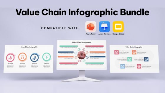
Value Chain Infographic Bundle Powerpoint Ppt Templates And Slides




Try Before you Buy Download Free Sample Product
 Impress Your
 Audience
 100%
100% Editable
 Save Hours
 of Time


Our Value Chain Infographic Bundle Powerpoint Ppt Templates And Slides are topically designed to provide an attractive backdrop to any subject. Use them to look like a presentation pro.
People who downloaded this PowerPoint presentation also viewed the following :
Value Chain Infographic Bundle Powerpoint Ppt Templates And Slides with all 39 slides:
Use our Value Chain Infographic Bundle Powerpoint Ppt Templates And Slides to effectively help you save your valuable time. They are readymade to fit into any presentation structure.










FAQs for Value Chain Infographic Bundle Powerpoint Ppt
Key components of a value chain infographic include primary activities like inbound logistics, operations, outbound logistics, marketing and sales, and service, alongside support activities such as procurement, technology development, human resources, and firm infrastructure. These visual elements work together by clearly mapping business processes, identifying cost optimization opportunities, and highlighting competitive advantages, with many organizations finding that well-designed infographics streamline strategic planning and enhance stakeholder communication across complex operational workflows.
A well-designed value chain infographic enhances understanding by visualizing complex operational flows, identifying cost centers, highlighting value-adding activities, and revealing interconnected processes across departments. Through clear visual mapping, organizations streamline communication with stakeholders, pinpoint efficiency opportunities, and demonstrate competitive advantages, with many companies finding that infographics accelerate strategic decision-making and operational transparency.
Manufacturing, retail, healthcare, logistics, and financial services can benefit significantly from implementing value chain infographics, as these sectors involve complex multi-stage processes requiring clear visualization. These industries leverage value chain infographics to streamline operations, enhance stakeholder communication, and identify optimization opportunities, with many organizations finding that visual mapping delivers improved operational efficiency and strategic decision-making across departments.
Value chain infographics vary significantly across sectors, with manufacturing typically showcasing linear processes from raw materials through production, distribution, and sales, while service industries emphasize intangible activities like customer relationship management, knowledge transfer, and experience delivery. These visual adaptations enable organizations to streamline sector-specific operations, enhance stakeholder understanding of complex workflows, and ultimately deliver targeted improvements in operational efficiency and competitive positioning within their respective markets.
Best practices for creating an effective value chain infographic include clear sequential flow, consistent visual hierarchy, focused messaging, strategic color coding, and simplified terminology. These design elements enhance comprehension by highlighting interconnected processes, reducing information overload, and emphasizing value-added activities, with many organizations finding that well-designed infographics improve stakeholder understanding and strategic alignment.
Technology enhances value chain infographic design through advanced data visualization software, automated layout algorithms, interactive elements, real-time data integration, and collaborative cloud platforms. These tools streamline design processes by enabling dynamic updates, enhancing visual clarity, and facilitating team collaboration, with many organizations finding that modern infographic technologies deliver more engaging presentations and faster strategic communication.
Value chain infographics aid strategic decision-making by visualizing cost structures, identifying bottlenecks, highlighting competitive advantages, and revealing optimization opportunities across business operations. These visual tools enable executives to quickly assess resource allocation, streamline inefficient processes, and make data-driven decisions about partnerships, with many organizations finding that clear visualization accelerates strategic planning and enhances operational transparency.
Companies measure value chain infographic effectiveness through engagement metrics, comprehension assessments, stakeholder feedback surveys, and decision-making impact analysis. Through analytics tracking, organizations monitor viewer time, interaction rates, and knowledge retention, while conducting pre-and-post implementation surveys with teams across operations, ultimately delivering improved strategic alignment and faster process optimization initiatives.
Visual storytelling transforms complex value chain data into compelling narratives that stakeholders can quickly understand and act upon, using design elements, color coding, and flow visualization to highlight key relationships and bottlenecks. Through strategic visual narratives, organizations streamline communication across departments, enhance decision-making processes, and ultimately deliver clearer operational insights, with many companies finding that well-designed infographics accelerate strategic alignment and improve cross-functional collaboration.
Businesses can customize value chain infographics by incorporating industry-specific activities, unique operational steps, proprietary technologies, and distinctive value propositions that differentiate their processes. Through tailored visual elements, sector-relevant examples, and company-specific metrics, organizations in manufacturing, retail, and services create compelling presentations that accurately represent their competitive advantages, ultimately enhancing stakeholder understanding and strategic communication.
Common mistakes include overcrowding with excessive details, using inconsistent visual elements, neglecting clear flow direction, omitting key stakeholder connections, and failing to highlight value-adding activities distinctly. These design flaws confuse audiences by creating visual chaos, disrupting logical progression, and obscuring critical relationships, with many organizations finding that streamlined, strategically focused infographics deliver significantly better stakeholder comprehension and operational alignment.
Value chain infographics facilitate collaboration by providing a unified visual framework that aligns teams around shared processes, identifies interdependencies between departments, and clarifies each team's role in delivering customer value. Through clear visual mapping, organizations streamline cross-functional communication, reduce silos, and enable teams to coordinate more effectively, ultimately enhancing operational efficiency and strategic alignment.
Crucial data sources include operational metrics, financial records, supplier information, customer feedback, and performance benchmarks from each value chain stage. These sources enable organizations to map actual workflows, identify bottlenecks, and quantify costs across procurement, production, and distribution, with many companies finding that comprehensive data integration reveals previously hidden inefficiencies and optimization opportunities.
A value chain infographic helps identify cost reduction opportunities by visually mapping each business activity, highlighting resource allocation, operational inefficiencies, and redundant processes across the entire workflow. Through clear visual analysis, organizations can pinpoint bottlenecks, streamline procurement processes, optimize labor costs, and eliminate non-value-added activities, ultimately delivering enhanced operational efficiency and improved profit margins.
Successful value chain infographics include Porter's Five Forces visualizations, supply chain mapping templates, manufacturing process flows, retail distribution networks, and technology development cycles. These examples demonstrate effective approaches by combining clear visual hierarchies, strategic color coding, and intuitive flow patterns, with many organizations finding that well-designed infographics enhance stakeholder understanding and streamline complex business process communication.
-
Good research work and creative work done on every template.
-
Happy to incorporate such stunning templates in my presentation. Made my presentation look professional and engaging.