

Pyramid Bundle Powerpoint Ppt Templates And Slides





Try Before you Buy Download Free Sample Product
 Impress Your
 Audience
 100%
100% Editable
 Save Hours
 of Time


Our Pyramid Bundle Powerpoint Ppt Templates And Slides are topically designed to provide an attractive backdrop to any subject. Use them to look like a presentation pro.
People who downloaded this PowerPoint presentation also viewed the following :
Pyramid Bundle Powerpoint Ppt Templates And Slides with all 34 slides:
Use our Pyramid Bundle Powerpoint Ppt Templates And Slides to effectively help you save your valuable time. They are readymade to fit into any presentation structure.
-

Pyramid Presentation
-

3 Steps Pyramid Presentation
-

5 Step Pyramid Presentation
-

4 Steps Pyramid Presentation
-

4 Steps Pyramid Presentation
-

4 Step Pyramid Presentation
-
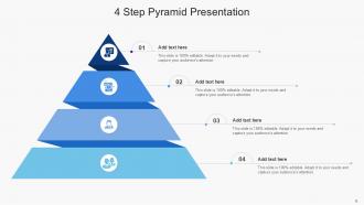
4 Step Pyramid Presentation
-

5 Step Pyramid Presentation
-

4 Step Pyramid Presentation
-
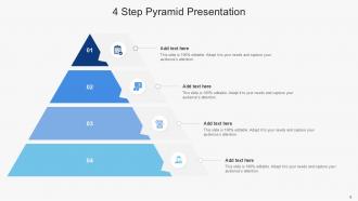
4 Step Pyramid Presentation
-
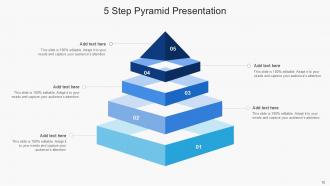
5 Step Pyramid Presentation
-

3 Step Pyramid Presentation
-

4 Step Pyramid Presentation
-

5 Step Pyramid Presentation
-
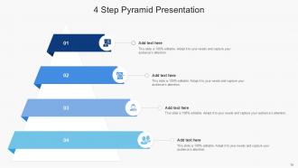
4 Step Pyramid Presentation
-

5 Steps Pyramid Presentation
-
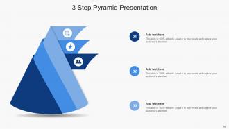
3 Step Pyramid Presentation
-

4 Steps Pyramid Presentation
-
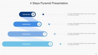
4 Steps Pyramid Presentation
-
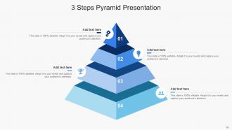
3 Steps Pyramid Presentation
-
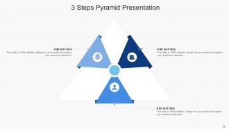
3 Steps Pyramid Presentation
-

4 Steps Pyramid Presentation
-
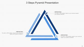
3 Steps Pyramid Presentation
-

4 Steps Pyramid Presentation
-

4 Steps Pyramid Presentation
-

3 Steps Pyramid Presentation
-

-

-

-

-

-

-

-

FAQs for Pyramid Bundle Powerpoint Ppt
Honestly, it's a total game-changer because you hit them with your main point right away. No beating around the bush. Then you back it up with your strongest arguments first, working down from there. I swear this works so well for exec presentations - those people have zero patience for buildup. Plus your logic becomes super clear, and you won't bury your key message in a bunch of fluff. Here's the thing though - meetings always run short, right? So you've already covered what matters most. Definitely try leading with your "so what" next time instead of the whole dramatic reveal thing.
So basically, you flip the whole thing upside down - start with your main point right at the top instead of making people wait for it. Then group your supporting arguments underneath to back up that conclusion. It's like... why make someone read through pages of setup when you could just tell them what matters first? Your audience will actually thank you because they get the key message immediately. Even if they get distracted later (happens to everyone), they've already got what they need. I started doing this for work stuff and honestly, it makes such a difference. Try it on your next big presentation or report.
Honestly, pyramid structure is clutch when people have zero attention span. Start with your main point right up front - like in exec summaries or project updates where your boss might only read the first paragraph anyway. News writers do this all the time for good reason. Your strongest argument goes first, then you can pile on the supporting stuff after. Works really well for proposals too since stakeholders are usually scanning for the bottom line. I mean, who actually reads every word these days? Save yourself the stress and lead with what matters most.
Yeah totally! That pyramid thing works for basically any job. Tech, healthcare, finance - doesn't matter. I've watched people nail it with marketing stuff and boring research presentations too. Honestly, once you get the hang of it, you'll probably use it everywhere. Just swap out the examples and jargon for whatever makes sense in your field. Like if you're talking to doctors, don't use tech speak, you know? Figure out what your industry actually cares about first. Then just plug that into the framework and you're golden.
Think of your pyramid like this: conclusion goes on top, then 2-3 supporting points in the middle, with all your data/examples at the bottom. Don't bury your main point - hit them with it right away. The middle layer is where I used to mess up by cramming too much stuff in there. Keep it tight. Your bottom section? That's where all the nitty-gritty details live - specific examples, numbers, whatever proves your middle points. Each layer should connect naturally. Honestly, if someone only reads your top section, they should still get what you're trying to say.
Honestly, the pyramid thing works because you're not making people wait for the good stuff. Start with your biggest point right away - boom, they know why they should care. Then you can walk through all your evidence and they'll actually stick around to hear it. People have zero patience these days (myself included lol). It's like spoiling a movie but somehow that makes them want to watch more? Weird but true. Once they get the "so what" upfront, they're way more likely to follow your reasoning instead of zoning out halfway through.
Ugh, the biggest thing is people bury their main point instead of leading with it. Put your conclusion RIGHT at the top! I literally see this mistake everywhere and it's so frustrating. Don't go overboard with details in each section either - you'll lose focus fast. Keep your groups logical, maybe 3-5 points per section max. Oh and here's what people always forget: actually tie your evidence back to your main argument. That's honestly what makes everything click together. Start with easy topics first, then move to harder stuff once you get the hang of it.
So basically you flip the whole thing upside down - start with your main point right off the bat instead of making people wait for it. Trust me, nobody has time for mystery novels in business presentations. Then you stack all your proof underneath: data, examples, whatever backs up that big idea. Short sentences work. Longer ones give you room to explain the why behind your argument. The whole point is people aren't sitting there going "okay but what's your actual point?" They know from sentence one, then you just keep reinforcing it. You've gotta be pretty ruthless about cutting stuff that doesn't directly support your main message though.
Okay so first thing - sketch out what info you want where before you even think about design. Most important stuff goes at the top, then work your way down. I'd stick to like 3-5 levels max because honestly more than that just looks chaotic. Make each section visually different - different sizes, colors, whatever works. Just don't cram too much text in each part or it'll be unreadable. Oh and seriously, I can't tell you how many pyramid templates I've seen where everything's the same size and you can't tell what's supposed to be important. Super frustrating when you're trying to actually use the thing.
Honestly, pyramid templates work really well as your base structure - just change up how you present everything. I always start with my main point, then layer in the supporting stuff underneath. Super helpful for storytelling presentations or even video scripts. You can totally mix it with problem-solution formats too (helps you figure out what to tackle first). Infographics love this approach - that top-down logic just makes sense visually. The trick is sticking to that "big stuff first" rule while letting your format do its thing. Works way better than I expected when I first tried it.
Canva's been my go-to lately - their pyramid templates actually look professional without much effort. PowerPoint and Google Slides work too if you want something familiar, they've got built-in pyramid shapes. Honestly, Canva just saves me so much time compared to trying to design from scratch. Need something more complex? Lucidchart or Visio handle hierarchical stuff really well. Excel works for basic pyramids too, though it's kinda clunky. I'd start with Canva first - you can throw something together pretty quickly and it won't look like garbage.
Oh yeah, visuals totally make pyramid templates way more effective. People get the hierarchy instantly instead of having to read through chunks of text. I watched this one presentation where the guy used a simple pyramid graphic and probably saved everyone 10 minutes of confusion - honestly made me realize how much time we waste overexplaining things. Color coding each level works great, or throw in some icons that match your concepts. Short sentences hit different too. The visual structure keeps everyone on track so they don't zone out halfway through your explanation.
Honestly, the pyramid thing works because people's brains are lazy - we want the main point first. It's like getting the GPS destination before you start driving, right? When you lead with your conclusion, you sound way more confident than those people who dance around their point forever. Plus your audience can actually follow along instead of getting lost in details. I've noticed people ask smarter questions when I do this too. Their brains aren't working overtime trying to figure out where you're going. Oh, and it builds trust somehow - maybe because you're not hiding the ball? Definitely try it next time you're presenting something.
Just send out surveys and look at your analytics to see which templates people actually use. Monthly check-ins with your power users work great too. Honestly, people will tell you straight up what sucks if you ask them directly - no sugar-coating needed. Watch for patterns in questions you're getting; if three people are confused about the same thing, fix it. Also track how much people modify templates after they make them - that's usually a dead giveaway something's off. Direct interviews are clutch, but honestly the usage data tells you everything. Quick wins come from just paying attention to where people get stuck.
Honestly, virtual presentations are tricky because people's attention just dies after like 5 minutes. I'd chop your pyramid into way smaller pieces - maybe 5-7 minutes each before you mix things up. Throw in polls or breakout rooms between sections to wake people up. Your visuals need to be bigger and cleaner too since everyone's staring at tiny screens. Oh, and this might sound obvious but - consider moving some content to pre-work instead of shoving everything into one session. Nobody wants to sit through a 2-hour virtual marathon, trust me.
-
Placing an order on SlideTeam is very simple and convenient, saves you a lot of your time.
-
SlideTeam never fails to surprise me with its amazing PPT designs. Thanks team for providing me with your constant support!