

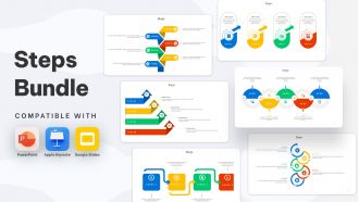
Steps Bundle Powerpoint Ppt Templates And Slides





Try Before you Buy Download Free Sample Product
 Impress Your
 Audience
 100%
100% Editable
 Save Hours
 of Time


Our Steps Bundle Powerpoint Ppt Templates And Slides are topically designed to provide an attractive backdrop to any subject. Use them to look like a presentation pro.
People who downloaded this PowerPoint presentation also viewed the following :
Steps Bundle Powerpoint Ppt Templates And Slides with all 34 slides:
Use our Steps Bundle Powerpoint Ppt Templates And Slides to effectively help you save your valuable time. They are readymade to fit into any presentation structure.










FAQs for Steps Bundle Powerpoint Ppt
Honestly, pick your colors and fonts first - that's your foundation. Stick to 2-3 fonts max or it'll look messy. Your color scheme should actually work together (shocking concept, I know). Give your content room to breathe with white space. Create different layouts for title slides, regular content, section breaks - whatever you'll need. The biggest thing? Make sure people can actually read your text against the background. I've seen way too many presentations where the text just disappears. Your template should help your message shine, not compete with it.
Good design principles will totally transform your template. First thing - create visual hierarchy so people's eyes go where you want them to. Consistent fonts and colors make you look professional (inconsistent stuff just screams amateur, honestly). White space is seriously underrated - don't jam everything together like you're running out of room. The rule of thirds helps with balance, and contrast makes your important points pop. Oh, and readable fonts with good color combos are non-negotiable. Start with solid structure, then customize colors and fonts for your brand.
Honestly, just go with something super clean and minimal - white space is your friend here. Navy, gray, maybe some muted blue if you're feeling fancy, but skip anything bright like orange or pink (learned that one the hard way). Keep fonts simple - Arial or Calibri work great. I'd stick to maybe 2-3 colors tops because more than that gets messy fast. Oh, and don't go crazy with animations - they're way more distracting than you think. The whole point is making your content shine, not the template. Test whatever you pick with your actual slides first though!
Dude, colors totally make or break your presentation. Dark blue with white text? Perfect - keeps people awake and actually readable. But yellow on white? Your audience will be squinting and probably scrolling their phones instead. Warm colors like red create energy (maybe too much energy if you're not careful), while blues and greens feel more chill and trustworthy. I learned this the hard way after bombing with a neon green theme once. Just match your colors to your vibe - don't pick something that fights your message.
Dude, typography can totally make or break your presentation. Bad font choices? Instant credibility killer. I learned this the hard way when I used some weird decorative font and nobody could read my slides from the back. Stick with clean, simple fonts - nothing smaller than 24pt. Two font families max, otherwise it looks messy. Use different weights and sizes to show what's most important. Oh and definitely do the "stand across the room" test before you present. Trust me on this one - what looks fine on your laptop screen might be impossible to read on the big screen.
Honestly, PowerPoint templates are a game-changer for saving time. You're not stuck picking fonts and colors for hours – just drop your content into slides that already look decent. I used to spend forever on formatting (such a pain!). Templates keep your presentations looking consistent too. Short prep tip: make a few different versions for your main presentation types. Oh, and don't go crazy customizing every little detail – sometimes good enough is perfect. You'll probably cut your prep time in half, maybe more.
Honestly, industry-specific templates are a game changer. Your audience instantly gets that you understand their world - builds trust super fast. They're loaded with the right color schemes, layouts, and visuals that already match what people in healthcare, finance, tech (whatever) expect to see. No more building charts from scratch either, which honestly nobody wants to do anyway. I always tell people to grab 2-3 solid ones for their field and just customize with your own branding. Saves you hours and makes everything look way more professional.
Okay so basically your brain processes images like 60,000 times faster than text (crazy right?). When you throw in charts or icons with your words, people get the info through both visual and verbal channels - it's called dual coding and it makes stuff stick better in memory. Honestly, nobody wants to read paragraph after paragraph on slides anymore. The trick is making sure your visuals actually mean something instead of just looking pretty. Swap out those boring bullet points for simple icons or turn your data into charts. Trust me, your audience will actually pay attention instead of checking their phones.
Honestly, just start with PowerPoint's Slide Master - it's already on your computer and lets you set up all your fonts, colors, and layouts in one place. Pretty straightforward stuff. If that feels too basic, Canva's template designer is super user-friendly and has way more design options. Adobe Creative Suite works too if you're feeling ambitious with custom graphics, though that might be overkill depending on what you need. There's also Beautiful.AI which does some smart design stuff automatically. I'd mess around with Slide Master first since it's free, then maybe check out Canva if you want something prettier.
Balance is everything - you want text and images working together, not competing. Use high-contrast colors so people can actually read your stuff (seriously, why do so many people put gray text on white backgrounds??). Keep text short and sweet. Position images to support what you're saying, not just because you need to fill empty space. White space is your friend - cramped slides look awful. Stick with consistent fonts and image styles throughout. Oh, and test everything on different screens first! What looks perfect on your laptop might be totally unreadable when projected.
So educational templates are all about grabbing attention - bright colors, fun graphics, layouts that make learning interactive. Corporate ones? Total opposite. They're super buttoned-up with neutral colors and clean lines (sometimes boring honestly). Schools use cartoon characters and bold fonts because kids need that visual stimulation. Meanwhile, corporate templates prioritize brand consistency and that polished look executives expect. Your audience makes all the difference here - students want engaging visuals while business people prefer distraction-free presentations. Just match whatever vibe your setting expects.
Dude, get a template with clean layouts that won't fight your content for attention. You'll want built-in spots for charts and data stuff. Most templates are honestly way too cluttered - like, who thought neon backgrounds were a good idea? Find one with slide types for results, testimonials, and product features. The color scheme should match your brand, and pick fonts people can actually read. Oh, and make sure it works for both in-person meetings and Zoom calls. Get something with slide masters already configured so you can duplicate sections without wanting to throw your laptop out the window.
Okay so first thing - make your fonts way bigger, like 24pt minimum. People are squinting at laptops and phones. High contrast is your friend too - dark text on white backgrounds because video compression makes everything look terrible otherwise. I bombed a client presentation once because my "stylish" gray text was completely unreadable on their end. Keep backgrounds super clean since you're already competing with your own face on screen. Oh, and definitely test it on different devices first - what looks great on your monitor might be a disaster on someone's iPad. Honestly, design like everyone's going to be doing laundry while "listening."
Honestly, the worst thing you can do is pick some crazy busy template that fights with your content. I've watched people choose these gorgeous designs that completely buried their actual message - so frustrating! Skip anything with weird animations or tiny fonts that'll make everyone squint. Also, don't just grab the first free one you see. Test your actual slides in it first. Can someone in the back row read your text? Do your colors look decent together? Trust me, spending five minutes checking this stuff upfront saves you from looking like a mess later.
Build in accessibility from day one - it's way easier than fixing it later. High contrast colors are your friend, and Arial or Calibri work better than fancy fonts that look cool but nobody can read. Drop in alt text placeholders for images and use PowerPoint's heading styles (they're actually pretty decent). Here's the thing about color - don't rely on it alone to show important stuff. Colorblind folks will thank you. Run the accessibility checker when you're done, or better yet, test it with a screen reader if you can. This way anyone using your template automatically makes inclusive presentations without thinking about it.
-
Stunning collection! With a wide variety of options available, I was able to find a perfect slide for my presentation. Thank you, SlideTeam!
-
SlideTeam is very efficient when it comes to saving time. I am happy that I chose them for my presentation.