


Packaging Design Powerpoint Ppt Template Bundles




Try Before you Buy Download Free Sample Product
 Impress Your
 Audience
 100%
100% Editable
 Save Hours
 of Time


Our Packaging Design Powerpoint Ppt Template Bundles are topically designed to provide an attractive backdrop to any subject. Use them to look like a presentation pro.
People who downloaded this PowerPoint presentation also viewed the following :
Packaging Design Powerpoint Ppt Template Bundles with all 29 slides:
Use our Packaging Design Powerpoint Ppt Template Bundles to effectively help you save your valuable time. They are readymade to fit into any presentation structure.





FAQs for Packaging Design Powerpoint
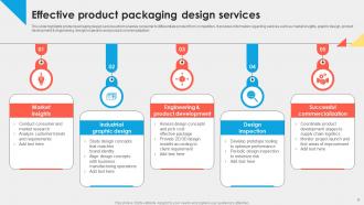
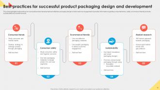
Your packaging is literally the first thing people see - it's doing all the talking before they even know what you're selling. Look at how you spot a Tiffany box instantly, right? That's the power you want. Colors, fonts, the whole vibe should scream YOUR brand from across the store. Honestly, most people sleep on packaging but it's such a game-changer for standing out. When someone picks up your product, they should immediately get who you are and what you're about. Quick test: show your current packaging to someone random - do they instantly connect it to your brand? If not, time for a redesign.
Start by figuring out what you actually need structurally, then hunt for eco alternatives that'll still do the job. Recycled cardboard and plant-based films are solid bets - honestly, biodegradable plastics have come a long way too. Just test everything early because some of this stuff acts weird compared to regular materials. Super annoying but not a dealbreaker. First step though? Cut down on how much material you're using overall. Then swap what's left for greener options. Customers definitely notice when you're trying, plus you'll probably save cash. I'd start with just the outer packaging and go from there.
Focus on hierarchy, contrast, and clarity first - people need to instantly get what you're selling and why they'd want it. Strong, readable typography is huge. Colors should either pop on shelves or tell your brand's story. Emotional imagery works way better than generic stock photos, trust me. Don't cram everything together though - white space is your friend, not the enemy. Your logo needs to be visible but shouldn't compete with product details. Keep copy short and punchy. Pro tip: sketch everything in black and white first to nail the layout before you even think about color.
Honestly, packaging is all about psychology. People judge your product in like 2 seconds based on colors and fonts - it's totally subconscious. Bright colors catch the eye but can look cheap, while clean minimal stuff feels expensive. The actual weight and texture matter too (sounds crazy but it's real). You need to think about who's buying this - are they drawn to bold flashy designs or sophisticated simplicity? Their culture and shopping habits will tell you. I'd definitely test a few versions with real people first. Don't want to drop money on something that flops.
Honestly, sustainability is driving everything right now - people actually choose brands based on eco-friendly packaging. You're seeing way more recyclable stuff, cleaner designs, refillable containers. Personalization's massive too, especially limited drops that make customers feel special. My whole feed is just pretty packaging these days, not gonna lie. Bold, Instagram-ready designs still crush it because unboxing content is free marketing gold. There's also this trend toward clear packaging so you can see the actual product - builds trust I guess. Start with sustainable materials, then figure out how it'll photograph for social.
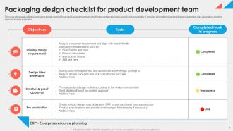
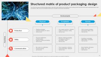
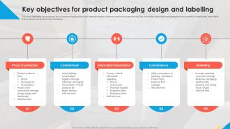
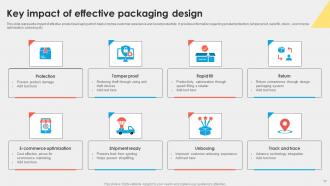
Figure out what your package actually needs to do first - protect stuff, store it properly, tell people what it is. Pretty colors mean jack if the thing falls apart in shipping, you know? Build your design around those basics. Make sure people can easily read the product name, what it does, how to use it. Your fonts and colors should help with that, not just look trendy. Visual hierarchy is huge here - guide their eyes to the important stuff first. Oh, and test it with real people early. They'll catch weird issues you totally missed.
Honestly, think of unboxing like you're telling a story through each layer. Make the outside packaging something people actually want to post - Instagram loves that stuff. Then build up the anticipation as they go deeper. Quality materials are worth it, plus little surprises like tissue paper or thank you notes (cheesy but it works). The reveal sequence is everything - each layer should amp up the excitement. Oh, and tape placement actually matters way more than you'd think because nobody wants to wreck pretty packaging just to get inside. Those first 30 seconds need to feel special.
Dude, packaging is everything when it comes to shelf appeal. You've got like 3 seconds max before someone walks past your product. Bold colors and clean fonts are your best friends here - white space too, don't cram everything together. Put your product name first, then benefits, then whatever else. I swear I've watched good products totally bomb because their packaging looked like garbage or was just confusing. Oh, and make sure people can read your main message from across the aisle. That alone puts you ahead of half your competition.
Dude, packaging is SO culturally specific - you can't just slap the same design everywhere. Like, white packaging screams "pure and clean" here but represents death in parts of Asia. Red's lucky in China but spells danger in other places. You've gotta think about reading direction too (some cultures read right to left), plus local shopping habits and religious stuff. Honestly, I've seen companies bomb because they didn't research this. My advice? Find local designers who actually get the culture - they'll save you from major embarrassment and lost sales.
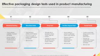
Don't overcomplicate things - cramming too much text and graphics just makes everything look messy. Also, picking cheap materials that won't actually protect your product? Huge mistake. Your packaging needs to pop on shelves next to competitors, but honestly, half the battle is just making sure it works for real people. Test it out first! Even asking a few friends for feedback beats discovering problems after you've already printed thousands. Oh, and think about how it'll hold up during shipping - I've seen too many beautiful designs that arrive completely destroyed.
Listen, shipping packages is way different than just making them look pretty on a shelf. Keep it light so you don't get killed on shipping fees, but make sure it can handle getting thrown around - delivery drivers aren't exactly gentle lol. Don't go crazy with tape and plastic because nobody wants to fight their way into a package. Add some nice touches like tissue paper or a thank you note to make opening it feel special. Oh, and definitely ship one to yourself first to test it out. Trust me on that one.
Honestly, the packaging world is getting wild right now. Smart tech like QR codes and NFC chips are everywhere - customers can literally interact with your box through their phones. Sustainable stuff is blowing up too: seaweed films, mushroom packaging that actually breaks down instead of sitting in landfills forever. AR lets people "try" products virtually, which is pretty sick. 3D printing makes custom packaging affordable even for small batches now. AI's optimizing shapes to cut shipping waste, though that feels a bit dystopian to me lol. I'd probably start with sustainable materials that fit your current products.
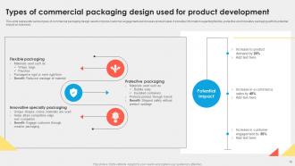
Honestly, just go with mono-materials if you can - all paper or all plastic. Mixed stuff is such a pain for recycling places to deal with. Skip the metallic foils and those little plastic windows too, even though they look fancy. Heavy dyes make processing harder, so keep colors simple. Here's the thing - design it so people can actually take it apart easily. Tear strips work great, or those perforated sections you can snap off. Don't go crazy with adhesives either. Start sketching ideas where everything separates cleanly!
Focus on contrast and bigger fonts first - visual stuff is huge. Braille or raised textures help too, even basic dots work. Your packaging better not require a crowbar to open (I'm looking at you, literally every electronics package). Easy-grip surfaces are clutch. Clear instructions with simple icons, not tiny text everywhere. Testing with actual users who have disabilities is where you'll learn the most - they catch things you'd never notice. Oh, and tear strips! Why don't more companies use those? Seriously though, functional accessibility matters just as much as visual.
Honestly, regulations will make or break your packaging design depending on what you're selling. Pharma stuff needs tamper-proof seals and child-resistant caps - plus all that tiny print nobody reads. Food packaging? FDA gets picky about what materials touch your product, and don't get me started on nutrition labels. Medical devices are probably the most intense because everything has to stay sterile through the whole process. Even cosmetics have ingredient rules now. Oh, and anything hazardous needs those warning symbols that look like they're from a sci-fi movie. Talk to your regulatory team early though - fixing compliance issues later costs a fortune.
-
Kudos to SlideTeam for achieving the high success rate in delivering the top-notch slides.
-
Great work on designing the presentation. I just loved it!