


Hse Powerpoint Ppt Template Bundles





Try Before you Buy Download Free Sample Product
 Impress Your
 Audience
 100%
100% Editable
 Save Hours
 of Time


Introducing our comprehensive PowerPoint PPT presentation on Health, Safety, and Environmental HSE management. This professionally designed presentation offers a detailed overview of the essential aspects of an effective health and safety management system, incorporating a robust health, safety, and environmental framework. The PPT highlights key elements necessary for a successful HSE program, including risk assessment, incident reporting, emergency response protocols, and rraining and induction. It provides valuable insights into best practices and industry standards, helping organizations establish a culture of safety and well-being. Additionally, the presentation features an HSE report template and emphasizes the importance of conducting internal audits to ensure continuous improvement. With various approaches and an HSE internal audit checklist, this PPT is a valuable resource for any organization striving to enhance their health and safety practices.
People who downloaded this PowerPoint presentation also viewed the following :
Hse Powerpoint Ppt Template Bundles with all 19 slides:
Use our Hse Powerpoint Ppt Template Bundles to effectively help you save your valuable time. They are readymade to fit into any presentation structure.
-

HSE
-
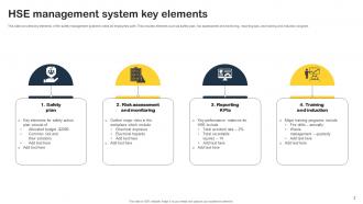
HSE management system key elements
-
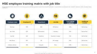
HSE employee training matrix with job title
-
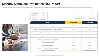
Monthly workplace evaluation HSE report
-
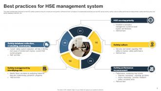
Best practices for HSE management system
-
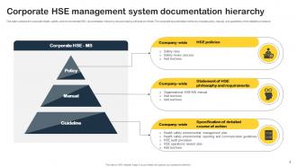
Corporate HSE management system documentation hierarchy
-
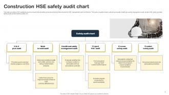
Construction HSE safety audit chart
-
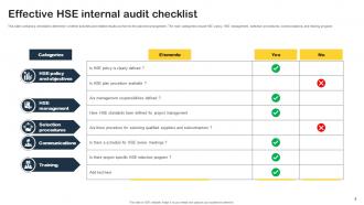
Effective HSE internal audit checklist
-
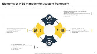
Elements of HSE management system framework
-
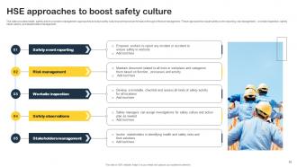
HSE approaches to boost safety culture
-

HSE equipment maintenance dashboard for safety professionals
-
HSE employee training plan icon
-
HSE icon with personal protective equipment
-

Thanks for watching
-

-

-

-

-

FAQs for Hse Powerpoint
Honestly, just focus on getting templates that actually have the HSE stuff you need - incident reports, risk assessments, all that. Clean designs work best because flashy animations look ridiculous when you're talking about workplace safety. Customizable colors are a must for your company branding. I'd definitely look for ones with timelines and process flows built in - super helpful for training presentations. Multiple layouts keep things from getting stale. Oh, and this is huge - make sure it comes with editable safety icons. You'll thank me later when you're not googling "hazard symbols" at 10pm before a presentation.
Dude, get the HSE templates - they're actually worth it. Your safety presentations won't look like garbage anymore, and people might actually pay attention instead of zoning out. You get pre-made slides for all the usual stuff like risk assessments and incident reports. No more staring at blank PowerPoint wondering where to start. The templates keep everything looking consistent, which somehow makes people remember things better. Most come with interactive bits too. Oh, and you can track what you've covered across different sessions way easier. Start with their popular safety bundle - I probably saved like 6 hours last week alone using it.
Oil & gas, construction, manufacturing - basically anywhere people can get seriously hurt. These places have crazy safety regulations and workers need crystal clear communication about risks. Mining and chemical processing too, obviously. Healthcare and aviation companies use them a ton since one screwup can be devastating. Honestly, logistics might seem boring but they're all over HSE templates. If you're constantly doing safety presentations or training materials, these templates will save you hours. Way better than starting from scratch every time, and your presentations won't look like garbage.
Honestly, customizable HSE stuff is a game changer because you can actually make it relevant to your people. Throw in photos of your actual facility instead of stock images. Update the numbers with real data from your workplace. When you reference equipment they use every day or scenarios they'd actually face? Night and day difference in engagement. Generic content is where presentations go to die - I swear people's eyes glaze over the second they realize it's not about them. Short version: make it feel personal and you'll actually hold their attention. Your team will thank you for not making them sit through another cookie-cutter safety meeting.
Oh man, you definitely need good visuals for HSE stuff! People's brains just shut off when you throw statistics at them. Charts and infographics actually make that data stick instead of going in one ear and out the other. Real workplace photos work great too - way better than trying to explain abstract safety concepts with just words. I've seen people pay attention to a simple emergency flowchart when they'd completely zone out during a bulleted list. Honestly, anything that makes safety training feel less like a boring lecture is worth it. Your goal is making it memorable, not just checking the training box.
Honestly, stick with stuff everyone gets no matter what job they do. "Going Home Safe Every Day" hits different because it's about family, you know? "Safety is Everyone's Responsibility" and "See Something, Say Something" work too - makes everyone feel like they're part of it. I really like "Small Actions, Big Impact" since it doesn't make people feel overwhelmed. Oh, and definitely use visuals with different workplace scenarios so teams actually see themselves in it. Focus on teamwork instead of pointing fingers. Test a few themes with different departments first though - what works for one group might totally flop with another.
Visualization tools are game-changers for HSE data - way better than staring at endless spreadsheet rows. Heat maps show you exactly where incidents cluster, trend lines reveal if your safety programs actually work, and dashboards give real-time updates. You'll spot patterns fast: which departments are risky, what time periods suck, compliance gaps you missed. Leadership loves charts too - much more convincing than raw numbers when you're asking for budget. I'd start with your most critical KPIs first, then build from there. Makes presenting to executives so much easier.
Dude, those HSE templates are honestly a lifesaver. They come with all the compliance stuff already built in - risk assessments, safety protocols, incident reporting forms. No more staring at a blank slide wondering what you forgot. I learned this the hard way after an auditor called out missing documentation last year. The templates match industry standards too, so you're not scrambling to figure out the right format. Your safety briefings will breeze through approval. Trust me, just grab one of these templates and you'll wonder why you ever started from scratch.
Honestly, these templates are a lifesaver for risk assessment meetings. You get pre-built slides with hazard ID frameworks, risk matrices, all that stuff already laid out. No more staring at blank PowerPoint wondering where to start. They keep everyone focused instead of wandering off into random tangents (which happens way too often in safety meetings, let's be real). The visual consistency is nice too - makes you look like you actually know what you're doing. You'll hit all the important boxes: likelihood, severity, controls. Easy to customize for whatever project you're working on. Grab a bundle and you're done in minutes.
Make sure your videos actually relate to safety stuff - don't just throw in random stock footage because it looks awful. Good quality videos showing real procedures work best. Audio needs to be crystal clear since you're probably presenting in some loud conference room. Screenshots are perfect for showing dashboards or incident reports, honestly way better than trying to explain them. File sizes matter too - nothing worse than your presentation freezing halfway through (trust me on this one). Always have a backup ready without any multimedia just in case. Test everything first and throw captions on videos if you can.
For HSE templates, I always go with inclusive imagery and mix up the demographics - nobody wants to see the same type of person in every safety poster. Honestly, stick figures are clutch here since they sidestep the whole issue entirely. Neutral colors work better too. Skip anything too region-specific that might confuse people from different backgrounds. Icons beat photos of actual people most of the time. Before you launch anything, run it by coworkers from different cultures - saved my butt more than once. The goal is keeping safety universal while not stepping on anyone's toes culturally.
Don't cram every detail onto one slide - that's the worst thing you can do with HSE templates. Keep it visual, minimal text. Also, resist the urge to mess with their color scheme because those colors are chosen for accessibility compliance (learned that the hard way). Break complex safety stuff across multiple slides instead. Oh, and actually use those built-in icons they give you - I know they might look boring but they maintain consistency. Always preview in slideshow mode too. Trust me, you'll catch formatting weirdness that way.
Every 6-12 months is usually good, or whenever big regulatory stuff changes. Set a quarterly reminder though - seriously saves you from that last-minute panic when your boss needs templates ASAP. I'd also watch for new safety regs, company policy updates, or if your slides start looking super dated design-wise. Quick story - my old team was still using 2019 safety data until someone called us out in a meeting. Super awkward. Just stay on top of best practice changes too and you'll be golden.
Honestly, go with expert-designed HSE templates every time. They're built by actual safety professionals who know what auditors want to see. You'll get ready-made frameworks for incident reports, risk assessments, training modules - all that stuff that normally takes forever to create. Generic templates are basically just pretty backgrounds that leave you doing all the work anyway. The expert ones follow compliance standards too, so you won't accidentally skip something important. Trust me, your prep time gets cut in half and you look way more professional. Worth every penny.
Honestly, feedback is everything for making better HSE templates. Send out quick surveys after presentations or just watch people's faces - are they actually paying attention or scrolling their phones? I always look for patterns in the questions they ask and which parts seem to confuse everyone. Maybe your hazard icons suck, or people need more room to write site-specific stuff. Once you spot these trends, work with your design folks to fix the templates. It's way more effective than guessing what works. Oh, and direct comments are gold too - people will tell you exactly what's not clicking.
-
Their designing team is so expert in making tailored templates. They craft the exact thing I have in my mind…..really happy.
-
Amazing variety of PowerPoint slides. Really helpful in designing professional presentations.