


User Manual Powerpoint Ppt Template Bundles




Try Before you Buy Download Free Sample Product
 Impress Your
 Audience
 100%
100% Editable
 Save Hours
 of Time


Introducing our comprehensive PowerPoint presentation on User Manual, the quintessential guide for unlocking the full potential of your product. This user friendly resource covers every aspect of functionality, serving as an indispensable User Guide, Instruction Manual, and Product Manual. Navigate seamlessly through the intricacies of your device with the clarity provided in this User Handbook. From troubleshooting tips to step by step procedures, our User Documentation ensures a smooth and informed user experience. Empower your users with the knowledge they need to maximize product benefits. Elevate customer satisfaction and reduce support queries by making this detailed and visually engaging User Manual an integral part of your product package.
People who downloaded this PowerPoint presentation also viewed the following :
User Manual Powerpoint Ppt Template Bundles with all 19 slides:
Use our User Manual Powerpoint Ppt Template Bundles to effectively help you save your valuable time. They are readymade to fit into any presentation structure.












FAQs for User Manual Powerpoint
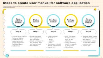
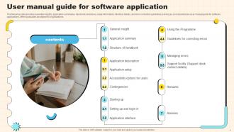
Start with a solid title slide and table of contents - sounds boring but people actually use those. Break everything into step-by-step slides with screenshots (visuals are your friend here). Keep your fonts consistent because honestly, random formatting looks super unprofessional. Don't forget troubleshooting and FAQ sections - that's where you'll save yourself tons of support emails later. Add contact info and slide numbers too. Oh, and if you're using technical terms, throw in a glossary. One concept per slide keeps things digestible.
Honestly, visual design is like a cheat code for getting people to actually absorb information. Colors, icons, clear layouts - your brain just eats that stuff up compared to boring text blocks. I mean, would you rather decode a paragraph about fixing something or just follow a simple flowchart? No contest. Good typography pulls readers through content without them even thinking about it. White space stops their brain from shutting down too. Oh, and don't go crazy with effects - every visual needs a job, whether it's explaining something or organizing it. Replace those dense paragraphs with infographics and you'll see the difference immediately.
Go for templates with editable master slides and color schemes you can actually swap out without losing your mind. Auto-resizing text boxes are clutch. The modular ones work best - you know, step-by-step layouts, FAQ sections, troubleshooting pages you can mix around. Most templates are honestly trash because they're too rigid. Find ones with built-in font options and icon libraries so you're not scrambling for graphics later. Oh, and get both light and dark versions - never know which one your brand will need.
Definitely start with a table of contents slide - makes it way easier for people to jump around. Put your most important stuff up front because honestly, half the people won't make it past slide 3 anyway lol. I like doing intro, then step-by-step walkthrough, troubleshooting, and FAQs. Don't cram everything onto one slide though - break complex stuff into separate ones. Keep your layouts consistent so it doesn't look messy. Oh and add a quick reference section at the end with shortcuts and contact info. Trust me, people love that.
Your logo and brand colors throughout the manual make a huge difference - people actually trust it more when everything looks official. I've seen manuals that look like they were thrown together in 5 minutes, and honestly? Nobody follows those instructions. Keep your fonts consistent too. Users navigate way better when they recognize your visual style from page to page. The whole thing just feels more authoritative when you're not mixing random formatting everywhere. Oh, and don't forget logo placement - that stuff matters more than you'd think for making people take your documentation seriously.
Only add videos or audio when text just won't cut it for explaining something complicated. High-res screenshots are perfect for step-by-step stuff. Videos in PowerPoint? Total pain because the files get huge - I usually just link to YouTube or whatever instead. Test everything on different devices first! Your laptop might handle it fine while someone's phone completely chokes. Oh, and always have a backup version without all the fancy multimedia because technology loves to mess with you at the worst possible moments. Also throw in some text descriptions for accessibility.
For your PowerPoint manual template, start with high contrast colors - but seriously avoid red/green combos since that's the most common colorblind issue. Font size should be at least 12pt, though I'd go bigger for manuals honestly. Alt text on all images is a must. Structure your headings properly so screen readers can jump around easily. PowerPoint has a built-in accessibility checker that's actually pretty decent, so run it through that. Testing with real users is ideal but I know that's not always realistic. Oh, and don't make your text too cramped - white space is your friend here.
Flowcharts are your go-to for user manuals, plus step-by-step diagrams work great. Screenshots with callouts? Game changer for software stuff - seriously, use them everywhere. Skip pie charts and fancy data viz since they're useless when someone's trying to figure out how to actually do something. Before-and-after diagrams are clutch, and decision trees help with troubleshooting (which, let's be honest, is half of what people need manuals for anyway). Keep everything straightforward so users don't get confused. I'd start with basic flowcharts for your main processes, then add other stuff as needed.
So here's what works - pick a realistic person doing a real task, like "Maria's trying to get this accounting software running before month-end." Way better than boring step lists! Walk through each instruction as part of her story. Screenshots should follow the same scenario too. Honestly, people remember stories way better than random procedures. When you hit troubleshooting sections, frame it like "If Maria runs into this error..." The whole manual becomes this journey instead of just technical stuff. Pick one solid use case and stick with that character throughout - it'll feel so much more natural to read.
Oh man, don't cram everything onto one slide - nobody wants to squint at tiny text! I've literally seen templates that look like someone exploded a design magazine all over PowerPoint. Keep your colors simple and consistent. White space is your friend here. One thing I learned the hard way? Test it with real content first, not just placeholder text. Your audience needs to follow along step-by-step, so honestly clarity beats looking fancy every single time. Short sentences work. Don't overthink the layout either.
User feedback is honestly the best way to fix your template issues. People will straight up tell you what's broken or confusing - way better than guessing. I usually just ask them directly after they use it, or sometimes do quick surveys. You know what's funny? Users always catch stuff I completely miss because I'm staring at the same design for hours. They'll be like "this font is tiny" or "I have no idea what this section means." Just listen to what they say and actually make changes. Don't overthink it - set up something simple where you can collect feedback regularly and your template will improve fast.
Dude, seriously - good color schemes make or break manual presentations. I learned this the hard way after watching people's eyes glaze over during a training I ran last year. Anyway, here's what actually works: stick to 2-3 colors max and use contrast so people can actually read the thing. Consistent colors help create that visual hierarchy where important stuff stands out. You know those manuals that are just walls of black text? Total engagement killer. When you've got the right colors, people follow along way better and retain more info. Your audience will definitely notice the difference.
I usually go for like 60% text, 40% visuals, but it really changes based on what you're explaining. Screenshots and diagrams are lifesavers for breaking up those walls of text - nobody wants to read a novel on each slide. Max 3-4 lines of text at a time, and use visuals to actually show stuff instead of just making things look pretty. Quick test I do: if someone can't get the main idea in 5 seconds, there's too much text happening. Oh, and make sure your visuals actually help explain things rather than just taking up space.
One action verb per slide keeps people from getting overwhelmed. Screenshots are clutch - way better than making someone read through everything (and you'll get fewer "wait, what?" messages later). Number your steps but don't go crazy with bullet points everywhere. Honestly, adding those little "here's what you should see" boxes saves so much confusion. Write like you're actually there with them, not like a manual. Oh, and definitely test it with someone who's clueless about the process first - they'll catch stuff you totally missed.
Honestly, icons are a game-changer for user manuals. That little warning triangle? Way more effective than three sentences explaining "proceed with caution." People scan documents differently now - they want quick visual cues, not paragraphs to decode. You'll create better flow by using symbols to break up sections and guide readers through processes step by step. The language barrier thing is pretty cool too - a trash can icon means delete whether you speak English or not. Just don't get creative with weird symbols nobody recognizes, and stay consistent throughout.
-
I am so thankful for all of the templates I've found on your site. They have saved me hours every week and helped make my presentations come alive. Keep up with these amazing product releases!
-
Kudos to SlideTeam for achieving the high success rate in delivering the top-notch slides.