


EDI Powerpoint Ppt Template Bundles





Try Before you Buy Download Free Sample Product
 Impress Your
Audience
 100%
Editable
 Save Hours
of Time


Our EDI Powerpoint Ppt Template Bundles are topically designed to provide an attractive backdrop to any subject. Use them to look like a presentation pro.
People who downloaded this PowerPoint presentation also viewed the following :
EDI Powerpoint Ppt Template Bundles with all 22 slides:
Use our EDI Powerpoint Ppt Template Bundles to effectively help you save your valuable time. They are readymade to fit into any presentation structure.





FAQs for EDI Powerpoint
Honestly, start with templates that actually show diverse people in the images - not just stock photo diversity theater. Clean layouts work best since you don't want cheesy clipart stealing focus from your message. High contrast colors and readable fonts are clutch for accessibility. Make sure it has different slide types built in (title slides, comparison charts, etc.) so you're not rebuilding everything from scratch. Oh, and check that the icons actually make sense with your content. The right template should amplify what you're saying, not make you fight against bad design choices.
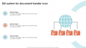
Honestly, these templates are lifesavers when you're trying to explain EDI stuff. They come with all the flowcharts and network diagrams already built in - way less painful than building everything from scratch. The visuals actually help people understand how electronic documents flow between companies, which is super hard to explain with just text. Most templates keep everything looking clean and professional too. Oh, and definitely swap in your own real examples instead of their generic ones. Makes a huge difference when people can relate to actual scenarios they might deal with.
Oh totally! First thing - ditch the cheesy stock photos and use images that actually represent real communities. Make sure your color contrast is solid because what's the point of talking inclusion if people can't even read your slides? I've seen way too many presentations with microscopic text that defeats the whole purpose. Simple layouts work best, plus readable fonts are non-negotiable. Honestly, the whole thing should practice what you're preaching - your design choices need to back up your message, not just look pretty.
Start with clear EDI definitions, then add your current demographic data and goals. Most templates totally bomb on the metrics section - way too vague to be useful. Include key initiatives and specific action items with real timelines. Don't forget budget allocation and leadership commitment statements. The storytelling part is crucial though - you need actual employee voices in there. I'd make it modular so you can swap sections depending on who you're presenting to. Oh, and accountability measures are non-negotiable if you want this to actually work.
Hey! So for EDI templates, first hit View > Slide Master - that's where the magic happens. Change up the colors, fonts, and swap in your logo there. Honestly, getting the color scheme right is such a pain but worth it. Short sentences work. Then grab some images that actually fit your company instead of those weird stock photos everyone uses. Oh, and definitely save it as a new template when you're done so your whole team can use the branded version. Way easier than everyone doing their own thing.
Honestly, healthcare, tech, and finance crush it with EDI presentations - they're drowning in regulations and have stakeholders breathing down their necks constantly. Manufacturing's getting better at this stuff too. Really, any company with messy supply chains should jump on this. Board meetings? Investor pitches? That's where these templates shine because those people want to see the diversity numbers upfront. Oh, and compliance teams eat this up. My advice? Find templates that actually match your industry's rules first, then tweak them. Don't just grab some generic template and hope it works.
So basically, EDI templates save you from making those awful presentations where everyone's eyes glaze over. You know the ones - packed with technical garbage about transaction sets that nobody cares about. These templates give you clean diagrams and simple language instead. Start with the big picture flow, then maybe get into details if people actually want them. I swear, half the EDI presentations I've sat through just confuse the hell out of everyone. The templates help you focus on what actually matters: how data moves around, what changes happen, and why the business should care. Way less painful for everyone involved.
Can't give you specific client names obviously, but EDI templates are great for diversity training, inclusion workshops, and those big board reports. What really matters is the accessibility stuff - good contrast, readable fonts, clean layouts. The magic happens during all-hands DEI meetings because everyone's seeing the same visual story. Honestly, standardized messaging across different audiences is where you'll see the biggest impact. Oh, and definitely talk to your internal comms people first - they probably have case studies sitting around from past company presentations you could totally steal ideas from.
Dude, definitely go with high contrast colors - navy and white work great, or dark gray on light backgrounds. Trust me, I bombed a presentation once using light gray text that nobody could read from the back! Sans-serif fonts are your friend here: Arial, Calibri, Helvetica. Way cleaner than those decorative fonts that make dyslexic people's lives harder. Oh, and bump that font size to at least 24pt - might look huge on your laptop but it's perfect for the room. Honestly, your slides should practice what you're preaching about inclusive design anyway.
Honestly, visuals work because our brains are just wired that way - we process images way faster than text. Nobody's going to remember your boring bullet points about inclusion stats, but throw that same data into a good infographic? Suddenly people actually retain it. I always tell people to ditch at least half their text slides. Your audience gets multiple ways to absorb the same info when you mix visuals with what you're saying. Creates better memory pathways or whatever. Trust me, icons and charts beat walls of text every single time. People will actually walk away remembering your key diversity metrics instead of zoning out.
Okay so first thing - don't stuff your slides with walls of text. EDI stuff needs space to actually land with people. Those generic stock photos are the worst too, like when companies use obviously fake "diverse" team shots that scream stock photo. Ugh. Customize the content for real instead of just swapping in your company logo. But honestly? The biggest mistake is skipping feedback from your ERG groups beforehand. Run it by them first - they'll catch things you totally missed. Trust me on this one.
Honestly, the biggest thing is mixing up your format so people don't fall asleep. Text-heavy slides are the worst - I've sat through way too many boring EDI presentations where everyone just checks out. Throw in some polls or quick group discussions every few slides. Personal stories work great too, or even short videos if you've got them. Keep your slides clean with images that actually make sense (not just random stock photos). Oh, and ask questions! Once it becomes you talking at people instead of with them, you've lost the room. Short breaks for discussion are everything.
Oh totally! Salesforce's Ohana culture thing is a great example - they have solid before/after numbers. Ben & Jerry's supplier diversity program works well too. Honestly, accessibility case studies are my favorite because you can actually show the visual changes in your slides, which keeps people engaged. Accenture did some interesting hiring restructure stuff that could work depending on your audience. Just make sure whatever you pick has real data, not just feel-good stories. Pick maybe 2-3 that actually relate to your industry and build around those.
Okay so storytelling is everything with EDI presentations - you're basically trying to change how people think, not just dump data on them. Templates help here because they can guide you through the whole arc: what's happening now, who gets hurt, where we want to go. I swear, most EDI talks are just boring charts and bullet points that put everyone to sleep. But tell someone's actual story? Walk through a real scenario? People suddenly give a shit. Oh and pick templates that are super clean - you want the story to shine, not compete with some crazy busy design that distracts everyone.
Oh man, polls are seriously your best friend here - they'll wake people up fast! Start with clickable navigation buttons between sections, then throw in some Q&A slides where people can actually participate. Hyperlinks to videos or resources work great too. Interactive infographics are cool if they fit your content. Just don't go crazy with it though - pick maybe 2 or 3 things that actually make sense for what you're presenting. I'd honestly start simple with the navigation stuff and add more later. Way better than those boring slide-after-slide presentations everyone zones out during.
-
Templates are beautiful and easy to use. An amateur can also create a presentation using these slides. It is amazing.
-
I am not the best at presentations but using SlideTeam’s PPT template made it easier for me. Thank you SlideTeam!