


EV PowerPoint PPT Template Bundles




Try Before you Buy Download Free Sample Product
 Impress Your
 Audience
 100%
100% Editable
 Save Hours
 of Time


Our EV PowerPoint PPT Template Bundles are topically designed to provide an attractive backdrop to any subject. Use them to look like a presentation pro.
People who downloaded this PowerPoint presentation also viewed the following :
EV PowerPoint PPT Template Bundles with all 22 slides:
Use our EV PowerPoint PPT Template Bundles to effectively help you save your valuable time. They are readymade to fit into any presentation structure.






FAQs for EV PowerPoint
For your EV deck, start with clean charts showing charging infrastructure and battery performance - that data really sells itself. Vehicle imagery sections are obvious must-haves. Timeline templates work great for adoption trends, plus you'll need environmental impact slides since that's where people get excited. Honestly, comparison templates for gas vs electric are probably your strongest slides. Don't forget icon sets for different EV types and charging stations to keep things looking polished. Oh, and sustainability symbols tie everything together visually. That should give you a solid foundation to build from.
Good visuals are everything for EV presentations, trust me. Clean graphics and consistent colors keep people engaged instead of scrolling Instagram. That EV template bundle has solid vehicle mockups and energy icons that make boring battery specs actually interesting - because honestly, who wants to read paragraphs about kilowatt hours? Smart design lets you craft a real story about sustainability rather than just throwing data at people. Those visual elements basically walk your audience from "here's the problem" to "here's how we fix it." Way more effective than text-heavy slides.
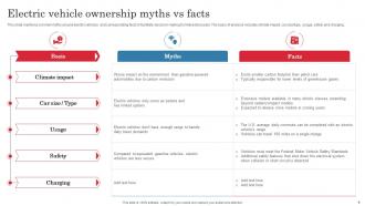
Honestly, you'll mainly be fighting three big myths. Range anxiety is huge - people think EVs die after 100 miles or whatever, but most new ones go 250+ miles easily. Charging time is another one, though fast-charging stations are literally everywhere now. Cost gets tricky because everyone fixates on that sticker price instead of looking at the actual savings over time. Oh, and there's this annoying thing where people claim they're worse for the environment? Total BS, even with battery manufacturing factored in. I'd throw in some real charts showing charging infrastructure growth - those visual comparisons really shut down the arguments fast.
Dude, infographics are game-changers for EV presentations. People zone out hard when you dump spreadsheet data on them - I've seen it happen way too many times. But throw in some clean charts and icons? Suddenly everyone gets it. Your charging stats and range comparisons become these visual stories that actually make sense. Engineers love their numbers, but everyone else needs to see the bigger picture. Trust me, swap out one boring data table for a solid infographic next time. You'll notice people leaning forward instead of checking their phones.
Honestly, colors matter way more than people think for EV pitches. Blue's your safest bet - it screams trustworthy and reliable (Tesla nailed this). Green works but literally everyone uses it now, so you might blend in with every other sustainability brand. White and silver give off that clean, futuristic feel people expect from electric cars. Skip the reds and oranges though - they'll remind people of gas stations and exhaust fumes, which is obviously the opposite vibe you want. I'd stick to just 2-3 colors max and keep them consistent. The whole point is making people excited about tomorrow, not stressed about climate change.
Videos of charging stations really help make your EV presentations pop. Battery animations showing power flow are solid too. I'd throw in some interactive charts for range comparisons - way better than boring static slides. Sound effects can work if you don't go crazy with them, like that quiet electric motor hum. Short clips of EVs accelerating silently are pretty cool, or maybe time-lapse charging sequences. Some templates I've seen get way too flashy though. Oh and definitely test your tech beforehand - nothing worse than everything crashing mid-presentation. Trust me on that one.
Dude, you absolutely need consistency in your EV pitch deck. Mismatched fonts and colors? Total amateur hour. Your audience will get distracted by the visual mess instead of listening to what you're actually saying. The EV market is crazy competitive right now, so looking polished matters more than ever. I've seen brilliant ideas get dismissed because the slides looked thrown together last minute. Pick your colors, fonts, and layout style at the beginning. Then don't deviate - I mean it. Even small inconsistencies make investors question if you can execute properly.
Honestly, I'd start with the basics everyone always wants to know - how EVs work, why they're better, where you charge them, and how much they actually cost vs gas cars. Battery tech and range stuff comes next, plus all that environmental impact data. Oh and definitely include government incentives since those change like every month lol. Market trends and adoption charts are gold for execs - they eat that stuff up. Maybe throw in some future predictions about autonomous driving too? But yeah, nail those fundamentals first. You can always get fancy with specialized presentations later once you've got your foundation solid.
Tell stories people actually connect with - like "picture never stopping for gas again" or share real user experiences from your research. That EV template should help you build these narratives into your slides instead of just throwing specs at people. Nobody remembers technical stuff anyway. Try before/after scenarios or cost-saving journeys they can picture themselves in. Environmental stories work too, but honestly the money angle usually hits harder. Make EVs feel personal to their actual lives. Find one solid story thread and let it carry your whole presentation.
Your EV charts should tell one clear story - battery trends, charging growth, whatever. Stick with greens and blues, they just look right for energy stuff. Bar charts work great for comparing models. Line graphs are perfect for adoption rates over time. Pie charts... honestly I'd avoid them unless you're doing market share. Don't overcrowd slides or people zone out. Label your axes clearly with actual units like kWh. Oh, and always cite your data source at the bottom - learned that one the hard way.
Yeah, so you just swap out the content blocks and change up the tone depending on who you're talking to. Investors want all the money stuff - ROI numbers, market forecasts, financial data. But for regular consumers? Focus on what they actually give a damn about: saving money, how easy it is to use, helping the planet. Policymakers are different - they care about infrastructure requirements and regulatory stuff, plus economic development angles. The templates are modular, which is honestly pretty convenient. You can just mix and match the relevant slides instead of building everything from scratch every time.
Dude, go with clean fonts like Calibri or Arial for EV stuff - those battery charts are already confusing enough without people struggling to read Comic Sans or whatever. Make your text at least 24pt so people in the back can actually see it. Headers should be bigger and bold, obviously. Honestly, I've seen way too many presentations that use like 5 different fonts and look completely chaotic. Stick to max two font families. Oh and here's something I learned the hard way - always check how your slides look from across the room before you present. You'd be surprised how tiny text looks when you're not right up on the screen.
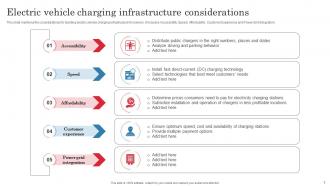
Honestly, these templates are lifesavers for breaking down all that messy infrastructure stuff. You'll get way better engagement when people can actually see maps and diagrams instead of just listening to you ramble about charging networks. The visual frameworks make everything click - where stations go, how they connect, timeline breakdowns. Plus they keep your cost presentations consistent, which is huge during those long planning meetings (trust me on this one). Timeline slides are clutch too. Just make sure you snag one with decent mapping features and those little infrastructure icons.
Honestly, case studies are a game changer for EV presentations. You're basically showing real proof instead of just boring stats. Companies that actually made the switch to electric fleets? That's way more convincing than theoretical stuff. Your audience can actually picture how it'd work for them too. I always grab 2-3 examples that match whoever I'm presenting to - like if it's logistics companies, find logistics success stories. Also breaks up those heavy technical slides which... let's be real, nobody wants to sit through slide after slide of specs. Real examples just hit different.
Honestly, user feedback is everything for your EV template bundle. People will straight-up tell you what's missing - like when they're begging for more battery comparison charts or charging station slides. You'll be shocked how passionate folks get about color choices too (apparently everyone has feelings about green vs blue for sustainability stuff). Watch for complaints about cluttered layouts since EV content gets super technical really fast. Just throw a quick feedback form with each download. Oh, and definitely listen when they say there's too much text - nobody wants to read paragraphs during a presentation.
-
I can always count on your designs for my professional needs. I believe I found a one-stop-shop for PPTs.
-
Stunning collection! With a wide variety of options available, I was able to find a perfect slide for my presentation. Thank you, SlideTeam!