


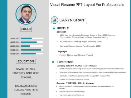
Visual resume ppt layout for professionals




Try Before you Buy Download Free Sample Product
 Impress Your
 Audience
 100%
100% Editable
 Save Hours
 of Time


Drive folks to implement directions with our Visual Resume Ppt Layout For Professionals. It will energize the administration.
People who downloaded this PowerPoint presentation also viewed the following :
Visual resume ppt layout for professionals with all 5 slides:
Give them enough information to chew on with our Visual Resume Ppt Layout For Professionals. Be able to bombard their brains.
FAQs for Visual resume ppt
Okay so first thing - put your contact info right at the top where they can't miss it. Use bullet points everywhere because hiring managers are basically just scanning for keywords anyway. Keep your sections organized (experience, skills, education) and don't go crazy with fonts or colors. Seriously, I've seen resumes that look like a unicorn threw up on them and it's just distracting. Stick to maybe 2-3 colors tops. White space is your friend too - it makes everything easier to read. Just make sure everything lines up properly and you'll be good to go.
So basically a visual resume swaps out boring black text for graphics, charts, icons - the whole nine yards. It's like turning your work history into an infographic. Progress bars show your skill levels, icons break up different sections, and you can throw in colors that match your vibe. Creative people love these things, especially in design or marketing since it's literally proof you can make stuff look good. Only downside? Most online application systems are still stuck in the stone age and can't read them properly. I'd definitely keep a regular version around for when you're applying through company websites and stuff.
Honestly, just go with navy, charcoal, or maybe deep green with white backgrounds. Most industries play it safe that way. Creative jobs can get away with bolder stuff, but I've watched so many people bomb with like... neon pink thinking they're being innovative. Finance and tech guys? Stick to blues and grays, trust me. Healthcare does well with those calming blues or greens. Oh, and one accent color tops - your actual work should be what pops, not some wild color combo. Print a test copy first though. Colors look different on paper than your screen.
Think of icons as visual breadcrumbs that guide recruiters through your resume without them getting lost in text blocks. I usually throw them next to contact info and skills - makes everything way easier to scan. Don't get me wrong, your qualifications still matter most, but a clean layout with simple icons can be the difference between someone actually reading your stuff or moving on. Keep it professional though. I've seen resumes that look like someone went crazy with clip art, and honestly? It's distracting. Start small and see what works.
Honestly, the worst thing you can do is go overboard with design stuff. I've seen resumes where you literally can't find basic info because it's drowning in graphics and weird fonts. Keep your colors simple - maybe 2 or 3 max. Also, those ATS systems are picky as hell, so too many images will kill your chances before a human even sees it. White space is your friend here. Print it in black and white first - if it looks terrible, you know you went too far. Clean beats flashy every time.
Honestly, just tweak it based on what they're looking for. Tech job? Make your skills section way more detailed and move it up top. Creative role? Show off more portfolio stuff. Match their vibe too - startups usually dig bold colors, but banks and law firms want that boring professional look (sorry, but it's true). Scan their job posting for specific keywords and sprinkle those exact words throughout your resume. Trust me on this one. Oh, and save different versions so you're not recreating the wheel every time you apply somewhere new.
Hey! Same basic stuff as regular resumes - contact info, summary, skills, work history with dates, education. Just make it visual. Don't go crazy with the design though, I've seen some that look like abstract art lol. Clean charts for skills work well, maybe icons for contact stuff or timeline layouts. Keep it readable first, pretty second. One thing - save a plain text backup since some companies still use those boring applicant systems that can't read fancy formatting. The design should help tell your story, not distract from it.
Look, whitespace is like the secret weapon everyone ignores. Your resume needs room to breathe or it'll look like a hot mess - I've definitely been guilty of cramming too much stuff on there before. Around 20-30% should be empty space, which sounds like a lot but trust me. It helps guide where people look first. Short sections work better than walls of text. The hiring manager's eyes need somewhere to rest, you know? Plus it makes your best accomplishments stand out instead of getting buried in a sea of words.
Canva's probably your best bet - super easy to use and has a million templates. No design experience needed. If you're feeling ambitious and want total control, Adobe InDesign is what the pros use, but fair warning, it takes some time to figure out. Figma's another solid option that's free and runs in your browser, which is nice. Hell, I've even seen people make decent ones in PowerPoint if you get creative with it! Just whatever you do, don't go overboard with fancy stuff. Recruiters need to actually read the thing quickly.
Okay so try making your resume tell an actual story. Timeline formats work really well for showing your career path. Under each job, drop in quick challenge-solution bits that show what problems you solved. Icons and little infographics make everything pop way more than plain text—trust me on this one. Most resumes are painfully dull anyway, so even basic storytelling helps you stand out. Oh, and definitely add a "career highlights" section that reads like mini success stories. The whole point is connecting your experiences to real results so recruiters can follow your growth easily.
Helvetica, Arial, or Calibri are your safest bets - they look clean and read easily on any device. Montserrat's pretty solid too if you want something more modern. Don't go crazy with decorative fonts though. They're honestly just distracting and make you look amateur. Body text should be 10-12pt, headers can be 14-16pt. Oh, and stick to max two fonts total - I see people mixing like four different ones and it's a mess. Your resume might get printed or viewed on someone's tiny laptop screen, so readability beats fancy every time.
Honestly, go for clean and professional first, then sprinkle in creative stuff. Modern fonts and subtle color accents work great. Don't make it look like an art project though - I've seen so many that are impossible to read quickly! Your industry matters too. Tech and creative fields? You can get away with more visual flair. Finance or law? Keep it simple. Pick colors and maybe some icons that show your personality without being distracting. Test if it's easy to scan first. Then add the fun touches that actually highlight your skills instead of hiding them.
Think of your resume like a newspaper - what catches your eye first? That's visual hierarchy, and honestly, it's make-or-break for getting noticed. Your name should be the biggest thing on there, then use consistent formatting to create sections that flow down the page. Most important stuff (recent jobs, key skills) needs to pop immediately through size or positioning. I've seen people with incredible backgrounds get passed over because their resume looked like a wall of text. Recruiters will literally skip to the next one if they can't quickly scan yours. Make it easy for them to find your best stuff right away.
Oh totally! Creative fields like graphic design and marketing eat up bold, colorful resumes - they want to see your skills right there on the page. Tech companies are different though, they're more into clean, minimal layouts with maybe some subtle data viz stuff. Finance, law, healthcare? Play it safe with conservative designs that just organize things better, nothing too flashy. I'd definitely check out their websites and social media first to get a feel for their vibe, then match that energy. You don't want to show up looking like a circus poster to a law firm, you know?
So instead of just bullet pointing everything, try turning your wins into actual visuals. Bar charts work great for showing skill levels. Timeline graphics are perfect for career stuff. Even simple icons make things way easier to scan - people sleep on those honestly. Don't go crazy though. You're making a resume, not some fancy dashboard that'll give recruiters a headache. Start small with just your skills section maybe? See how it looks before you chart-ify your entire work history. The whole point is making your stuff pop at first glance.
-
Good
-
Innovative and Colorful designs.
-
Very well designed and informative templates.