


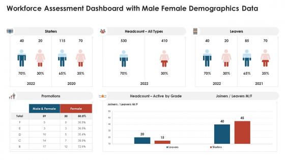
Workforce assessment dashboard with male female demographics data




Try Before you Buy Download Free Sample Product
 Impress Your
 Audience
 100%
100% Editable
 Save Hours
 of Time


Our workforce assessment dashboard with male female demographics data are topically designed to provide an attractive backdrop to any subject. Use them to look like a presentation pro.
People who downloaded this PowerPoint presentation also viewed the following :
Workforce assessment dashboard with male female demographics data with all 10 slides:
Use our workforce assessment dashboard with male female demographics data to effectively help you save your valuable time. They are readymade to fit into any presentation structure.








FAQs for Workforce assessment dashboard with male
Start with the basics - age, gender, race/ethnicity, how long people have been there, education levels, and what departments they're in. Geographic stuff matters too if you've got multiple offices. But honestly? The juicy insights come from tracking hiring trends over time and turnover rates broken down by demographics. That's where you'll actually spot problems. Make sure you can filter everything different ways so leadership can dig into patterns. Oh, and you can always add fancier stuff like promotion rates later once you get the foundation down.
Honestly, your workforce data is like a cheat sheet for recruiting. Look at what you're missing - maybe your engineering team is all dudes, so you know to hit up women-in-tech boards. Age gaps? Different story, different approach. The cool part is seeing who sticks around vs. who bounces. If certain groups are leaving faster, that tells you something about your messaging (or maybe your culture, but that's another conversation). Short version: your current team composition basically tells you exactly who to recruit and where to find them.
Honestly, a demographics dashboard is like having x-ray vision for your company's diversity issues. It shows you exactly where different groups are getting stuck - whether that's in hiring, promotions, or just straight-up leaving. Instead of guessing why your engineering team is 90% dudes, you'll actually see the data behind it. The best part? You can set real goals and make executives answer for whether they're hitting them or not. Plus you'll spot red flags early - like if women keep quitting after 18 months - so you can fix things before they get worse. Way better than flying blind!
So break down turnover by age, gender, race, department, how long they've been there - the usual suspects. The voluntary vs forced exits thing is huge though, tells you if people are jumping ship or getting tossed. Exit interviews are great if you can get honest answers (good luck with that lol). Compare it against who you're hiring to see if certain groups are bailing faster than you're replacing them. I'd honestly start with whatever demographics align with your goals and dig deeper on those first.
Look at your workforce data to find patterns between different groups. Remote workers scoring lower than office folks? Time to rethink your virtual connection game. New hires tanking compared to veterans means your onboarding's probably broken - honestly, most companies mess this up. Break down the numbers by age, department, how long people have been there, location, whatever makes sense. Then actually do something about it instead of letting those insights collect dust. Design specific programs that hit what each group actually needs. Short sentences work here. The whole point is turning data into action that matters.
Honestly, visuals are a game changer for demographic data. People get pie charts way faster than spreadsheet rows - I've watched too many meetings where execs just zone out looking at raw numbers. You'll catch trends and weird outliers that would totally hide in tables otherwise. Interactive dashboards are pretty sweet because users can dig into whatever they actually care about, like specific departments or hiring stats. Just keep your charts clean and make sure they answer the "okay so what does this mean" question right away. Nothing worse than a confusing graph that needs a 10-minute explanation.
So basically, your demographics dashboard shows age and experience spread across teams. Super helpful for catching skills gaps early. Like, you'll notice if half your senior engineers are about to retire (yikes) or if marketing is all new hires. Honestly, the retirement thing keeps me up at night sometimes - so much knowledge just walking away! Look at what you've got now versus what you'll need later. Then you can plan training, tweak hiring, or set up mentorships. Way better than scrambling when people actually leave.
Tableau, Power BI, or Looker are your best options here - they're all solid for HR dashboards. If you're using Microsoft stuff already, Power BI's the way to go since it connects easily with Excel and everything else. I've watched people try building these in Excel and it's honestly painful to see how badly that goes. The key thing is getting direct connection to your HRIS - trust me, you don't want to be manually updating data every month. Oh, and Looker's interface is pretty slick if budget isn't tight. Start with one of these three and you'll be good.
Look at your demographic data to catch talent gaps early. Got a bunch of people retiring in the next few years? You'll want to know that now, not later. Also helps you find high-performers from underrepresented groups who'd be great leadership candidates. Honestly, it's one of those things that seems boring but saves your ass down the road. Map your current demographics against critical roles first. Then figure out where to put your development dollars - the patterns will basically tell you where to focus and who's got real potential.
Honestly, just make it stupid easy for people to update their stuff. Set up quarterly audits and auto-reminders - trust me on this one. We once had 30% of our gender data as "prefer not to say" because our form was terrible lol. Validate everything upfront so you catch mistakes early instead of cleaning up later. Privacy compliance is obviously non-negotiable, but also give people actual control over what they share. Oh, and don't try to fix everything at once - pick your most critical data points first. Way less overwhelming that way.
Look, demographics show you who's actually in your company and how they're feeling about the culture. Break down engagement scores by age, department, tenure - you'll start seeing patterns. Maybe new hires always rate psychological safety lower, or remote folks feel disconnected. That's gold right there. Instead of throwing random culture initiatives at the wall (which honestly never works), you can target the real issues. It's basically like having insider info on what's broken. Use these insights when you're writing culture surveys too - ask better, more specific questions based on what the data's telling you.
Three big things to watch out for: consent, privacy, and bias. First off, people should've actually agreed to share their demographic info - can't just assume that's cool. Aggregate everything so you can't figure out who's who, especially with smaller teams where it's super obvious. Some demographics are way more sensitive than others too (disability status, sexual orientation). Honestly, the trickiest part is making sure your dashboard doesn't accidentally create weird pressure or reinforce stereotypes. Always explain why you're tracking this stuff and how it'll actually help with equity. Otherwise people get suspicious real quick.
Honestly, demographics dashboards are pretty clutch for workforce planning. You'll see exactly who's working where and can catch problems early - like when half your IT department is hitting retirement age (yikes). Tracking diversity progress becomes way easier too. Instead of guessing what roles to hire for, you've got real data showing skill gaps and future needs. Budget planning gets simpler when you know which teams need training based on actual trends. My take? Don't try to track everything at once - just focus on whatever's keeping you up at night workforce-wise.
Don't cram everything onto one screen - I've seen dashboards that look like airplane cockpits and they're useless. Pick your 5-7 most important metrics and stick with those. Tiny charts are the worst, nobody can read them. Keep your color schemes simple so trends actually pop out. Oh and make sure your data definitions match across different sections - sounds obvious but you'd be surprised how often that gets screwed up. Filters are clutch for letting people dig into specific departments or timeframes. Start basic, then build up based on what people actually ask for. Way better than guessing what they want upfront.
Honestly, start with 3-4 metrics that actually matter to your company first. Then hit up Bureau of Labor Statistics, industry associations, or DEI research firms like Catalyst for benchmark data. Most dashboards let you overlay that external stuff with your internal numbers, which is pretty neat. Just make sure you're not comparing a tech startup in Austin to a manufacturing company in Detroit - same job levels, regions, company size, all that matters. Some platforms apparently have built-in benchmarking now that pulls relevant data automatically. Though I'd still double-check those numbers myself.
-
Wonderful templates design to use in business meetings.
-
The Designed Graphic are very professional and classic.
-
Best way of representation of the topic.
-
Innovative and attractive designs.