


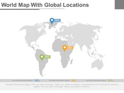
World map with global locations powerpoint slides




Try Before you Buy Download Free Sample Product
 Impress Your
 Audience
 100%
100% Editable
 Save Hours
 of Time


Our World Map With Global Locations Powerpoint Slides will automatically energize you. They are good for combating fatigue.
People who downloaded this PowerPoint presentation also viewed the following :
World map with global locations powerpoint slides with all 4 slides:
Allow our World Map With Global Locations Powerpoint Slides to be your anchor. Get a firm grip on your career.
FAQs for World map with global
Key features include high-resolution vector graphics, customizable colors and regions, editable text placeholders, data visualization capabilities, and multiple map projections. These elements enable presenters to highlight specific countries, display regional data through color coding and infographics, and maintain visual clarity across different screen sizes, ultimately delivering compelling geographic narratives and enhanced audience engagement.
Customizable world map slides enhance audience engagement by enabling visual storytelling, interactive data presentation, and geographic context that makes complex information more accessible. These slides allow presenters to highlight specific regions, customize colors for different data sets, and create dynamic narratives that keep audiences focused, with many finding that geographical visualization significantly improves comprehension and retention rates.
World map PowerPoint templates effectively integrate with choropleth maps, heat maps, bubble charts, flow diagrams, and infographic overlays. These visualizations streamline global data presentation by enabling geographic clustering, demographic comparisons, and regional performance tracking, with many organizations finding that strategic map-based presentations enhance stakeholder understanding and accelerate decision-making processes.
Different design styles of world map slides significantly influence audience comprehension through color schemes, visual hierarchy, data representation methods, and cultural sensitivity considerations. Minimalist designs enhance focus and clarity, while detailed cartographic styles build credibility, and interactive elements increase engagement, with many organizations finding that strategically chosen map aesthetics ultimately deliver stronger audience retention and more effective global communication outcomes.
Vector-based world map PowerPoint slides offer infinite scalability without quality loss, smaller file sizes, editable individual elements, and faster loading times compared to raster images. These technical advantages streamline presentation development by enabling seamless zooming, custom color modifications, and selective country highlighting, with many global organizations finding that vector maps enhance visual clarity while maintaining professional presentation standards across different screen sizes.
World map PowerPoint slides illustrate global trends by displaying market expansions, regional performance data, international partnerships, and demographic shifts across geographic regions. These visual tools enable presenters to showcase cross-border opportunities, highlight emerging markets, and demonstrate worldwide brand presence, ultimately delivering clearer strategic insights and enhanced audience engagement during critical business discussions.
**INPUT**: What are the best practices for animating world map slides to maintain audience interest? **OUTPUT**: Best practices for animating world map slides include progressive region reveals, data-driven color transitions, zoom-in sequences for specific countries, and synchronized text overlays with visual changes. These techniques enhance storytelling by guiding attention strategically, emphasizing key markets or data points, and creating dynamic narratives that transform static geographic information into compelling visual journeys, ultimately delivering more memorable presentations.
Educators can utilize world map PowerPoint slides to create interactive geography lessons, facilitate cultural exchange discussions, illustrate historical events and migrations, demonstrate climate patterns across regions, and support comparative studies between different countries. These visual tools enhance student engagement by transforming abstract geographical concepts into concrete learning experiences, with many teachers finding that interactive mapping activities significantly improve retention rates and foster global awareness in increasingly diverse classrooms.
Color schemes significantly enhance world map slide effectiveness by improving data visualization, creating visual hierarchy, ensuring accessibility, and supporting brand consistency across presentations. Strategic color choices enable audiences to quickly distinguish regions, identify patterns, and process complex geographical data, while maintaining professional aesthetics that reinforce key messages and facilitate better decision-making in business contexts.
Presenters can leverage world map slides to showcase geographic market penetration, demographic variations, sales performance by region, competitive landscape differences, and expansion opportunities through color-coding, data overlays, and visual annotations. These strategic visualizations enable executives to identify underperforming markets, highlight growth regions, and demonstrate global reach to stakeholders, ultimately delivering clearer strategic insights and enhanced decision-making capabilities.
Industries with global operations benefit most from world map PowerPoint slides, including logistics and supply chain companies, international consulting firms, multinational corporations, financial services, and technology businesses. These slides enable organizations to visualize market expansion strategies, demonstrate geographic reach, present regional performance data, and illustrate cross-border partnerships, ultimately enhancing stakeholder understanding and strategic decision-making processes.
World map slides facilitate global issue discussions by providing visual context for data distribution, impact zones, affected populations, and comparative regional analysis across countries and continents. These presentations enable stakeholders to identify patterns, track progression trends, and develop coordinated response strategies, with organizations like WHO, environmental agencies, and multinational corporations finding that geographic visualization enhances understanding and drives more informed policy decisions.
Accessibility considerations for world map PowerPoint slides include high contrast color schemes, alternative text descriptions for geographic elements, screen reader compatibility, scalable fonts, and colorblind-friendly palettes. These design principles enhance presentation inclusivity by ensuring clear visual distinction between regions, providing descriptive content for assistive technologies, and enabling seamless navigation, ultimately delivering broader audience engagement and professional credibility across diverse organizational settings.
World map slides can be tailored by adjusting color schemes, data visualization complexity, regional focus areas, font sizes, and cultural sensitivities to match audience preferences and comprehension levels. Through demographic-specific customization, presenters enhance audience engagement, improve information retention, and deliver more compelling presentations, with many organizations finding that tailored geographic visualizations significantly increase stakeholder buy-in and strategic decision-making effectiveness.
Common mistakes include using cluttered maps with excessive detail, poor color contrast that reduces readability, outdated geographical boundaries, inconsistent scaling across slides, and failing to highlight relevant regions for your audience. These presentation pitfalls can confuse viewers and diminish message impact, with many organizations finding that simplified, strategically colored maps with clear regional focus ultimately deliver better audience engagement and more effective communication outcomes.
-
Great quality slides in rapid time.
-
Innovative and Colorful designs.