

World map with icons network and mail ppt presentation slides




Try Before you Buy Download Free Sample Product
 Impress Your
 Audience
 100%
100% Editable
 Save Hours
 of Time


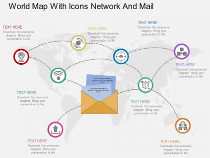
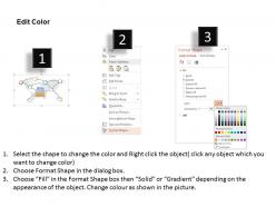
Do you plan to start a new company or are you an experienced owner and want to expand your business to grow across the globe. Are you planning to present an idea that would flood the world market and create new jobs? Or do you want to show your viewers how countries are interconnected with each other. Simply download our world map with icons network and mail PowerPoint templates slide. This slide is especially beneficial for firms or organisations which run logistics businesses and want to display yearend review or want to present a new idea that would revolutionize this industry. Make use of our customizable icons and objects and add icons of your choice from a massive collection of pre-prepared icons. Group or ungroup objects at will for different purposes and target audience. Edit colors for better contrast and making certain objects more impactful than others. The PowerPoint graphics are to the point and apt for the purpose they serve. With the right presentations, you can reveal a lot of information about your business while educating customers on your services and products. Good presentations make use of World Map With Icons Network And Mail Ppt Presentation Slides that are created by professionals.
People who downloaded this PowerPoint presentation also viewed the following :
World map with icons network and mail ppt presentation slides with all 4 slides:
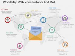
Make your presentations rewarding in todays interlinked world with our World Map With Icons Network And Mail Ppt Presentation Slides. They are your best option in the modern scenario.
FAQs for World map with icons network and mail
Key features include visual hierarchy with clear focal points, consistent icon sizing and color schemes, strategic placement of network connections, readable typography, and balanced whitespace distribution. These design elements work together by enhancing audience comprehension, maintaining professional aesthetics, and ensuring message clarity, with many presenters finding that well-designed network visualizations significantly improve stakeholder engagement and communication effectiveness.
World map network mail icons enhance audience understanding by visually connecting geographical locations with communication flows, creating immediate comprehension of global reach, network connectivity, and cross-border information exchange. These visual elements transform abstract concepts into tangible representations, enabling audiences to grasp complex international communication strategies, partnership networks, and worldwide operational scope more effectively than text-based explanations alone.
Creative approaches include using world map network mail icons as section dividers between global topics, animated connectors showing email flow between international offices, background watermarks for contact slides, interactive elements highlighting regional communication hubs, and timeline markers for global campaign rollouts. These design strategies enhance presentations by creating visual continuity across complex international content, improving audience engagement through dynamic storytelling elements, and ultimately delivering more memorable corporate communications that emphasize global connectivity and strategic reach.
Color schemes significantly influence how audiences perceive world map network mail icons by affecting readability, emotional response, hierarchy establishment, and brand alignment within presentations. Professional blue tones convey trust and reliability for corporate communications, while warmer palettes create approachability for customer-focused content, and high-contrast combinations ensure accessibility across diverse viewing environments, ultimately enhancing message clarity and audience engagement.
PowerPoint's built-in drawing tools, Adobe Illustrator, Canva, and specialized presentation platforms like SlideTeam offer comprehensive customization options for world map network mail icons. These tools enable designers to modify colors, sizes, animations, and connectivity lines while maintaining professional quality, with many organizations finding that template-based solutions significantly streamline the creation process.
**INPUT**: What are the best practices for ensuring icon clarity and scalability in presentations using world map network mail icons? **OUTPUT**: Best practices include using vector-based formats, maintaining consistent sizing ratios, selecting high-contrast color schemes, and ensuring adequate spacing between elements. These design principles enhance visual communication by improving readability across different screen sizes, enabling seamless scaling for various presentation formats, and delivering professional clarity that strengthens global communication messaging.
Data visualization techniques integrate with world map network mail icons through interactive overlays, dynamic flow animations, color-coded regional segments, and real-time data connections that transform static presentations into engaging visual narratives. These approaches enable organizations to showcase global communication patterns, email campaign performance across territories, and international network connectivity, while enhancing audience comprehension and delivering strategic insights for multinational operations.
**INPUT**: What content should accompany world map network mail icons to provide context in a presentation? **OUTPUT**: Content should include regional email performance metrics, geographic distribution data, delivery success rates, time zone considerations, and targeted campaign results. These elements enhance audience understanding by providing specific context like regional open rates, cross-border communication patterns, and geographic market penetration, ultimately delivering actionable insights that transform visual elements into strategic business intelligence.
Font choice significantly impacts world map network mail icons by affecting readability, visual hierarchy, and professional credibility across global communication presentations. Clean, sans-serif fonts like Arial or Helvetica enhance clarity when labeling network connections, while consistent typography sizes create seamless information flow, with many international businesses finding that strategic font selection ultimately strengthens audience engagement and message comprehension.
Common mistakes include using inconsistent icon sizes, overcrowding maps with too many elements, choosing poor color contrast that reduces readability, and failing to align icons properly with geographic locations. These design errors can confuse audiences and diminish presentation impact, with many organizations finding that maintaining visual hierarchy, using complementary color schemes, and strategically spacing elements ultimately delivers clearer communication and more professional-looking presentations.
Animations and transitions enhance world map network mail icons by creating sequential reveals of connection points, smooth pathways between geographic locations, and dynamic highlighting of data flow patterns. These effects enable presenters to guide audience attention strategically, demonstrate global communication networks progressively, and transform static geographic data into compelling visual narratives that emphasize connectivity and operational scale.
World map network mail icons can be adapted by customizing colors to match industry branding, adjusting icon density to reflect regional communication volumes, and incorporating sector-specific symbols alongside mail indicators. Financial services might emphasize secure connection pathways, healthcare organizations could highlight patient communication networks, and retail companies may showcase customer touchpoint distributions, ultimately delivering tailored visual narratives that resonate with specific audience expectations and strategic messaging goals.
Cultural differences significantly influence icon interpretation across international audiences, as symbols, colors, and visual metaphors carry varying meanings between regions, potentially causing confusion or misunderstanding during presentations. When presenting globally, organizations increasingly adapt their visual communications by incorporating culturally neutral designs, testing icon clarity across diverse markets, and providing contextual explanations, ultimately ensuring clearer messaging and more effective cross-cultural business communication.
Presenters can effectively engage audiences by using interactive polling to identify global communication challenges, incorporating real-world case studies from multinational corporations like Amazon or Microsoft, and encouraging audience members to share their own international collaboration experiences. These techniques transform static network diagrams into dynamic discussions about cross-border communication strategies, ultimately helping participants visualize how global connectivity impacts their specific industries and organizational goals.
**INPUT**: What are the trends in visual communication that influence the design of world map network mail icons in presentations? **OUTPUT**: Visual communication trends influencing world map network mail icons include minimalist flat design, interactive hover effects, color-coded connectivity indicators, and responsive scaling for mobile presentations. These design approaches enhance audience engagement by streamlining complex global communication networks into digestible visuals, with many organizations finding that strategic icon placement ultimately delivers clearer messaging and stronger stakeholder comprehension.
-
Visually stunning presentation, love the content.
-
Best way of representation of the topic.