

World map with linear timeline for business powerpoint slides




Try Before you Buy Download Free Sample Product
 Impress Your
 Audience
 100%
100% Editable
 Save Hours
 of Time


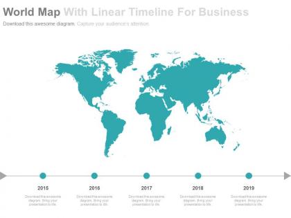
Regularly the multinational mammoths outline introductions which oblige them to consolidate a slide denoting the individual areas of their base spread around the world. In such cases, our world map with linear timeline for business PowerPoint slides. The exceptionally altered world map with linear timeline for business PPT template slide permits you to include your preferred pictures and customize the show totally. Include it as a feature of various slides in light of corporate organization profile PPT layout or human asset introduction visuals. This PPT Infographic is extraordinarily composed keeping in edge the exceptionally aggressive situation where style are the recognizing variable among numerous choices. Stamp yourself high on a size of execution when you have such professionally prepared and very much made presentation slide visual available to you. You just need to tap on the downlink interface gave on the accompanying page and spare the record in your coveted arrangement. Cultivate your customers with our World Map with world map timeline business PowerPoint Slides. Our World Map With Linear Timeline For Business Powerpoint Slides will get them with it. They will always feel abreast.
People who downloaded this PowerPoint presentation also viewed the following :
World map with linear timeline for business powerpoint slides with all 5 slides:
Create excellent citizens with our World Map With Linear Timeline For Business Powerpoint Slides. They help ensure good grooming.
FAQs for World map with linear timeline for
World map timelines enhance business presentations by providing global context, visualizing international expansion phases, tracking market entry strategies, demonstrating geographic growth progression, and illustrating cross-regional project milestones. These visual tools streamline complex geographical data while enabling audiences to grasp worldwide operations instantly, with many organizations finding that combining temporal and spatial elements significantly improves stakeholder comprehension and strategic decision-making processes.
A world map timeline enhances corporate storytelling by visualizing global expansion chronologically, tracking market entry sequences, showing regional performance evolution, and demonstrating international partnerships development across geographical contexts. Through this strategic combination, organizations create compelling narratives about their global journey, enabling audiences to understand complex multi-market strategies while showcasing operational scale, ultimately delivering enhanced stakeholder engagement and competitive positioning.
World map timelines effectively represent global expansion data, international market penetration, worldwide product launches, cross-border partnership formations, and multinational regulatory changes. These visualizations enable organizations to showcase geographic progression over time, with companies in sectors like technology, pharmaceuticals, and retail finding that temporal mapping enhances strategic presentations and stakeholder understanding.
A world map timeline visualizes market evolution across regions and time periods, enabling businesses to identify emerging opportunities, track competitive movements, and demonstrate geographic expansion patterns. This strategic combination streamlines complex global data into compelling narratives, with many organizations finding that visual market progression enhances stakeholder understanding while ultimately delivering clearer investment decisions and competitive advantage.
**INPUT**: What tools and software are commonly used to create world map timelines for business? **OUTPUT**: Popular tools include PowerPoint, Tableau, Google Earth Pro, ArcGIS Online, and specialized timeline software like TimelineJS and Preceden. These platforms streamline visualization creation by offering customizable templates, interactive mapping features, and data integration capabilities, with many organizations finding that combining geographic and temporal data enhances strategic presentations and delivers clearer insights for global business planning. [Word count: 58 words]
Cultural differences significantly influence world map presentations through varying color associations, reading patterns, regional focus preferences, and symbolic interpretations of geographical elements. Organizations must consider these factors when presenting to global audiences, with many multinational companies finding that culturally-adapted map designs enhance communication effectiveness and foster stronger international business relationships.
Industries that benefit most include logistics and supply chain, international consulting, global manufacturing, multinational retail, and financial services companies. These sectors leverage world map timelines to visualize expansion strategies, track supply chain movements, and present market entry phases, with many organizations finding that geographic timeline visualization enhances stakeholder understanding and streamlines strategic communications.
Successful presentations often feature world map timelines showcasing global expansion strategies, product launches across regions, international merger chronologies, and market entry sequences. Companies like McDonald's, Starbucks, and Amazon have effectively used these visuals to illustrate their geographic growth patterns, demonstrating market penetration timelines, regional revenue milestones, and strategic international partnerships, ultimately delivering compelling narratives about global business evolution and competitive positioning.
Key design elements include clear geographical accuracy, intuitive timeline progression, consistent color coding for different data sets, readable fonts at various zoom levels, and strategic use of icons or markers. These elements enhance comprehension by streamlining complex global data presentation, ensuring visual hierarchy guides viewer attention, and enabling seamless integration with corporate branding, ultimately delivering professional presentations that communicate international business strategies effectively.
Color coding in world map timelines enhances data clarity through consistent categorical schemes, progressive intensity scales, and contrasting hues for different metrics or time periods. These visual strategies streamline complex global data interpretation by creating intuitive patterns, enabling faster trend identification, and reducing cognitive load, with many organizations finding that strategic color application ultimately delivers more engaging presentations and improved stakeholder comprehension.
Common mistakes include overcrowding maps with excessive data points, using inconsistent visual hierarchies, selecting poor color schemes that obscure regional distinctions, and failing to maintain chronological clarity across timeline segments. These design pitfalls can confuse stakeholders during presentations, with many organizations finding that streamlined approaches emphasizing clear geographical focus and intuitive navigation deliver significantly better audience engagement and comprehension.
Interactive elements like clickable regions, hover tooltips, animated progression markers, filterable data layers, and zoom functionality can transform static world map timelines into engaging experiences. These features enable users to explore specific geographical data, customize viewing preferences, and navigate through temporal changes at their own pace, with many organizations finding that interactive timelines significantly enhance audience retention and comprehension during presentations.
Balancing information density and clarity requires strategic color coding, selective data layering, and consistent visual hierarchy across time periods. Focus on essential milestones while using progressive disclosure techniques, with many organizations finding that grouping related events by regions or themes, combined with clear legends and readable fonts, ultimately delivers comprehensive storytelling without overwhelming audiences.
Businesses can measure timeline impact through audience engagement metrics, decision-making speed, stakeholder comprehension assessments, and presentation effectiveness surveys. These measurement approaches enable organizations to track improved information retention, faster project approvals, and enhanced strategic communication, with many companies finding that visual timelines reduce meeting times while increasing clarity and actionable outcomes.
Audience analysis determines the geographic scope, data complexity, and visual emphasis needed for world map timelines, ensuring relevant regional focus, appropriate detail levels, and clear messaging hierarchy. By understanding stakeholder backgrounds, business contexts, and decision-making needs, presenters can strategically highlight specific markets, customize data granularity, and emphasize outcomes that resonate with viewers, ultimately delivering more compelling and actionable presentations.
-
Out of the box and creative design.
-
Informative design.