


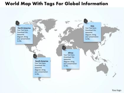
World map with tags for global information ppt presentation slides




Try Before you Buy Download Free Sample Product
 Impress Your
 Audience
 100%
100% Editable
 Save Hours
 of Time


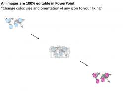
Are you in search of beautifully designed and thoroughly editable world map PPT? Then you need to download our world map with tags for global information PPT presentation slides. The provided global map PPT PowerPoint template is sure to carry high weight age of professionalism and ease of understanding. The editable world map for global information PPT presentation model is easy to modify and use based on varied criteria. Illustrate about the locations and regions specific to your company and organization with the help of our vector based PowerPoint slide background. You may use the provided map background to talk about the international news and other world based information. The tags can be used to mention the region specific highlights or other aspects which are of business value. Our experts have worked out all essentials to come up with a presentation which is professionally sound and aesthetically equipped. You simply need to click, download, save and customize for final show of presentation.
People who downloaded this PowerPoint presentation also viewed the following :
World map with tags for global information ppt presentation slides with all 4 slides:
Allow our World Map With Tags For Global Information Ppt Presentation Slides to be your anchor. Get a firm grip on your career.
FAQs for World map with tags for global information
Effective world map presentations include clear geographic focus, consistent color coding, readable labels, relevant data overlays, and strategic visual hierarchy. These elements enhance audience understanding by highlighting specific regions, differentiating data categories, and maintaining visual clarity, with many organizations finding that well-designed map slides streamline global reporting and facilitate strategic decision-making across international operations.
Interactive elements enhance world map presentations by enabling clickable regions, hover-over data displays, animated transitions, and real-time updates that transform static visuals into engaging experiences. These features allow presenters to drill down into specific geographic data, showcase regional comparisons dynamically, and maintain audience attention, with many organizations finding that interactive maps significantly improve data comprehension and decision-making outcomes.
Professional world maps work best with neutral base colors like light gray or beige backgrounds, paired with strategic accent colors such as blue for water, darker grays for land masses, and vibrant colors like red, orange, or green for data highlights. These color combinations ensure readability across projectors and screens while maintaining visual hierarchy, with many organizations finding that monochromatic schemes with selective color pops deliver maximum impact and accessibility.
Cultural considerations in world map slides include using accurate country names and borders, selecting culturally neutral color schemes, avoiding stereotypical imagery, ensuring inclusive representation, and choosing appropriate map projections that don't distort regions. These design choices enhance global accessibility by respecting diverse audiences, minimizing potential cultural sensitivities, and creating professional presentations that resonate across international markets, ultimately delivering more effective cross-cultural communication.
World map presentation slides effectively visualize demographic data, economic indicators, sales performance metrics, market penetration rates, and geographic distribution patterns. These visualizations enable organizations to identify regional trends, compare international performance, and communicate global strategies, with many businesses finding that map-based data presentations streamline decision-making and enhance stakeholder understanding.
Ensuring accessibility involves using high-contrast colors, clear fonts, descriptive alt text for visual elements, and multilingual labels where appropriate. These design choices enhance comprehension by accommodating color blindness, visual impairments, and language differences, with many international organizations finding that accessible maps improve audience engagement and ensure inclusive communication across diverse stakeholder groups.
**INPUT**: What software or tools are best for creating dynamic world map slides? **OUTPUT**: Leading tools for dynamic world map presentations include PowerPoint with advanced animation features, Tableau for data visualization, ArcGIS for geographic analysis, Canva for design simplicity, and specialized platforms like Mapbox. These solutions streamline global data storytelling by enabling interactive elements, real-time updates, and compelling visual narratives, with many organizations finding that strategic map presentations enhance stakeholder engagement and decision-making processes.
Choose between physical and digital maps based on your audience interaction needs, data complexity, and presentation format. Physical maps work well for printed materials, handouts, and static geographical references, while digital representations enable interactive features, real-time data integration, and dynamic zooming capabilities, with many presenters finding that digital formats deliver greater engagement and flexibility for complex business presentations.
**INPUT**: What narrative techniques can be used to engage the audience with world map slides? **OUTPUT**: Effective narrative techniques for world map presentations include storytelling with geographical progression, data-driven regional comparisons, customer journey mapping across territories, expansion timeline visualization, and interactive market analysis scenarios. These approaches enhance audience engagement by transforming static geographical data into compelling business stories, with many organizations finding that combining visual progression with strategic insights delivers stronger stakeholder buy-in and clearer strategic communication. [Word count: 60 words]
World maps effectively illustrate global market trends by visualizing data distribution, highlighting regional performance differences, and showing geographical patterns through color-coding, heat maps, and targeted annotations. These visual tools enable audiences to quickly grasp market penetration, growth opportunities, and competitive landscapes across different continents, while companies in sectors like retail, technology, and financial services find that geographic visualization enhances strategic discussions and investment decisions.
Common mistakes include using overly cluttered maps with too much data, selecting inappropriate color schemes that reduce readability, failing to provide clear legends or context, choosing incorrect projections for the intended message, and neglecting to highlight key regions effectively. These design pitfalls often overwhelm audiences and dilute the presentation's impact, with many organizations finding that simplified, strategically focused world maps deliver clearer insights and stronger audience engagement.
**INPUT**: How can I incorporate animations to highlight specific regions on a world map slide? **OUTPUT**: You can incorporate animations by using entrance effects for individual regions, color transitions to emphasize territories, zoom animations for detailed focus, and sequential reveals for storytelling flow. These animation techniques enhance audience engagement by drawing attention strategically, supporting data-driven narratives, and creating memorable presentations, with many organizations finding that animated geographical presentations significantly improve comprehension and retention rates. **Word count: 59 words**
Best practices for citing world map data include crediting the original data source, noting the publication date, specifying geographic boundaries used, acknowledging any modifications made, and providing accessible reference formats. These practices enhance presentation credibility by ensuring transparency, supporting fact-checking, and demonstrating research rigor, with many organizations finding that proper attribution builds audience trust while minimizing legal risks.
**INPUT**: How can I tailor my world map presentation to suit different industries, such as education or corporate? **OUTPUT**: Tailoring world map presentations involves adjusting visual complexity, color schemes, data focus, and interactive elements to match industry-specific needs and audience expectations. Educational presentations emphasize learning outcomes through simplified geography and engaging animations, while corporate versions prioritize business metrics, market expansion data, and professional aesthetics, ultimately delivering more targeted messaging and enhanced audience engagement across sectors.
Resources for accurate world map data include government mapping agencies like USGS and OpenStreetMap, commercial providers such as Esri and MapBox, and presentation-specific platforms offering pre-designed templates. These sources deliver current geographic information, customizable formatting options, and professional visualization tools, with many organizations finding that combining multiple data sources ensures comprehensive accuracy while streamlining presentation development processes.
-
Very unique, user-friendly presentation interface.
-
The content is very helpful from business point of view.