


Year End Review Powerpoint Ppt Template Bundles




Try Before you Buy Download Free Sample Product
 Impress Your
 Audience
 100%
100% Editable
 Save Hours
 of Time


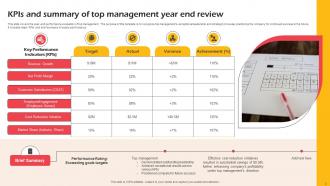
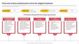
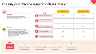
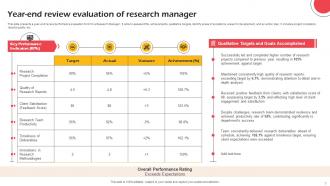
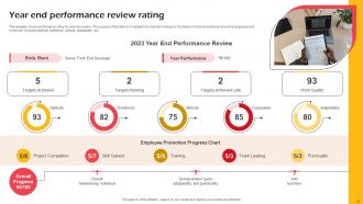
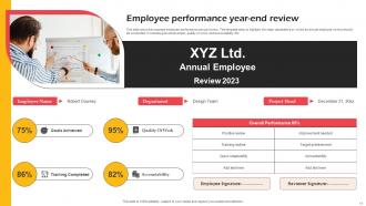
A year-end review is a comprehensive assessment conducted by employees and managers at the end of the calendar year to reflect on individual and team accomplishments, performance, and growth. It serves as a critical tool for evaluating progress towards goals, identifying strengths and areas for improvement, and providing feedback for professional development. For employees, year-end reviews offer an opportunity to gain insights into their performance, receive recognition for their achievements, and set goals for the upcoming year. Managers use these reviews to assess team performance, recognize outstanding contributions, and align individual goals with organizational objectives.This template includes a comprehensive range of content for your presentation on year-end reviews. It covers a 5-step process to conduct year-end reviews, providing valuable insights on how to structure and execute successful evaluations. Additionally, it offers KPIs and a summary of the top managements year-end review, showcasing key performance indicators and outcomes. The presentation also includes a year-end review performance form tailored for digital marketers to assess their achievements. Furthermore, it features a case study demonstrating how year-end reviews can improve customer retention. It delves into year-end review evaluations for research managers and the finance department, highlighting their significance in assessing departmental performance. The template presents year-end performance review ratings, shedding light on how employees are evaluated based on their performance. Lastly, it incorporates icons to enhance the visual appeal and effectiveness of the presentation.
People who downloaded this PowerPoint presentation also viewed the following :
Year End Review Powerpoint Ppt Template Bundles with all 22 slides:
Use our Year End Review Powerpoint Ppt Template Bundles to effectively help you save your valuable time. They are readymade to fit into any presentation structure.














FAQs for Year End Review Powerpoint
So for your year-end review, definitely hit the basics first - revenue growth, profit margins, cost stuff. Customer metrics are clutch too: retention rates, how happy people are, what it costs to get new customers. Don't sleep on employee engagement and turnover though, that's where a lot of companies mess up honestly. Productivity measures and project completion rates matter. Oh, and whatever KPIs are specific to your industry - those always look good. I'd say pick like 8-10 total metrics? Mix the hard numbers with some of those softer wins so you're not just drowning everyone in spreadsheet hell.
Honestly, visuals are a game-changer for year-end reviews. People's eyes just glaze over when you hit them with spreadsheet after spreadsheet - charts and graphs make trends way easier to spot. I'd start with your three biggest wins and build around those. Progress bars work great for showing goal completion, and if you've got any before/after project photos, definitely use those. Oh, and infographics are perfect for breaking down complicated stuff. Don't underestimate how much colors and icons help organize everything too. Your accomplishments won't get buried in a wall of text that way.
Okay so the key is being super specific with numbers and real examples. Like instead of "made communication better," try "cut project time by 20% with weekly standups." Way more impressive, right? I'd group everything by themes - leadership stuff, innovation wins, client results - makes it way easier to read. Each bullet should be detailed enough that someone who doesn't know your job would get why it matters. Oh and seriously, start writing now because December always sneaks up faster than you think. Nothing worse than rushing through something this important!
Hey! So when you're talking about challenges, flip them into learning moments instead of just disasters. Pair every obstacle with what you actually learned from it - shows you bounce back. Be specific but don't go on forever about blame or stuff you couldn't control (seriously, no one wants to read your project horror story). Talk up your problem-solving instead. How did these situations make you tougher or teach you new skills? Oh, and always wrap up by mentioning concrete steps you're taking so the same mess doesn't happen again. Makes you look forward-thinking.
Honestly, storytelling is a game changer for year-end reviews. Nobody wants to sit through another boring list of accomplishments - been there, done that. Frame it like you're telling the story of your year instead. What challenges hit you? How'd you handle them? Where are things heading next? People remember stories way better than bullet points anyway. Structure it with a clear beginning, middle, and end. Your audience will actually get why your work mattered and how it connects to the bigger picture. Trust me, they'll still be thinking about it after the meeting ends.
Definitely swap out those boring generic questions for stuff that actually matters in your industry. Like if you're in tech, ditch the standard sales metrics and focus on innovation or how well people work with different tools. The rating scales need tweaking too - healthcare should track patient outcomes, agencies should look at creative impact, that kind of thing. Default templates are honestly pretty useless anyway. Just don't go too crazy with changes - whatever you customize still needs to connect back to your main performance goals somehow.
Dude, skip the spreadsheet dumps - nobody wants to stare at rows of numbers. Charts and graphs are your best friend here. I'd throw in some comparison tables showing year-over-year stuff, maybe break revenue down by quarters or whatever makes sense for your business. Those percentage changes hit way harder than raw numbers alone. Oh, and those callout boxes for key metrics? Super helpful. People actually notice those. Start with your biggest wins right off the bat - sets a good vibe. Just add quick explanations when numbers jump around weirdly. Trust me, stakeholders love context.
Honestly, just bake the feedback collection right into your template from day one. I send out quick surveys or do short one-on-ones like 2-3 weeks before reviews - people need time to actually think, not just wing it last minute. Then I've got specific spots in my template where I pull together what they said alongside my own thoughts. Works way better than just random quotes scattered everywhere. Oh and definitely hit up your manager, direct reports, cross-functional people - maybe even clients if that makes sense for your role. The whole thing falls apart if you wait too long though.
Honestly, go digital. You can edit them super easily, copy them for your whole team, and there's no printing drama. Never lose your notes again since everything saves automatically - I can't tell you how many paper reviews I've misplaced over the years! The cool part is you can drop links right into the document, add videos or whatever, and actually search through old reviews when you need them. Your team can all work on the same doc at once instead of that awkward paper shuffle thing. Start with Google Docs or maybe Notion if you're feeling fancy. Keep it simple at first.
Okay so definitely include a "lessons learned" section where they actually write what worked and what bombed. SMART goals for next year are crucial too - none of that wishy-washy "I'll do better" stuff. Oh, and add a resource needs part because honestly, people always forget to mention what they'll actually need to succeed. I'd throw in concrete examples and measurable stuff rather than vague promises. Don't forget a follow-up date section either - otherwise these things just get filed away forever. If your workplace isn't too weird about it, peer feedback questions work really well too.
Throw in some interactive polls - people love voting on biggest wins or predicting what's coming next year. Q&A sessions are solid too, though you might want to plant a few questions beforehand so it doesn't get awkward. Breakout groups where everyone shares their own stuff then reports back? Chef's kiss. Live word clouds are pretty cool, or you could do interactive timelines where people add their milestones. Even simple games work - like guessing metrics or whatever. Honestly, anything beats just talking at people for an hour straight. The whole point is giving them reasons to actually participate instead of zoning out.
Don't dump all your numbers in boring charts at the end. Mix the data right into your story instead. I always go with something like "Our support team absolutely killed it on response times" then hit them with the actual numbers and what it meant for customers. Honestly, executives just want context - they're not looking for spreadsheets. Do maybe 60/40 narrative to data. Start with the outcome first, like "here's what we accomplished and why you should care," then prove it with your metrics. Way better than leading with numbers and hoping people figure out why they matter.
So here's the thing - corporate people want hard numbers upfront. ROI, revenue growth, how you're beating competitors. That's their jam. Non-profits? Totally different world. They care about actual impact on people and those heartwarming donor stories that make everyone feel good about writing checks. Your language needs to shift too. Business folks expect all that corporate speak and data-heavy slides. Non-profit crowds respond way better to storytelling that hits them in the feels. Oh, and non-profits usually have messier audiences - board members, volunteers, community partners all mixed together. You might end up making like three different versions of the same presentation, honestly. Figure out who you're talking to first, then build from there.
Dude, skip the text walls - nobody reads those anymore. Visual stuff like bar charts and pie charts actually get people's attention. I'd go with bar charts for comparing quarters, pie charts for budget stuff, and maybe timeline graphics for project milestones. Keep it simple though. Don't get all fancy with crazy colors or whatever - clean visuals work best. Your stakeholders will thank you since they can spot trends instantly instead of squinting at spreadsheets. Pick maybe 3-4 numbers that really matter and build around those. Trust me, it makes a huge difference.
Oh god, don't make the same mistake I did last year - cramming every single metric into your slides. Nobody can absorb that much info. Pick 3-5 key things max. And please, for the love of all that's holy, tell a story with your data instead of just dumping numbers on people. What do they actually mean? Skip those boring corporate templates too. Make it look decent but not so flashy that it's distracting. Here's the thing though - save time for actual discussion. You don't want to just talk at people for an hour straight, trust me.
-
The information is visually stunning and easy to understand, making it perfect for any business person. So I would highly recommend you purchase this PPT design now!
-
Thank you SlideTeam for such an excellent service.