

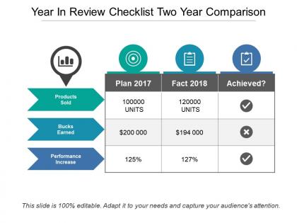
Year in review checklist two year comparison





Try Before you Buy Download Free Sample Product
 Impress Your
 Audience
 100%
100% Editable
 Save Hours
 of Time


Force your critics to actually back off with our Year In Review Checklist Two Year Comparison. It helps handle the hounds.
People who downloaded this PowerPoint presentation also viewed the following :
Year in review checklist two year comparison with all 5 slides:
If it's nice, do it twice. Double the pleasure with our Year In Review Checklist Two Year Comparison.
FAQs for Year in review checklist
Honestly, minimalist stuff crushed it this year - everyone's obsessed with those clean layouts and tons of white space. Makes sense though, presentations were getting way too busy before. "Modern Pitch Deck" was the most downloaded template, then "Analytics Dashboard" and "Product Roadmap" came right after. Oh, and interactive timelines blew up too, especially for quarterly stuff. If you're doing anything client-facing, definitely grab something from the minimalist section. Those templates still look fresh and make your work seem way more professional than it probably is lol.
Honestly, minimalism took over everything this year. Clean layouts with tons of white space replaced all that cluttered junk we used to see. Dark mode is literally everywhere now - kinda overdone if you ask me, but whatever. Bold typography became huge too. Interactive stuff is where it's at though. People want clickable elements and embedded videos instead of boring static slides. The real shift? Templates actually tell stories now instead of just looking nice. If you're updating yours, go for clean designs with solid visual hierarchy. Maybe grab some dark themes since everyone's obsessed with them.
Healthcare was huge this year - all those regulatory changes meant they desperately needed compliance and patient communication templates. Finance came in second with financial reporting and audit stuff. Tech companies wanted project management and technical docs (makes sense). Real estate did pretty well too, mostly contracts and property listings. Honestly? I'd go all-in on healthcare compliance templates if I were you. That's where the real money is right now. The demand is crazy and doesn't seem to be slowing down anytime soon.
Honestly, people were super frustrated with how cookie-cutter the old templates felt. Everyone's career journey is totally different, you know? The main issue was that chunks of it just didn't apply to what they actually did at work. Some folks wanted to showcase big project wins, others cared more about the skills they picked up or how they worked with their team. Plus the whole thing looked way too corporate and bland - like something from 2015. We basically started over and made it way more flexible. Now you can swap out sections for stuff that actually matters to your situation and make it look however you want.
Dude, AI presentation tools are actually insane now. You just type what you want and boom - slide designs appear. The cloud stuff means everyone can edit at once without that awful version control nightmare we used to deal with. Templates automatically match your brand colors too, which saves so much time. Oh and they adjust formatting when you dump in new content - no more broken layouts. Honestly the hardest part is picking just one tool. Don't do what I did and try everything at once. Just pick one AI platform and get good at it first.
Yeah, so AI stuff was everywhere this year - though honestly half the "experts" probably just discovered ChatGPT last month lol. Hybrid work presentations got big too, plus everyone's obsessing over sustainability now. Data storytelling blew up, and mental health topics were huge. Oh, and people finally realized their Zoom presentation skills were trash, so that became a thing. ESG reporting dominated across pretty much every industry. For next quarter? Skip the generic AI overviews - audiences want real stories about how companies actually used it. Way more engaging than another "what is artificial intelligence" deck.
Ugh, I learned this the hard way during lockdown - your slides probably look terrible on video calls! Everything gets compressed and blurry, so bump up those font sizes way more than you think. High contrast colors are your friend now. Clean layouts work better than busy ones too. Oh, and throw in more "raise your hand if..." type prompts since you can't tell if people are zoning out. Honestly, I test everything by squinting at it on my phone first. If I can't read it there, it won't work on someone's laptop during a Zoom meeting.
Honestly, colors make or break your presentation. For year-end stuff, go celebratory but still professional - maybe a deep blue with gold accents or something like that. Keep it to 2-3 colors max because more than that looks messy. Use your boldest color for the big wins and metrics you want people to remember. Neutral tones work great for regular text. Then throw in an accent color for anything you really want to pop. I learned this the hard way after some truly ugly slides last year. Pick your palette first, then design everything else around it. Makes the whole thing look way more put-together.
First thing - figure out your biggest wins and stories, then see which template sections work best for those. Most templates let you swap colors and move stuff around pretty easily. Photos are honestly the most annoying part, but just keep the sizes consistent and you'll be fine. Skip sections that don't fit your vibe. I'd focus on maybe 3-5 main themes that actually matter instead of trying to cram everything in. Way better to nail a few key points than have a cluttered mess, you know?
Dude, Gamma is insane for auto-generating slides - seriously try it first. Canva's new AI stuff saved me so much time this year too. I'd usually start with ChatGPT to get my outline sorted, then jump into Canva for the actual design work. Oh and Loom became my go-to for adding quick video bits to presentations. Unsplash got way easier to use across different platforms which was nice. The trick is mixing them all - AI handles the boring structure part, Canva makes it look decent, then Loom adds that personal vibe. Half my decks started this way honestly. You'll probably cut your prep time in half.
Ugh, the worst thing I see people do is falling for flashy templates that look amazing but totally don't fit their actual content. Like, you've got basic product info but you're trying to cram it into some complex layout meant for portfolios or whatever. Then there's the lazy approach - using everything straight from the template without changing colors or fonts to match their brand. Looks super generic. Also, nobody checks if it works on phones anymore, which is kinda wild since that's where most people browse. My advice? Figure out what you actually need to show first, then hunt for templates that make sense for that specific content.
Dude, presentations totally changed this year. Clients are SO over boring slide decks - they want videos, clickable stuff, charts that actually look good. Static bullets are basically dead. Hybrid meetings made it worse too since remote people zone out easier. Even the old-school corporate types are suddenly obsessed with "telling a story" instead of just listing features. Honestly didn't see that coming from them. You should probably learn Prezi or those interactive PDFs everyone's using now. Trust me, that's where this is all going.
For your year-in-review template, start with a clean visual hierarchy - nobody wants to squint through clutter. Keep your branding consistent throughout and arrange everything chronologically so it actually tells a story. Build in sections for metrics, big wins, team shoutouts, and what went wrong (because let's be real, stuff always goes sideways). Make it flexible enough for different departments but not so open-ended that people stare at a blank page forever. Oh, and definitely test it with real content first - I learned that one the hard way when our marketing team couldn't fit their novel-length project descriptions anywhere.
So we dug into the analytics and found some pretty clear patterns. Certain templates were getting hammered while others just sat there unused. People kept tweaking the same basic ones over and over - obvious sign they needed more specific versions. The really telling part? We spotted gaps where users were building identical templates from scratch repeatedly. That's basically free market research right there. Those usage patterns turned into our whole product roadmap. You can do the same thing - just watch what's actually getting used in your library and you'll know exactly what to build next.
Dude, minimalist layouts are huge right now - but pair them with really bold fonts that grab attention. Static sites feel so 2020 honestly. Everyone's adding micro-animations and interactive stuff now. Colors are interesting... earthy tones mixed with bright pops of color work well. Gradients are back too (I know, I know). Mobile-first isn't optional anymore either. Oh, and white space is your friend - don't be scared of it. I'd mess around with this stuff in your next few projects. Clients are gonna start asking for it soon anyway.
-
Enough space for editing and adding your own content.
-
Very unique, user-friendly presentation interface.