


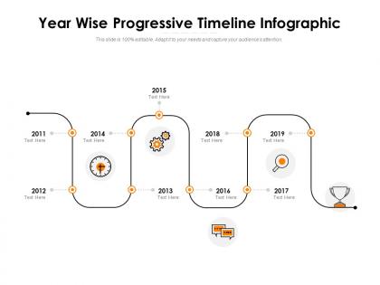
Year wise progressive timeline infographic




Try Before you Buy Download Free Sample Product
 Impress Your
 Audience
 100%
100% Editable
 Save Hours
 of Time


A high degree of interest in our Year Wise Progressive Timeline Infographic is guaranteed. It is a good investment.
People who downloaded this PowerPoint presentation also viewed the following :
Year wise progressive timeline infographic with all 2 slides:
Enlighten folks on investment with our Year Wise Progressive Timeline Infographic. Enable them to generate high interest.
FAQs for Year wise
Effective timeline infographics include clear chronological markers, concise milestone descriptions, consistent visual hierarchy, strategic color coding, and relevant supporting graphics or icons. These elements work together by guiding viewer attention through sequential information, enhancing comprehension through visual consistency, and maintaining engagement, with many organizations finding that well-designed timelines significantly improve project communication and stakeholder understanding.
Timeline infographics enhance historical event presentations by transforming complex chronologies into visually digestible narratives, incorporating dates, milestones, contextual details, and visual elements that guide audience comprehension. These structured formats enable educators, museums, and corporate presenters to streamline information delivery while maintaining engagement, ultimately delivering clearer understanding and improved retention across diverse audiences.
**INPUT**: What software tools are most recommended for creating timeline infographics? **OUTPUT**: Recommended timeline infographic tools include Canva, Adobe Illustrator, Visme, Lucidchart, and PowerPoint, each offering distinct template libraries and customization capabilities. These platforms streamline visual storytelling by providing drag-and-drop functionality, professional templates, and export flexibility, with many organizations finding that strategic tool selection enhances project communication and stakeholder engagement.
Color schemes and design principles significantly impact timeline infographic readability by establishing visual hierarchy, ensuring adequate contrast, and guiding viewer attention through chronological flow. Strategic color choices enhance comprehension by distinguishing time periods, highlighting key milestones, and maintaining consistency, while thoughtful typography and spacing streamline information processing, ultimately delivering clearer communication and more engaging presentations across industries.
Creative milestone representations include progress bars with percentage completions, iconic symbols matching each achievement, color-coded phases showing different project stages, interactive hover elements, and visual metaphors like climbing steps or journey maps. These approaches enhance viewer engagement by transforming static timelines into dynamic storytelling tools, with many organizations finding that symbolic representations significantly improve information retention and make complex project progressions more accessible to diverse stakeholders.
Timeline infographics enhance project management by visualizing milestones, deadlines, dependencies, and task sequences in an easily digestible format. These visual tools streamline progress tracking, improve team communication, and facilitate stakeholder reporting, with many organizations finding that timeline infographics reduce project delays and enhance accountability while delivering better resource allocation and strategic oversight.
Timeline infographics offer enhanced visual comprehension, faster information processing, improved audience engagement, better retention rates, and simplified complex sequencing compared to text-based formats. These visual tools streamline communication by combining graphics, colors, and structured layouts, with organizations across education, healthcare, and project management finding that audiences process timeline information 60% faster while achieving significantly higher comprehension and retention.
Cultural differences influence timeline infographics through varying perceptions of time orientation, visual hierarchy preferences, color symbolism, and narrative flow expectations. While Western audiences typically favor left-to-right chronological progression, many cultures interpret temporal sequences differently, with organizations finding that culturally adapted timeline designs enhance comprehension, engagement, and decision-making across diverse stakeholder groups.
Sequential data, milestone-based information, project phases, historical events, and process workflows are best suited for timeline representation. These data types enhance comprehension by displaying chronological relationships, with many organizations finding that timelines streamline communication of complex processes, project schedules, and strategic roadmaps, ultimately delivering clearer stakeholder understanding and improved decision-making.
Animation and interactivity enhance timeline infographics by enabling progressive disclosure, guided storytelling, and user-controlled exploration of complex chronological data. These dynamic elements help organizations streamline information delivery, reduce cognitive overload, and increase audience engagement, with many educational institutions and corporate training departments finding that interactive timelines deliver significantly higher retention rates and more memorable learning experiences.
Storytelling transforms timeline infographics from simple chronological displays into engaging narratives that guide audiences through key milestones, turning points, and cause-effect relationships. By incorporating narrative elements like character development, conflict resolution, and thematic progression, organizations create more memorable presentations that resonate with stakeholders, ultimately enhancing comprehension and emotional connection to the data.
Businesses leverage timeline infographics to showcase company milestones, product evolution, industry achievements, and brand development in visually compelling formats that enhance customer engagement and trust. These visual storytelling tools enable organizations to demonstrate growth trajectories, highlight key innovations, and build credibility with stakeholders, ultimately strengthening brand narrative and competitive positioning.
Common timeline infographic mistakes include overcrowding with excessive information, using inconsistent visual elements, poor chronological flow, inadequate spacing between events, and unclear date formatting. These design flaws confuse audiences and diminish message impact, with many organizations finding that simplified layouts, consistent color schemes, and strategic white space ultimately deliver better comprehension and engagement.
Timeline infographics can be adapted for educational purposes by visualizing historical events, scientific processes, literary plot developments, mathematical concept evolution, and biographical milestones in engaging, chronological formats. These visual tools enhance student comprehension by transforming complex sequences into digestible segments, while enabling teachers to present curriculum content more effectively, ultimately improving retention rates and making abstract concepts more accessible across diverse learning styles.
Timeline infographics are embracing interactive elements, mobile-responsive designs, vertical storytelling formats, animated transitions, and data-driven personalization features. These trends reflect organizations' need for more engaging stakeholder communications, with many companies finding that interactive timelines significantly enhance project presentations, corporate milestone showcases, and educational content, ultimately delivering better audience retention and clearer strategic messaging.
No Reviews