


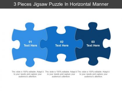
3 pieces jigsaw puzzle in horizontal manner




Try Before you Buy Download Free Sample Product
 Impress Your
 Audience
 100%
100% Editable
 Save Hours
 of Time


Advise folks to combine forces with our 3 Pieces Jigsaw Puzzle In Horizontal Manner. Give them cause to indulge in joint effort.
People who downloaded this PowerPoint presentation also viewed the following :
3 pieces jigsaw puzzle in horizontal manner with all 5 slides:
Cater for ethnic influences with our 3 Pieces Jigsaw Puzzle In Horizontal Manner. Allow for the effect of different customs.
FAQs for 3 pieces jigsaw puzzle
Honestly, jigsaw puzzles are genius for presentations because you're basically building suspense. People stay hooked wondering what's coming next instead of getting that glazed-over look. You reveal info bit by bit - no overwhelming anyone with a massive wall of text. Each piece connects to show how concepts actually fit together, which is way cooler than static slides. I always start with scattered pieces, then assemble as I go. The best part? That moment when everything clicks and the full picture emerges. Your audience gets those satisfying "oh, NOW I see it" moments that make them feel smart.
Honestly, jigsaw puzzle templates are genius for presentations. Instead of people just sitting there zoning out, they're actually participating. You reveal info piece by piece as they solve sections - keeps everyone way more focused. There's something weirdly satisfying about watching those pieces click together too. The cool part is how it helps with memory retention. When your concepts build on each other like puzzle pieces, people remember way more afterward. I'd start with an incomplete puzzle image and let each piece represent a key point. Trust me, your audience gets so much more invested when they're part of solving it.
Honestly, jigsaw puzzles work really well when you've got messy, interconnected stuff going on. Like when you're restructuring teams or mapping out project dependencies - anything where connections matter more than just listing facts. Perfect for those collaborative sessions where people can actually grab pieces and move them around (way better than staring at a boring slide deck). The visual metaphor just makes sense to most people, so you'll get less pushback. Use them when your audience needs to grasp both the overall picture and how everything fits together. Don't bother if you're just presenting linear info though.
Okay so visual hierarchy is huge here. Your eye hits the top-left first, so put your main point there. After that, group related stuff together - like, don't scatter pieces of the same argument all over the place. Give yourself breathing room too. Cramped layouts look terrible and nobody wants to decode that mess. I'd use the same colors or fonts to show how different parts connect. Honestly though? Simple beats fancy every time. You're trying to make complex stuff easy to follow, not win some design award. Build outward from that top-left anchor point and you'll be good.
Dude, the jigsaw approach is actually genius for presentations. Start with one piece - maybe your market research. Then drop the customer pain points. Finally reveal your solution. People get hooked trying to see how it all connects, you know? Way better than info-dumping everything upfront (which honestly puts everyone to sleep). Each slide builds anticipation for the next one. Your audience feels like they're solving a puzzle alongside you. Plus you control exactly when to drop each revelation. Trust me, try it once and you'll see people actually leaning forward instead of checking their phones.
Oh nice! So for digital stuff, Photoshop and GIMP are your best bet - they handle all the cutting paths and layers really well. Illustrator's solid too if you're into vectors. I've actually seen people do decent work with Canva, which kinda surprised me, but you'll probably outgrow it fast. If you're going physical, definitely get a Cricut or Silhouette. Game changer. Their software makes everything so much easier than doing it by hand. Start simple though - like basic geometric shapes first. Don't jump into crazy interlocking pieces right away or you'll want to throw your computer out the window.
So here's what I do - grab puzzles with opposite colors and put them next to each other. Like that blue ocean one next to your orange sunset puzzle? *Chef's kiss* Perfect contrast. I usually group by color families first, then step back and see what looks off. Warm colors like reds and oranges naturally draw your eye in. Cool blues and greens work great for transitions between sections. It's basically interior decorating but way more fun because, you know, puzzles. Oh and don't make everything too matchy-matchy - you need some visual tension to keep it interesting!
Don't make your puzzle metaphor super complicated - like seriously, if people are trying to figure out how the pieces fit together instead of listening to your point, you've already lost them. Three or four pieces, tops. And don't milk the reveal forever (we've all been trapped in those endless analogies that go nowhere). Each piece should actually connect to what you're saying, not just sound smart. People can tell when you're forcing it. Oh, and start backwards - know your complete picture first, then figure out how to break it down logically. Way easier than trying to build something clever from scratch.
So you know how jigsaw puzzles work, right? Same concept for your data - break that mess into smaller chunks that actually connect. Don't dump everything into one crazy overwhelming chart. Give each metric its own space but arrange them so people can see how they relate. I usually group similar stuff by color or make important ones bigger. Way better than those dense spreadsheets nobody wants to look at. Your team can focus on individual pieces first, then step back for the full picture. Makes quarterly reviews so much less painful.
Dude, you absolutely need interactivity! When people can actually click and drag pieces around, they stay way more focused than just watching you talk. Makes sense, right? I mean, we all zone out during boring presentations. Having them physically manipulate stuff taps into that hands-on learning style - suddenly abstract ideas feel real. You'll get those awesome "oh I get it now!" moments when everything clicks. Honestly? Don't overthink it. Just add like 2-3 spots where they're actually doing something instead of staring at your screen. Way more memorable that way.
So basically you wanna match the puzzle to who's doing it. Kids need bright colors and maybe like 50-100 pieces max - Disney characters work great. Adults usually go for the 500-2000 piece range with landscapes or famous paintings. My grandmother's obsessed with those vintage car puzzles, which honestly makes sense for that generation. For accessibility stuff, bigger pieces help if someone has arthritis or whatever. High contrast images are clutch for people with vision issues. The main thing is don't make it too hard or too easy - you want that sweet spot where it's challenging but not frustrating. Oh, and avoid those all-sky puzzles unless you hate the person.
Oh dude, puzzle layouts in presentations are actually genius! People can't help themselves - they'll mentally try completing whatever pattern you show them. It's like their brains are hardwired for it or something. I watched this speaker break down data visualization this way once and everyone was totally hooked. You get that satisfying click when pieces connect, right? Plus they remember way more afterward since you're hitting that completion-craving part of their brain. Next time you're presenting, try building it piece by piece until the full picture emerges. Works surprisingly well.
Honestly, this works so well - split a big puzzle into sections and give each team their own area to tackle. Pick something like a landscape where you've got obvious chunks: sky, trees, water, whatever. 500 pieces between 4-5 teams is perfect. The cool part is they have to talk to each other about edge pieces and colors to make everything fit together at the end. I'd switch up the teams halfway through too, just to mess with them a bit - forces people to explain what they've figured out. There's something oddly addictive about watching it all come together!
Definitely announce each section before jumping in - like "alright, let's tackle the border now" or whatever. Point at the pieces you're talking about too since visual stuff helps. I usually do a quick recap of what we just finished because honestly, people's minds wander during puzzles. Connect each part back to your overall game plan so it doesn't feel totally random. Give them that mental roadmap of where you're going next. Oh and transitions between sections can make or break the whole flow - learned that the hard way!
Honestly, customer feedback is everything when you're designing puzzles. Track your completion rates and see what people are actually complaining about - too hard, weird colors, pieces that don't fit right. Reviews are obvious, but don't sleep on social media comments either. People love venting about their puzzle disasters online! Multiple complaints about the same thing? That's real data. If everyone's saying your landscape was boring or your 1000-piece made them want to quit halfway through, listen to them. Also just ask your regulars directly what they want - they'll be brutally honest about piece counts, themes, all of it.
-
Wonderful templates design to use in business meetings.
-
Content of slide is easy to understand and edit.