

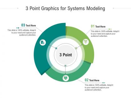
3 point graphics for systems modeling infographic template




Try Before you Buy Download Free Sample Product
 Impress Your
 Audience
 100%
100% Editable
 Save Hours
 of Time


Our 3 Point Graphics For Systems Modeling Infographic Template are topically designed to provide an attractive backdrop to any subject. Use them to look like a presentation pro.
People who downloaded this PowerPoint presentation also viewed the following :
3 point graphics for systems modeling infographic template with all 2 slides:
Use our 3 Point Graphics For Systems Modeling Infographic Template to effectively help you save your valuable time. They are readymade to fit into any presentation structure.
FAQs for 3 point graphics for systems
Start with clear visual hierarchy - don't try cramming everything in like most people do. Use consistent shapes for inputs, processes, outputs, and feedback loops. I'd stick to one color family per subsystem so it actually makes sense. Put your main system dead center, then build outward from there. Short sentences work better than long explanations. Add a legend because people shouldn't have to guess what stuff means. Honestly, half the system diagrams I see are total messes. Test it on someone who doesn't know your topic - if they're confused, you'll know right away.
So basically, your brain processes visual stuff way faster than text - it's just how we're wired. Think about staring at a massive block of code versus seeing a clean flowchart. Night and day difference, right? Color coding and diagrams let you spot patterns and bottlenecks instantly. The trick is staying consistent with your visual choices so everyone's on the same page. Honestly, I've seen too many projects where people skip this step and then wonder why stakeholders look confused in meetings. Spatial organization just makes sense to us - we naturally think in relationships and hierarchies anyway.
So there's basically three main types - conceptual ones that show relationships, mathematical models with equations, and physical representations of actual systems. Flowcharts work really well for processes, network diagrams for system connections, and hierarchical trees for organizational stuff. Those stock and flow diagrams are everywhere now - just boxes with arrows showing movement through your system. Honestly, I'd pick whatever fits your data first, then worry about making the visual flow make sense left-to-right or top-to-bottom. People need to actually follow it, you know?
Honestly, infographics are a game-changer for explaining messy system stuff. You can turn all those confusing feedback loops into actual visual stories people can follow. Flowcharts and diagrams work way better than drowning everyone in technical words - trust me on this one. When you're dealing with stakeholders who don't think in systems, visuals help them see how things connect and affect each other over time. Plus you can highlight the really important parts of your system. I learned this the hard way after watching too many eyes glaze over during presentations. Next time you're stuck explaining something complex, just sketch it out first.
Dude, pick your audience first - that's literally everything. Executives want high-level outcomes and clean visuals. Technical people need the nitty-gritty details and process flows. General folks? Simplify the language and throw in more visual metaphors. I swear, most infographics suck because they're trying to please everyone. You can't do that. Figure out who you're actually talking to, then match their knowledge level and attention span. Oh, and definitely show it to a few people from your target group before you call it done. Trust me on this one.
Okay so colors are basically your visual coding system - they help you tell different component types apart and show how things connect or flow. Pick maybe 3-4 colors max and give each one a specific job, like blue for inputs or red for decision points. Then stick to those rules! Honestly nothing's worse than those rainbow disaster infographics where you can't figure out what anything means. Use shades and tints if you need variations within the same category. Oh and definitely make a legend - people will thank you for it. Trust me, consistency is everything here.
Get your experts involved from day one - seriously, don't wait until the end. I always start with solid data before making anything pretty. Too many gorgeous infographics are total BS because someone prioritized design over accuracy. Have your subject matter experts check every single version, especially when you're simplifying stuff or using analogies. Clear labels are everything, plus consistent terms and cite your sources. Oh, and test it on someone who gets the topic but didn't help create it - fresh eyes catch mistakes you'll miss. Honestly? Pick clarity over being cute every time.
Honestly, just start with Draw.io - it's free and does everything you need for systems diagrams. Lucidchart is solid too if you want better team sharing stuff. Canva's awesome for making things look polished, though I always get distracted trying to pick the perfect color scheme lol. For really complex network stuff, Gephi handles the heavy lifting well. Visio's fine but kinda clunky IMO. Draw.io first, then maybe upgrade to Lucidchart later if you're working with other people a lot.
So basically you want your visuals to actually show what's happening in your system, not just look nice. Flowcharts with live data work well. Heat maps are perfect for spotting bottlenecks - honestly they're probably my favorite for this stuff. Network diagrams where the node sizes change based on performance? Super helpful. Interactive dashboards let people dig deeper into different parts of your model. Figure out which relationships in your system would benefit most from being visual first. Then pick techniques that highlight those specific patterns. The whole point is showing the actual dynamics, not making something that just sits there looking pretty.
Ugh, the worst thing you can do is cram everything into one graphic. Nobody wants to decode a visual mess! Also keep your symbols and colors consistent - I've seen diagrams that look like someone just threw random shapes at a wall. Make your text readable too (seriously, why do people make it microscopic?). Focus on the flows that actually matter instead of showing every tiny detail. Start with what you're trying to say first, then build around that. Way easier than cramming info into some template you found online.
Honestly, infographics are a game-changer for teaching systems modeling. Students' brains just shut off when you mention feedback loops, but throw some colors and icons at them? Suddenly they get it. The visual flow helps them actually see how different parts connect instead of just memorizing definitions. Plus they'll bookmark an infographic way before they'll keep track of handwritten notes - I swear half my students lose those within a week. Make them interactive if you can. QR codes linking to examples work great, or even just clickable sections. It transforms abstract concepts into something they can follow like a story.
Dude, storytelling totally transforms those boring system diagrams! Our brains just eat up narratives way better than random boxes and arrows. Walk people through like a "day in the life" scenario - show how one problem ripples through everything else. Way more engaging than a typical org chart, trust me. Add some real personas or examples that actually show your system doing its thing. The feedback loops become so much clearer when there's an actual story behind them. Plus people will actually remember what you're trying to show them instead of zoning out after 30 seconds.
Get feedback super early - like uncomfortably early when you're still not happy with it yourself. I do quick 15-minute screen shares because people actually explain what they're thinking instead of just saying "looks good." Ask specific stuff about whether the flow makes sense, not just if they like the colors (honestly, everyone has opinions about colors and most are useless). Test with actual end users, not the bosses paying for it. Those are totally different perspectives. Make a simple feedback form focused on comprehension. Do at least two rounds before calling it done.
Honestly, the biggest thing is making sure people can actually read your charts without squinting. Pick bar charts when you're comparing stuff, line graphs for showing changes over time. I learned the hard way not to shove everything into one messy visualization - nobody wants to decode that nightmare. Break your data into smaller pieces instead. Color coding helps tons, just keep it consistent. Always add your units and sources too. Here's what I do: figure out your 2-3 biggest takeaways first, then build everything around those. People should get the main point in like 10 seconds max.
Your audience's culture totally changes how they'll read your infographic. Reading direction matters - some go left-to-right, others don't. Colors are tricky too since red means danger here but luck in China (learned that one the hard way!). Different cultures expect different layouts. Hierarchical societies want clear top-down flows, while others prefer everything networked. Even your icons can backfire - gestures don't translate well. I'd definitely research your target audience first. Then you can adapt your visuals to actually make sense for them instead of just hoping it works.
-
Colors used are bright and distinctive.
-
Commendable slides with attractive designs. Extremely pleased with the fact that they are easy to modify. Great work!
-
Out of the box and creative design.