

3d doubtful man with red question mark confused solution ppt graphic icon




Try Before you Buy Download Free Sample Product
 Impress Your
 Audience
 100%
100% Editable
 Save Hours
 of Time


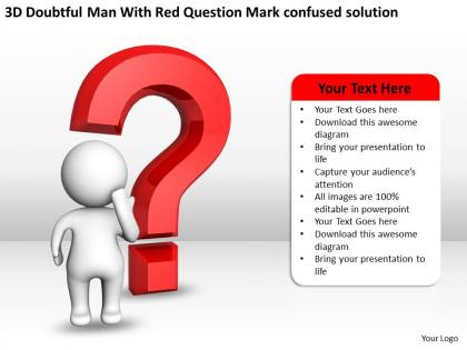
Download our 3D doubtful man with red question mark confused solution PPT graphic icon and make brilliant PPT slides. Your clients and customers understand your business by asking questions. It is the simplest and most effective way of learning. By including our doubtful man with red question mark confused solution PowerPoint image into your presentation you can make a difference between a failed project and a successful project as questions can be very powerful in getting what you want. Our Presentation theme has a graphic of a 3D businessman who is standing confused with a red question mark and is seeking answers to his questions. You can add your own list of questions in the confused man PPT diagram slide as the text is editable. Our question mark PowerPoint slideshow also helps in the decision-making process in any business. So, list your questions under discussion by utilizing our question mark PPT visual. Give your thoughts the compact look. Fit them into our acommodative 3D Doubtful Man With Red Question Mark confused solution Ppt Graphic Icon.
People who downloaded this PowerPoint presentation also viewed the following :
3d doubtful man with red question mark confused solution ppt graphic icon with all 3 slides:
Our 3D Doubtful Man With Red Question Mark confused solution Ppt Graphic Icon are cost effective. They give you much more than just value for money.
FAQs for 3d doubtful man with red question mark confused solution
Focus on making it obviously 3D first - shadows, gradients, that whole thing so it actually pops. Then go with the classics for confusion: question marks, someone scratching their head, maybe a shrug gesture. Don't get too creative here honestly, I've seen people overthink it and make icons that are more confusing than helpful lol. Strong contrast is crucial since these need to work at tiny sizes. Short version: if someone can't immediately think "oh that means I'm confused" then you missed the mark. Test it small before you commit!
Dude, 3D effects totally change the game for confusion icons. They add this depth that makes everything feel more "twisted" - which is perfect since that's literally what confusion feels like, right? Flat icons are fine but they don't grab attention the same way. When you throw some shadows and gradients on a question mark or tangled arrows, it pops off the slide. I've seen people go crazy with spinning 3D question marks during transitions (maybe too much?). But honestly, even subtle rotation or perspective will reinforce that whole "mixed up" vibe you're going for. Worth trying next time for sure.
You want people to immediately get what they're looking at - confusion or uncertainty, right? Question marks are your friend here, maybe some swirling stuff or puzzle pieces scattered around. Don't go crazy with colors though. Muted grays with some yellow or orange pops usually work pretty well. Here's the thing - depth should actually help people understand the icon, not make them squint at it like idiots. Watch those shadows and highlights when you scale down. Seriously, test it small early on because something that looks amazing at full size might turn into complete mush at tiny dimensions.
Warm colors like reds and oranges are your best bet for the confused stuff - they naturally create that anxious "something's wrong" feeling. For backgrounds, stick with cool blues or grays since they feel more stable. The contrast between the two really sells the emotion. I've noticed error states work super well when the problem area glows orange while everything else stays neutral. Though honestly, you should test different combos with real users because people react to colors differently depending on your audience.
Honestly, don't make it too literal with the crossed eyes or dizzy swirls - that stuff just looks cheesy. Simple depth beats complicated 3D every time. You'll want subtle lighting too, not some dramatic shadow situation. Here's what trips people up though: they go nuts with details that completely disappear on mobile. I've seen so many question marks that look amazing on desktop but turn into blurry messes on phones. The whole point gets lost, you know? Start with making sure people can actually recognize what it is, then add just enough 3D to give it some pop. Less is more here.
Okay so it really depends who you're presenting to. Executives? Go minimal - clean 3D head with some subtle question marks floating around it. Team meetings or teaching stuff? You can totally go wild with exaggerated faces, tangled thought bubbles, those dizzy cartoon spirals. Match your colors and lighting to whatever vibe your deck already has. I've seen so many icons that just look completely off because they clash with the slides. Honestly sketch out a few different versions first - like maybe three that fit your audience's expectations. Then pick whichever one feels right for the tone you're going for.
Oh yeah, definitely! It's so ironic - the more fancy 3D stuff you pile on, the harder it gets to figure out what the icon actually means. Like, your brain gets distracted trying to process all the shadows and gradients instead of just getting "hey, I need help." Honestly, I've seen some confusion icons that look like tiny art projects. Cool? Sure. Helpful? Not so much. All that visual noise just gets in the way of the actual message. You're better off sticking with something dead simple - a basic question mark or exclamation point does the job way better than some elaborate 3D thing that takes forever to decode.
Blender's honestly your best shot here - free and handles 3D icons like a champ. Cinema 4D rocks for clean geometric stuff, Maya works if you've already got it. But seriously, why spend money when Blender does everything you need? For simpler stuff, Figma with some plugins can pull off decent isometric designs. Adobe Dimension's okay for quick mockups too. The main thing is getting clean exports and solid lighting - confusion icons really need that depth to show the whole "uncertainty" vibe. Oh, and definitely check out Blender's icon-specific tutorials first.
So tech companies throw these into error screens and troubleshooting stuff - you know those confused 3D guys when apps break? Healthcare puts them in patient education and training software for tricky symptoms. E-learning platforms are obsessed with them too, showing when students get lost on concepts. Gaming goes absolutely nuts with confusion icons though, they're everywhere. Oh and I saw one in a banking app yesterday which was weird. The main thing is just making sure the vibe matches your audience - don't use a cutesy confused character for something serious.
Honestly, typography makes a huge difference for 3D confusion icons. Sans-serif fonts work best - they stay clean and don't fight with your dimensional elements. Bold headers paired with lighter text creates good visual hierarchy. Oh, and spacing is everything! I've seen way too many icons where cramped text just makes the whole thing worse. You want fonts with some weight to them but nothing that competes with the 3D style. The text should actually help clarify what users are looking at, not add more confusion to the mix.
Oh totally! Cultural stuff is massive for confusion icons. Question marks work fine here, but head-scratching or shrugging can come off as rude in other places. Colors are tricky too - what looks like "thinking" to us might mean something weird elsewhere. Actually had this blow up on me last year, ugh. The expressions and gestures you pick need to make sense everywhere your users are. I'd say test with people from different regions super early, before you're stuck with whatever you designed.
Honestly, animations are a game-changer for confusion icons - they grab attention right when you need to show uncertainty. I usually go with subtle stuff like gentle rotations or a little wobble that feels "thoughtful." Don't go crazy with spinning though, I've seen presentations where it's just distracting. Time everything with your talking points so the icon activates exactly when you're discussing the confusing part. Oh, and use entrance animations for new problems, exit ones when you solve them. Makes the whole thing feel way more dynamic than just static images sitting there.
Oh totally, the whole 3D confusion icon thing is getting way more refined now. Glassmorphism and neumorphism are everywhere - they add depth without looking cheesy. Clean geometry is key too, like smooth question mark curves instead of those messy tornado swirls from a few years back. Honestly, static icons feel pretty dead at this point. Everyone wants micro-interactions now - little rotating bits or morphing effects. Makes sense though, it actually helps communicate the "confusion" better. The accessibility push is real too, so you need solid contrast ratios. I'd say jump into animated prototypes early. That's where you'll actually figure out what clicks with people.
So feedback is like your cheat sheet for fixing that wonky 3D icon. Run some user tests and actually watch people use it - honestly, nothing beats seeing someone stare at your design completely lost. Figure out what's breaking: is the 3D angle weird, or do they just not get what it's supposed to be? Look for patterns in what people complain about. Maybe the lighting's off or it's too cluttered. Then fix those specific issues first. I'd start with simple A/B tests before going nuclear on a complete redesign. Way easier to tweak than rebuild from scratch.
Look, I haven't seen any formal case studies on 3D confusion icons - they're pretty niche. But I've noticed them work well in tech presentations when someone's about to explain something gnarly. Instructors use them too, like a "buckle up, this gets weird" warning before diving into complex stuff. You don't want to overdo it though. Save them for when you actually need to flag something as tricky or uncertain. Otherwise they lose their punch and just become visual clutter.
-
Great designs, Easily Editable.
-
Topic best represented with attractive design.