


7 boxes powerpoint ppt template bundles




Try Before you Buy Download Free Sample Product
 Impress Your
 Audience
 100%
100% Editable
 Save Hours
 of Time


Our 7 Boxes Powerpoint Ppt Template Bundles are topically designed to provide an attractive backdrop to any subject. Use them to look like a presentation pro.
People who downloaded this PowerPoint presentation also viewed the following :
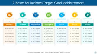
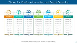
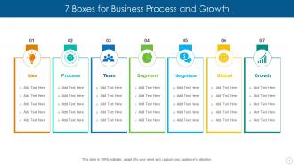
7 boxes powerpoint ppt template bundles with all 12 slides:
Use our 7 Boxes Powerpoint Ppt Template Bundles to effectively help you save your valuable time. They are readymade to fit into any presentation structure.

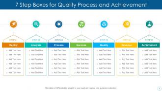
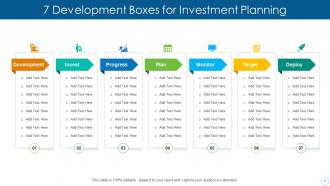
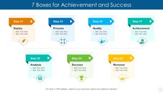
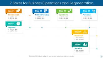
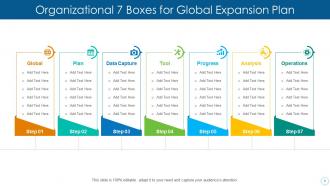
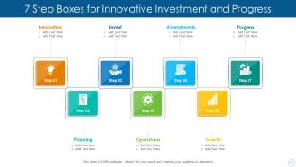
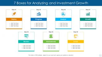
FAQs for 7 boxes powerpoint
Dude, stick with consistent fonts and clean colors that match your brand. White space is your friend - lets everything breathe instead of looking cramped. Make different layouts for title slides, bullet points, charts, that sort of thing. Oh and please don't go smaller than 24pt for body text, nobody wants to squint at tiny fonts! High contrast between text and background is cluttered templates drive me absolutely nuts. Keep your logo subtle but consistent across slides. The template should make your content pop, not steal the show. Start with maybe 3-4 solid layouts and expand later.
Honestly, colors can totally make or break your presentation. Bright, contrasting ones grab attention and highlight important stuff, but muted tones give off that professional vibe. I once used bright yellow text on white – looked fine on my laptop but was completely unreadable on the projector. Major fail! Your color choices affect how long people can actually look at your slides without their eyes hurting. Stick to 2-3 colors max and make sure there's good contrast between your text and background. Oh, and definitely test it on different screens first. Trust me on this one.
Honestly, just go with Calibri, Arial, or Montserrat - anything clean that won't make people squint. Two fonts max: one for headers, one for body text. Sans-serif is your friend here since it reads way better from the back of the room. I learned this the hard way when my fancy script font looked like gibberish on the projector. Keep body text at least 24pt and titles 36pt+. Make sure there's decent contrast between text and background too. Oh, and actually walk across the room to test it - you'd be surprised how many templates fall apart once you're not staring at your laptop screen.
Templates are honestly a game changer - they give you that solid starting point without locking you into someone else's vision. You get the layouts and color schemes already done, then just tweak whatever doesn't work for you. Way better than staring at a blank slide wondering where to even start (been there, it's rough). Swap out their stock photos, match your brand colors, move stuff around. The design stays cohesive but it's actually yours. I always grab a template first now - lets me focus on the actual content instead of fiddling with fonts for an hour.
Think of visual hierarchy like a roadmap for your reader's eyes. Make your title the star - biggest and boldest. Then your key points should pop out clearly while details stay more subtle. Size, color, and contrast are your best friends here. Honestly, I cringe when I see templates where every single element is fighting for attention - it's just visual noise. Good hierarchy happens when people naturally read things in the right order without even realizing it. Start with what's most important and scale down from there. Your brain will thank you later!
Make different versions of your template - 4:3, 16:9, maybe vertical too. I messed this up once and my slides looked awful on the conference room's massive screen, so learn from my mistake! Adjust text sizes and image placement for each format. Also test everything on your phone because what looks perfect on your laptop can be tiny and unreadable on mobile. Oh, and set up master slides that aren't too rigid - you'll thank yourself later. Color contrast matters way more than you'd think on smaller screens.
Your template choice totally depends on who you're pitching to. Healthcare folks want clean, clinical vibes - think medical imagery, not flashy startup graphics. Financial people? They're all about conservative blues and grays that scream "trustworthy." Creative agencies can handle wild colors and weird layouts, while tech companies go for that sleek minimalist look. It's basically like picking the right outfit for a job interview - you gotta show you understand their world. I learned this the hard way once! Do a quick search of what their industry typically uses before deciding.
Honestly, pre-made layouts are a lifesaver. You'll save so much time since you don't have to start from scratch every single slide. Just grab whatever layout matches your content and you're good to go. The spacing and fonts stay consistent too, which is clutch for looking professional. I mean, unless you're secretly a graphic designer? Most of us definitely aren't lol. Quick tip - browse through all the layout options before you start. I learned this the hard way after realizing there was a perfect one I'd missed. Takes like 5 minutes but totally worth it.
Your PowerPoint slides will look so much more professional when you actually use your brand stuff consistently. Throw your logo, brand colors, and main font into a master template everyone can share. People start recognizing those visual elements after seeing them repeatedly - it's basically like training their brain to remember your company. Honestly, the difference between branded slides and random templates is night and day. Your audience picks up on that consistency without even realizing it, which builds trust over time. Plus it stops your presentations from looking like they were slapped together five minutes before the meeting.
Pick a template that matches your vibe first - boardroom formal vs creative brainstorm, you know? Colors should back up your message, not scream over it. Also, can people actually READ your text from the cheap seats? That matters more than you'd think. Data presentations need clean layouts with breathing room. Storytelling works better with visual templates that don't look boring. Honestly, the template should make your story flow easier, not harder. Quick sanity check: does this thing help or hurt what I'm trying to say?
Build your animations right into the slide master so they'll auto-apply to new slides. Go with subtle stuff - smooth fade-ins for bullet points, clean transitions that feel on-brand. Less flashy is better since overly animated slides get old quick. Set entrance effects for your main elements and throw in some emphasis animations for callouts. Oh, and definitely test run everything first - nothing worse than slides glitching mid-presentation when your coworker's trying to impress the boss.
Honestly, just use PowerPoint's Slide Master view - it's way easier than you'd think. Go to View > Slide Master and set up all your layouts, fonts, and colors there. Most people don't even know this exists lol. If you want something more polished, start your design in Canva Pro or InDesign first, then bring those elements into PowerPoint. There are fancier tools like Slidebean or TemplateMonster's builder, but they're probably overkill. The native PowerPoint tools handle like 90% of what you'll need anyway. Start with Slide Master and see how far that gets you.
Oh man, global design is tricky! Colors are the big one - red screams danger here but it's lucky in China. Plus some places read right-to-left so your whole layout gets flipped. I made the mistake once of using a hand gesture that was apparently super offensive (whoops). Font choices matter too since you'll need different language support. Text expansion is annoying but necessary - translations usually take up way more space than English. Honestly? Just research each market first and get natives to check your work before launching.
Honestly, minimalism is huge right now - clean layouts with tons of white space and typography that doesn't hurt your eyes. Dark mode is finally mainstream (about time lol). Interactive stuff is cool but don't go overboard with animations. People are ditching those awful generic stock photos for real images too. My take? Don't try cramming every trend into one design. Pick maybe one or two things and actually do them well. Clean layout is probably your safest bet to start with.
Templates are honestly a game-changer for team stuff. No more endless debates about which font looks "more professional" - you just focus on the actual content. Everyone works with the same structure, so when you're dividing up slides it's not a total mess when you put everything back together. The placeholders make it pretty obvious where charts and text should go too. Oh, and if someone can't present their section last minute? Easy to shuffle things around since everything matches. Trust me, pick a decent template from the start and you'll save yourself so many headaches later.
-
Innovative and attractive designs.
-
Great designs, really helpful.
-
Amazing product with appealing content and design.
-
Best way of representation of the topic.