


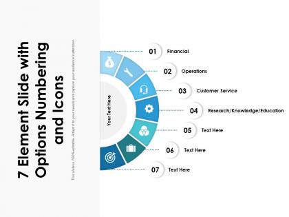
7 element slide with options numbering




Try Before you Buy Download Free Sample Product
 Impress Your
 Audience
 100%
100% Editable
 Save Hours
 of Time


Earn big instead of in bits due to our 7 Element Slide With Options Numbering. It gives a discernible boost to your income.
People who downloaded this PowerPoint presentation also viewed the following :
7 element slide with options numbering with all 2 slides:
Give a discernible boost to your income with our 7 Element Slide With Options Numbering. Earn big instead of in bits.
FAQs for 7 element slide
The 7 elements slide basically walks through your argument step by step. Start with situation/context, then hit complication, question, hypothesis, key findings, implications, and next steps. Each piece should flow into the next one naturally - honestly, it's just storytelling with a framework. One sentence per element, max. People zone out if you ramble. I usually map out my main message first, then figure out how it breaks into those seven chunks. The tricky part is making each point concise but still meaningful enough to stand alone. Think of it like dominoes - each element should set up the next one perfectly.
Size, color, and spacing are your best friends for guiding people through those 7 elements. Clear title first, then make each part look different but still connected. Honestly, I've seen way too many slides that look like confetti exploded on them! Stick to 2-3 colors max and keep fonts consistent. Replace text walls with icons or simple graphics - way more memorable. Don't cram everything together either. White space actually helps a ton. Try squinting at your slide from across the room. Can't pick out the main points? Time to simplify.
Don't cram every detail into each point - you'll just confuse people. Each element should cover one clear idea, that's it. Also watch out for overlap between your points since that defeats the whole purpose. Honestly, if your content fits better into 5 or 6 categories, just go with that instead of forcing exactly 7. Visual hierarchy matters too - everything can't look equally important or nothing stands out. Use consistent formatting and clear numbers so people can actually follow along. Oh, and keep the text minimal on each one.
Ok so first thing - figure out your main point and make sure all seven parts actually support it. Otherwise you'll just confuse everyone. Keep your fonts and colors consistent (I know it sounds obvious but people screw this up constantly). Number everything and throw in connecting words like "next" or "this leads to..." so it flows better. Honestly the best test is just saying it out loud to yourself first - if YOU can't get from point A to B smoothly while talking, your audience is gonna be completely lost. Also maybe do a quick run-through with someone else if you can swing it.
Dude, you need a story for your 7 elements slide or people will zone out completely. Nobody wants to sit through a boring bullet point list. Connect each element like chapters in a book - give it a beginning, middle, end. Each point should build on the last one and lead somewhere meaningful. Your audience needs to follow your logic, right? So figure out what bigger story you're actually telling first. Then make each element feel like the next logical step. Trust me, this approach makes everything way more memorable than just rattling off random facts. Stories stick with people long after they've forgotten your fancy charts.
Honestly, you've gotta totally switch up your approach depending on who's listening. Execs just want the big picture stuff - business impact, outcomes, that kind of thing. They'll zone out if you get too technical. But with technical teams? Go deep on the process details. I've seen so many people bomb because they used the exact same presentation for both - it's painful to watch. Change your examples too. Sales people eat up customer stories, operations folks care more about efficiency numbers. The basic structure can stay the same, but everything else needs to shift. Just think about what's actually stressing out your specific audience.
Keep it simple with 2-3 colors max, and make sure there's good contrast so people can actually read your stuff. Stick with one font - Arial or Calibri work great for presentations. I always go sans-serif since it looks cleaner on screens. Your colors should match whatever vibe you're going for (blues feel trustworthy, greens suggest growth, that sort of thing). Once you pick your palette and font, don't switch it up halfway through - consistency is everything. Oh, and definitely test it on a projector first if you can. I've learned the hard way that what looks perfect on your laptop might look totally washed out when projected.
Okay so the 70-30 rule is clutch - most of your slide should be visuals, way less text. People look at images first anyway, so make them actually relate to what you're saying. Don't write paragraphs! Bullet points or just short phrases work way better. I used to stuff slides with text thinking it looked more professional... total mistake. Place your text around the images instead of fighting for space. Oh and put your biggest point near your strongest visual - it creates this natural flow that just works. High-quality photos make a huge difference too, obviously.
Honestly just go with PowerPoint - I've made so many of these and it's still my go-to. The SmartArt thing is clutch for keeping 7 elements lined up without looking messy. Canva's also solid if you want something prettier, and their templates are actually decent (free version works fine). Keynote's nice too if you're on Mac. Whatever you use, definitely start with a template. Trust me on this one - trying to get the spacing right from scratch is such a pain. Oh, and make sure it has good alignment tools or you'll be eyeballing everything forever.
Look, sequencing helps but don't overthink it. Lead with your best stuff to grab attention right away. After that, just make sure things flow logically - one point should connect to the next somehow. I've watched people stress for hours about the "perfect" order when honestly? As long as you're clear, people will follow along. Don't dump your strongest point at the very end though - that's where you lose them. Oh, and definitely run it by someone first if you're second-guessing yourself. Better safe than sorry.
Honestly, just watch your audience during the presentation - are they asking questions? Paying attention? That tells you a lot right there. After, I always do a quick survey asking what their main takeaway was. Super revealing! Track if people actually do what you asked them to do within a week or two. Did they book that meeting? Approve the project? Those hard metrics matter way more than you'd think. The cool thing about using the 7 elements is each one has its own success markers you can measure. Oh, and don't sleep on conversion rates - they'll show you what's really working.
Get someone else to look at your slides before you present! When you've been staring at the same deck forever, you literally can't see what's wrong with it anymore. A coworker will catch stuff like wonky spacing or confusing flow that you're totally blind to. They'll also tell you if your main point is actually getting across - honestly that's huge because what makes sense in your head doesn't always translate. I always do a quick run-through with someone, even if it's just 10 minutes. Ask them specific stuff like "does this slide make sense?" or "what's the first thing you notice?" Trust me, it saves you from bombing.
Dude, this format works great for consulting, project management, marketing - basically anywhere you're breaking down complex stuff. McKinsey presentations love this approach. So do product launches and training sessions. Executives eat it up because they get the overview without drowning in details. Honestly way better than those awful text-heavy slides everyone hates sitting through. Next time you're pitching a big strategy or walking people through a process, try it. Keeps people actually paying attention instead of checking their phones.
Figure out what story you're telling first - like what's the main problem you're solving? That becomes your backbone. Each of those seven elements should connect like dominoes. Your problem naturally leads to your solution, then benefits, then how to actually do it. Honestly, I always write out those transition sentences beforehand because otherwise you end up with those cringe "next slide" moments. Practice saying the connections out loud too - your audience shouldn't be confused about why they're looking at something. It's basically building a bridge where each piece supports what comes next.
Dude, you gotta pause after each element and actually check if people are still with you. Ask questions, have them think of examples from their own work. I've watched so many presentations where someone just powers through all seven points - by element four, half the room is mentally checked out lol. Short sentences help. Between each element, build in those interaction moments where they can actually engage with what you're saying. The whole goal is getting them to internalize this framework, not just sit there passively. Oh and definitely save time at the end for them to practice applying it to something real they're dealing with.
No Reviews