

7 steps circular arrows with icons





Try Before you Buy Download Free Sample Product
 Impress Your
 Audience
 100%
100% Editable
 Save Hours
 of Time


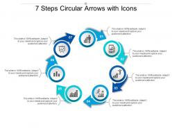
Seven steps circular arrow with icon PPT slide can demonstrate the process who has seven stages. Describe your achievement through the circular arrow diagram. Variety of icons encourage affirmative action. In a business perspective, you can illustrate the customer relationship with an organization as the priority given to the customer and you can insert the different drawing figures slide in your presentation and make it more innovative. Along with that pointed arrow diagram presents the Analysis, Brainstorming, Business, Chart, Concept, Creativity, Process Execution, Flowchart, innovative Ideas, Interface, Layout, and it also represents Legal Policies, Management, Meeting Notes, Plan, Benefits of Project and many other things related to business. In the education perspective, you can demonstrate the different Program for students and teach the students that how teamwork is essential to carry out a process by using seven circular pointed templates. There are many things associated with a process, pointed circular flow figure can help in explaining it. Bring about agreement with our 7 Steps Circular Arrows With Icons. It ensures disputes fizzle out.
People who downloaded this PowerPoint presentation also viewed the following :
7 steps circular arrows with icons with all 5 slides:
Fan their aspirations with our 7 Steps Circular Arrows With Icons. Give them cause to aim high.
FAQs for 7 steps circular
So basically you want clear stages with labels, plus arrows showing which direction everything flows. Picture a clock but swap the numbers for your process steps. Each part should connect logically to create that loop effect. Don't forget decision points where things might branch off or circle back - those are actually pretty crucial. I always put the main title in the center since there's usually dead space there anyway. Oh and make your arrows thick enough that people in the back row can actually see them when you're presenting!
Honestly, circular diagrams are so much better for visual learners! They show how stuff actually loops back to the start - like you get that lightbulb moment seeing the whole cycle. Linear ones just... end. But circles? Perfect for things like the water cycle or those endless project workflows we deal with. Something about the flow just makes more sense to your brain (works great for hands-on learners too). You can literally start anywhere on the circle and still get it. Try making your next diagram circular instead - I swear people will understand it way faster!
Oh man, these circular diagrams are literally everywhere once you start noticing them. Manufacturing companies use them for production cycles and quality stuff. Healthcare has them for patient care workflows. Software teams are obsessed with them for sprints and DevOps - honestly makes sense since everything's iterative there. They're perfect for showing how processes loop back on themselves, which makes spotting problems way easier. Project management across pretty much any industry uses them too. I'd say start with any workflow that repeats in your company. They're dead simple but super helpful for seeing the big picture.
Keep it simple - use the same colors/icons throughout so it looks cohesive. Give everything room to breathe with white space (cramped diagrams are the worst). Number your steps if order matters, and make sure those arrows actually show where to go next. Write like a normal person, not a manual. Honestly, 5-7 steps max or people zone out. Oh, and definitely run it by someone else first - I can't tell you how many times something seemed obvious to me but completely confused my coworker. What sounds crystal clear in your head doesn't always translate.
Honestly, colors can totally make or break these diagrams. You'll want strong contrast between your background and text - none of that light gray on white nonsense. Each step needs its own distinct color so people can actually follow what's happening. I always use complementary colors instead of similar shades because everything just turns into visual soup otherwise. Keep it consistent too, like maybe all inputs are blue and outputs stay green throughout. Oh, and skip the red-green combos since some people can't distinguish those. Step back from your screen when you're done - if you can't follow the flow from a distance, neither can anyone else.
I usually go with Lucidchart or Draw.io for circular process stuff - both have solid templates and aren't too complicated to figure out. Visio's okay if you're already using Microsoft everything, but honestly it feels kinda outdated. PowerPoint actually works fine for basic circular diagrams if you just need something fast. Canva's pretty good too, especially if you want it to look nice for presentations. Oh, and Draw.io is completely free which is awesome. I'd probably start there and see how it goes before spending money on anything else.
Dude, circular diagrams are honestly game-changers for explaining stuff to stakeholders. They show how everything flows together without that awkward "where do we start?" moment you get with linear charts. Non-tech people actually get it when you can point to any step and show how it connects to the next. Way more memorable than those soul-crushing bullet point lists we usually torture people with. I swear, stakeholders retain this stuff so much better. Just use them as conversation pieces - walk around the circle together and let people interrupt with questions. Makes the whole thing feel less like a presentation and more like, you know, an actual discussion.
Okay so annotations are basically what save your diagram from being a confusing mess of arrows and shapes. Use them to explain each step, clarify timing, or call out those crucial decision points. I always think of them like those sticky notes you'd slap on if you were walking someone through it in person. Without decent labels, people just stare at your diagram trying to decode what the hell each part means. My move is adding short, specific notes that explain both what's happening and why at each stage. Trust me, your audience will actually follow along instead of giving up halfway through.
Yeah totally! Just gotta be smart about it though. Break your big process into main chunks on the outside, then show the detailed stuff inside each section using smaller bits or different colors. I've definitely seen some that are just absolute disasters because they threw everything together at once lol. Color coding helps a ton, or you can do that thing where people click to see more details. Honestly the best approach is mapping out your main flow first, then adding layers bit by bit so you don't overwhelm people right away.
Use curved arrows that loop back to earlier stages - that's how you show feedback in circular diagrams. I'd make them look different from your main flow, like dashed lines or a different color. Otherwise it gets messy fast (trust me on this one). Put the feedback loops inside or outside your main circle so it stays readable. Label what each arrow is feeding back too - like "customer input" or whatever. Short feedback loops work better than long ones that span the whole circle. This way people can actually see how your process adjusts itself.
So circles work great when your process keeps going and going - no real beginning or end. Linear diagrams feel too rigid for that stuff, you know? Each step flows into the next one, then loops back around. Product development cycles are perfect examples. Quality improvement too. Honestly, I think circular diagrams just click better with people's brains when they see repetitive processes. If you've got something that feeds back into itself, definitely go circular. Makes the whole "this never really stops" thing super obvious to whoever's looking at it.
Honestly, circular diagrams are a game-changer for mapping out projects that loop back on themselves. Perfect for agile stuff or when you're constantly tweaking and going back to fix things. We used one last week for our product cycle and it made everything click - way better than those boring linear timelines that pretend projects actually work that way lol. The loop shows your team that real project work is messy and iterative. Just sketch one out for whatever you're working on now. You'll spot all those natural feedback points and revision cycles you didn't notice before.
Don't cram too much text or steps into your diagram - honestly, it just looks like a hot mess and nobody wants to decipher that. Make your arrows point in consistent directions. I see people forcing linear processes into circles all the time just because it "looks better" but it's confusing as hell. Keep your fonts and colors the same throughout, and make sure each step actually connects to the next one logically. Your text should be short and sweet. Here's what I always do: have someone else look at it first. If they're scratching their head trying to follow along, you'll know it needs work.
Test it with people who don't know the process - that's your best bet. Watch where they get stuck or confused. I'd grab a few coworkers and see if they can figure out where they are in the cycle and what's next. The whole point is making sure it actually speeds things up instead of creating more questions. Short sentences work better than long explanations, honestly. Can newcomers tell it's cyclical? Or do they think it's just another boring step-by-step list? If people aren't getting dizzy looking at it, you're probably on the right track.
Honestly, circular diagrams are game-changers for decision making. They show you how everything connects back to itself, which is huge. You'll spot bottlenecks way easier and catch those "oh crap, this will screw up that other thing" moments before they happen. I love how you can see the ripple effects of changes before committing to anything. The visual aspect really helps - like, where's the best place to jump in with improvements? Just sketch out your situation in a circle and watch the patterns pop out. Works way better than those boring linear flowcharts, trust me.
No Reviews