


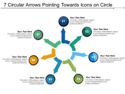
7 circular arrows pointing towards icons on circle




Try Before you Buy Download Free Sample Product
 Impress Your
 Audience
 100%
100% Editable
 Save Hours
 of Time


Create an effective and successful business presentation with our 7 circular arrows pointing towards icons on circle PPT slideshow. Our PowerPoint presentation slide of circle with arrows has been designed by our professional team members and allows you to tell a story for your next business presentation. This curved arrow PPT template can be used to take you presentations to next level, create ideas to wow you audience or to lay out slides to convey information cleanly. This circular arrow PPT slideshow can be used to depict different kinds of information like process flow, business hierarchy, connected people or feedback loop to a well-defined process. This PowerPoint layout is designed to present concepts of planning, business automation, strategy or success. With the help of this presentation of arrows in circles you can exchange of information or to depict the flow of process without any trouble. Download this slideshow and for such layouts visit our website. Generate fodder for their brains with our 7 Circular Arrows Pointing Towards Icons On Circle. Feed them with the facts to chew on.
People who downloaded this PowerPoint presentation also viewed the following :
7 circular arrows pointing towards icons on circle with all 5 slides:
Fulfill consumer aspirations with our 7 Circular Arrows Pointing Towards Icons On Circle. Build their consciousness about your brand.


FAQs for 7 circular arrows pointing towards
Okay so for circular diagrams, you'll want clear labels that actually make sense - I've sat through way too many presentations where people just threw random text everywhere. Each section should be one specific step or phase. Don't go crazy with colors, but mix it up enough so people can tell sections apart. Keep text big enough that someone in the back row can read it (learned that one the hard way). Honestly, anything more than 6-8 sections gets messy fast. The arrows need to flow naturally so your eye just follows them around without getting lost. Try walking through it out loud first - if you stumble explaining it, your audience definitely will too.
So circular diagrams are perfect for showing how processes loop back on themselves - no real ending, just continuous cycles. Think customer feedback loops or product development where each phase connects back to the start. Way clearer than those messy flowcharts that branch everywhere! People get it instantly because they can actually see how stage 3 affects stage 1. Suddenly all those "why do we keep repeating this" conversations make sense. I mean, it's honestly kind of obvious once you see it mapped out. Definitely sketch one before your next process meeting.
So for circular arrow stuff, I'd honestly just go with draw.io first - it's free and does pretty much everything you need. Lucidchart's another good one, both are web-based with decent templates. PowerPoint works too but can be annoying to get the arrows looking right. Canva's surprisingly decent if you want something that looks nice without wrestling with tools for hours. Visio's obviously the fancy option but costs a fortune. I mean, unless you're doing super complex diagrams all day, draw.io should handle it fine.
Yeah, colors totally mess with how people read those circular diagrams. Warm ones like red grab attention and scream "urgent!" while blues feel way more chill and steady. Here's the thing though - if you go crazy with different colors, people think those steps are separate or more important. Not always what you want, right? I'd stick with maybe 2-3 colors from the same family so the flow stays smooth. Oh, and save your punchiest color for whatever step matters most. Trust me on this one.
Don't cram a novel into each circle - nobody's gonna read that mess. Keep it to 6-8 steps max or it gets overwhelming. Your arrows should flow logically, not bounce around like a pinball machine. Honestly, the worst ones I've seen have zero consistency - giant arrows next to tiny ones for no reason whatsoever. Stick to 2-3 colors. Short sentences work better than long explanations. Here's the real test: show it to someone else first. If they're squinting and asking questions, you've probably overdone it. Simple beats fancy every time.
Honestly, it depends what you're showing. If your process loops back or repeats itself, go circular - it instantly tells people "hey, this keeps going." Linear works when there's a clear beginning and end. The shape actually does half the work for you, which is kinda cool. Like, if you use a straight line for something that cycles, people might think it just... stops? Which could confuse them. Circular's perfect for feedback loops, workflows that repeat, stuff like that. Short answer: pick circular when you want to show continuity. Linear when there's a definite start-to-finish sequence.
Honestly, consulting firms are obsessed with these things - like, borderline addicted. Tech and manufacturing companies use them tons too since they're perfect for showing workflows and processes. Business consultants will throw them into every presentation possible (sometimes when they don't even need to, but whatever). They work great for project management stuff and quality control. Manufacturing loves them for continuous improvement cycles. Oh, and literally any field dealing with feedback loops. If you're presenting something that repeats or cycles, just grab one of those circular arrow templates. Way easier than trying to explain it with bullets.
Oh totally! Circular diagrams are perfect for storytelling. They show how everything connects and loops back around - way better than boring straight timelines if you ask me. Great for character growth arcs or when your plot comes full circle. Your audience can actually *see* how the ending ties back to where you started, which feels really satisfying. I'd start by putting your key story moments around the circle first. Then draw arrows showing the flow between them. Works especially well for stories about cycles or learning from mistakes... actually makes complex plots way less confusing to follow.
Just stick the numbers right inside each arrow or segment - percentages, key metrics, whatever data you've got. I usually drop them next to the process labels or make little data boxes beside each step. Way more convincing than plain text, honestly. You could even make thicker arrows for bigger numbers, or throw small charts inside the larger segments if there's room. Don't go crazy though - too much clutter kills the whole thing. Start with maybe 1-2 metrics per section and adjust from there.
Honestly, short labels work way better - like "Analyze" or "Test" instead of writing out whole descriptions. I've made this mistake before and it just looks cluttered. Keep your verb tenses consistent across everything. Try to position text horizontally since nobody wants to tilt their head to read stuff. Color coding helps if you've got natural groupings in your process. Oh, and start with your first step at the top, then go clockwise from there. Trust me on this one - it'll look so much cleaner than cramming sentences everywhere.
Honestly, circular diagrams are amazing for visual people - you literally see the whole flow instead of trudging through boring text blocks. The arrows pull your eye around naturally, so it's obvious how each step connects. I love that the circular shape shows processes actually cycle back rather than just... ending somewhere random. Different colors for each stage work great, or throw in some icons if you're feeling fancy. Way better than trying to explain cyclical stuff in paragraph form - that just confuses everyone.
Start with vector tools like Illustrator or PowerPoint so it won't look pixelated later. Animations are cool but honestly they're overrated most of the time. Make your text at least 12pt - people will squint otherwise. High contrast colors work way better for print since printers always screw up the subtle stuff. Oh, and export at 300 DPI if you're printing anything. The biggest thing though? Test it on whatever device or paper you'll actually use. I learned this the hard way when my "perfect" diagram looked terrible on the conference room screen.
Dude, circular arrows are honestly game-changers for presentations. Your brain just gets cyclical stuff better when it's visual - way easier than reading through boring bullet points. There's real research backing this up too (can't remember the exact study name but whatever). The cool thing is people see how each step connects instead of thinking it's just A→B→C→done. Makes total sense for any process that repeats or builds on itself. I used one last month for explaining our feedback loop at work and everyone actually stayed awake. Trust me, if you've got something cyclical to explain, skip the linear charts. Your audience will thank you.
Circular arrows are perfect for this! They show how stuff loops back on itself - like when your output becomes the next round's input. I use them constantly for product dev cycles, feedback loops, that kind of thing. Way better than walls of text, honestly. Just arrange your steps around the circle and let the arrows do the work. Numbers or colors help if things get messy. The trick is making it obvious where one cycle ends and the next starts. Your audience will get it immediately once they see that visual loop.
Oh those are perfect for mapping out processes that circle back on themselves! Like when you're doing project reviews or improvement cycles - stuff that doesn't just go A to B to C and stop. They show how each step connects to the next and loops around again. Super helpful for spotting where things might get stuck or slow down. I actually used one last month for a campaign we kept tweaking based on feedback. Your team will get the flow way better than if you just listed steps out. Definitely try it next time you're dealing with anything cyclical.
No Reviews