


Asking questions graphics powerpoint ideas





Try Before you Buy Download Free Sample Product
 Impress Your
 Audience
 100%
100% Editable
 Save Hours
 of Time


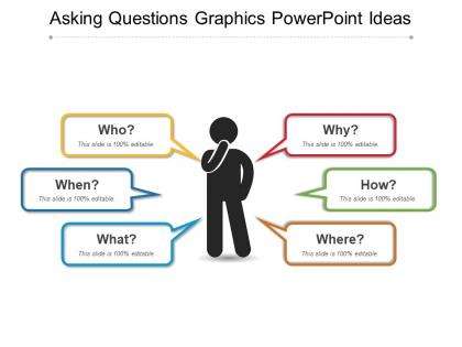
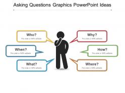
Introducing Asking Questions Graphics PowerPoint Ideas. With the help of this presentation slides you can ask for queries related to your topic. You can share your thoughts, opinions, ideas, and views with other people by using our PPT presentation template. If you are preparing a project and are unable to understand some specific topic, then ask your faculty about that with the help of this PowerPoint presentation. You can describe the different characteristics which are involved in research projects such as descriptive, relational, and causal questions using our professionally designed PPT slides. There are various types of questionnaire used in educational context like comprehensive, application, synthesis, analysis, evaluation, etc. which you can highlight with the help of this presentation template. The facts PowerPoint presentation slides are used by anyone in accordance with the direct, indirect, follow-up, positive, negative, compound, and initial questions. Download this ready-to-use PPT template and clear your doubts.
People who downloaded this PowerPoint presentation also viewed the following :
Asking questions graphics powerpoint ideas with all 5 slides:
The details contained in our Asking Questions Graphics Powerpoint Ideas are absolutely authentic. You can bet on the factual accuracy.
FAQs for Asking questions
So you'll want to pick participants who can actually make sense of your visuals - that's huge. Next, prep your images or videos carefully and pilot test them first (trust me on this one). Data collection means structured interviews or focus groups where you capture both what people say AND their reactions. The analysis bit? That's where it gets messy because you're hunting for patterns in how people see things differently. Don't forget solid documentation throughout. Oh, and obviously start with a clear research question or you'll be swimming in random data later.
Honestly, charts and graphs will save your sanity when you're drowning in data. Your brain just picks up on patterns and weird outliers so much faster than scanning endless rows of numbers. I always throw my messiest datasets into different chart types first - scatter plots, heatmaps, whatever - just to see what pops out. You'll catch trends over time that you'd totally miss otherwise. Plus when you need to present to people? Way easier than making them stare at spreadsheets (nobody wants that). Try it with your most confusing data and watch everything suddenly make sense.
Honestly, storytelling is what makes the difference between a presentation people remember and one they forget five minutes later. Your visuals need a narrative thread - like you're walking them through your discovery process step by step. Without it, you're just throwing charts at people (and trust me, nobody wants that). The story gives context to each piece of evidence and builds up to your big insights. I always map out beginning, middle, end before I even think about slides. It's way easier than trying to retrofit a story later. Think tour guide, not data dump.
Honestly, it depends on who you're talking to. Charts work best for data nerds who want the info fast. Infographics are better for keeping regular people interested - they tell more of a story, you know? Interactive dashboards get crazy engagement but they're way too much work for simple stuff. I'd look at your audience first. Executives? Give them a clean bar chart they can scan in 30 seconds. Presenting to the whole team though? Go with infographics that have icons and flow nicely. Just test whatever you pick first.
Honestly, the hardest part is getting people past that initial weirdness of analyzing images. Most folks aren't used to "reading" visuals critically, so you've got to ease them in with solid examples and clear prompts. Data gets chaotic super fast too - everyone interprets images differently, which is cool but messy. And wow, the analysis time will kill you. Visual inquiry creates this mountain of complex responses that takes forever to code properly. I'd definitely run pilot sessions first to iron out the weird stuff that always pops up. Also? Budget way more time for analysis than you think you need.
Honestly, mixing different fields is a game changer for visual analysis. You'll catch stuff you'd totally miss otherwise. Like, a psychologist might spot emotional patterns while an anthropologist sees cultural meanings - same data, completely different insights. I worked with a data scientist once and they found trends I never would've noticed. Each discipline has its own toolkit and way of thinking. Short version: find someone from a totally different background to collaborate with. The questions they ask will surprise you, and you'll end up with way richer analysis than going solo.
Honestly, I'd go with Miro first - it's built exactly for this kind of exploratory stuff and has templates so you won't spend forever setting up. Mural's solid too for collaborative visual thinking. Both let people interact with your content live, which is pretty cool. If you need something more polished-looking, Canva's your friend. Figma works great if you're already using it for other projects (their collab features are *really* good). PowerPoint isn't as terrible as people think anymore - they've actually improved their visual tools. But yeah, start with Miro since it's made for question-driven presentations.
Visual stuff is honestly a game-changer for research. Photos, mapping exercises, even simple sketches - they help people share experiences when words fall short. Language barriers become way less of an issue. I've seen participants who barely said anything in interviews suddenly open up through drawing activities. The data you get is so much richer too. Cultural contexts that you'd totally miss with standard surveys just pop up naturally. Even something basic like "sketch your ideal workspace" can reveal things direct questions never would. Oh, and it works especially well with people who just aren't comfortable talking but have plenty to show you.
Yeah, visuals definitely help people remember stuff way better! Your audience will retain like 65% of visual info after three days, but only 10% from text alone. Pretty crazy difference. The brain processes images about 60,000 times faster than words too - I mean, that's just insane when you really think about it. What happens is you're giving people two ways to remember the same thing: through what they see and what they hear. Makes it stick better later on. Just don't use those generic stock photos that have nothing to do with anything - go for charts, diagrams, or images that actually connect to your points.
Honestly, less is more with visuals - cluttered stuff just confuses people. Test everything first because I've totally bombed assuming something was "obvious" when it wasn't! Give context about what you want them to notice instead of just throwing up an image. Quality matters too - blurry screenshots are the worst. Let people actually look at it for a minute before jumping into questions. Oh and definitely follow up with "why do you think that?" type stuff to get past their surface reactions. The real insights come from digging deeper into what they initially say.
Honestly, you'll want to watch out for eye contact stuff and personal space - that varies SO much between cultures. Some places think direct visual analysis feels way too confrontational. Try having people work in small groups instead, or focus on objects rather than staring at faces. Colors are tricky too. Red symbolizes completely different things depending where you are! But here's what really works - get local people involved in designing your exercises from the start. They'll spot weird cultural assumptions you'd totally miss and help tweak activities so participants actually feel comfortable, not just politely participating because they have to.
Be upfront about where your data comes from and don't mess with scales or pick random timeframes that make your point look better. Label everything clearly. Colors and sizing shouldn't twist the story beyond what the numbers actually say. Oh, and cultural stuff matters more than you'd think - I once used red/green in a presentation forgetting half the audience was colorblind. Represent everyone fairly in your data, not just the parts that back up what you want to show. Honestly, if you can't defend your choices to the people who'll be affected by this data, you're probably doing something wrong.
Colors totally change how people react to your surveys. Complementary colors naturally draw eyes to important stuff. Reds and oranges grab attention fast - they make people more engaged. Blues and greens are chill, good for when you want thoughtful responses. I bombed a survey once with awful clashing colors and got like zero responses. It was embarrassing but taught me that color psychology actually affects your data quality. Try A/B testing different schemes to see what clicks with your audience. Some short sentences work. Others need more flow to feel natural when you're explaining complex stuff.
Honestly, user feedback is like your reality check for whether visuals actually make sense. People will tell you straight up what's confusing them or where they're still lost. Sometimes it's pretty eye-opening - like, you think they'll look at one thing but their eyes go somewhere totally different. That's the good stuff though. You can tweak your visual hierarchy, try a different approach, or even scrap the whole thing if needed. Oh, and don't just ask for feedback at the end - build it into every step. Trust me, it'll save you from those "wait, this makes no sense" moments later.
Honestly, visual stuff is a game-changer for getting teams aligned. When you map out concepts or sketch ideas together, suddenly everyone's abstract thoughts become something you can actually point to and discuss. Photo documentation works great too - I've seen whole meetings turn around once people start looking at the same visual instead of talking past each other. It levels things out since some people just don't process verbal info as quickly. Mind mapping is probably the easiest place to start. The difference in how aligned everyone feels afterward is pretty wild, not gonna lie.
-
I discovered this website through a google search, the services matched my needs perfectly and the pricing was very reasonable. I was thrilled with the product and the customer service. I will definitely use their slides again for my presentations and recommend them to other colleagues.
-
Very unique and reliable designs.