

Balance Scale Powerpoint Presentation Templates





Try Before you Buy Download Free Sample Product
 Impress Your
 Audience
 100%
100% Editable
 Save Hours
 of Time


Our Balance Scale Powerpoint Presentation Templates are topically designed to provide an attractive backdrop to any subject. Use them to look like a presentation pro.
People who downloaded this PowerPoint presentation also viewed the following :
Content of this Powerpoint Presentation
Slide 1: This slide introduces Balance Scale. State Your Company Name and begin.
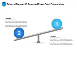
Slide 2: This slide shows Balance Diagram 3D Animated PowerPoint Presentation.
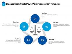
Slide 3: This slide presents Balance Scale Circle PowerPoint Presentation Templates.
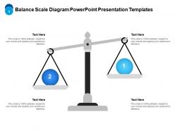
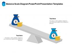
Slide 4: This slide displays Balance Scale Diagram PowerPoint Presentation Templates.
Slide 5: This slide represents Balance Scale Diagram PowerPoint Presentation Templates.
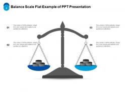
Slide 6: This slide showcases Balance Scale Flat Example of PPT Presentation.
Slide 7: This slide shows Balance Scale Icon Example of PPT Presentation.
Slide 8: This slide presents Balance Scale Icons PowerPoint Show.
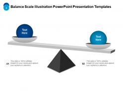
Slide 9: This slide displays Balance Scale Illustration PowerPoint Presentation Templates.
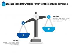
Slide 10: This slide represents Balance Scale Info Graphics PowerPoint Presentation Templates.
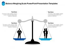
Slide 11: This slide showcases Balance Weighing Scale PowerPoint Presentation Templates.
Slide 12: This is a Thank You slide with address, contact numbers and email address.
Balance Scale Powerpoint Presentation Templates with all 12 slides:
Use our Balance Scale Powerpoint Presentation Templates to effectively help you save your valuable time. They are readymade to fit into any presentation structure.


FAQs for Balance Scale
Get pans that are the same size and easy to label - super obvious but you'd be surprised how many lopsided ones are out there. The fulcrum needs to be dead center with equal arm lengths. I'd avoid anything too fancy or decorative since people should focus on your comparison, not how pretty the scale looks. Leave decent space around it so your slide doesn't look cluttered. Oh, and definitely test it with your real content first - learned that one the hard way when my text didn't fit right!
Honestly, balance scales are so much better than those awful bullet point slides everyone uses. People instantly get the visual - one side's heavier, that's your winner. Perfect for budget stuff or when you're comparing features. I used one last month for a client presentation and actually saw people nodding instead of checking their phones (which never happens). The metaphor just works since we all know how scales function. Way better than charts that put people to sleep. You should definitely try it next time you're showing stakeholders why option A beats option B.
Teachers use these ALL the time - kids totally understand "weighing options" when they can actually see it visually. Healthcare workers create patient education stuff with them too. Legal firms are obsessed with pros/cons presentations, so balance templates are perfect for client meetings. Really, any job where you're comparing things or helping people make decisions will work. Just use whatever presentation software you already have and search their template section. PowerPoint, Google Slides - they've all got decent options. Way easier than starting from scratch, trust me.
Yeah, most balance scale templates are pretty customizable. You can swap out colors, fonts, and labels to fit whatever you're working on. The scale increments are adjustable too. Some let you completely change the visual style - I've seen people switch from boring traditional scales to really modern-looking ones. Text fields, categories, values - all that stuff can usually be modified. Oh, and you can resize things to fit your layout better. Just double-check the template details before downloading though, since some are more flexible than others.
Balance scale templates are honestly pretty genius for tough decisions. Your brain just gets it faster when you can actually see which side tips heavier. Instead of drowning in mental lists, you physically place pros and cons on each side. Some people just count items, but I like weighting things by how much they actually matter to me. Like, "good salary" might outweigh three smaller negatives. It beats staring at messy notes trying to figure out what you really think. Next time you're torn between choices, try sketching one out - even on a napkin.
So PowerPoint or Google Slides would be perfect for this - they've got tons of balance scale templates already built in. Just search "comparison" or "balance scale" in their galleries. Canva's another good option, especially if you want something that looks more polished without much effort. The drag-and-drop thing is pretty intuitive. I mean, you could go fancy with Prezi or Figma, but honestly that's probably overkill unless you're doing something super specific. Start with what you already have access to - probably PowerPoint or Google Slides. Way easier than downloading new software just for one project.
Yeah totally! Export your balance scale as SVG or PNG first. Most tools like Tableau and Power BI will import custom graphics no problem. SVG works way better though - stays crisp when you resize it. Just make sure the background's transparent and you've got good anchor points for your data. Power BI can be weirdly picky about formats sometimes, honestly. I'd test it with some fake data first to work out the kinks. Then layer your actual visualizations on top. Canva's another option if you want something simpler to start with.
Don't cram too much stuff on there - 3 or 4 points per side max, otherwise it looks messy. Make the colors and formatting consistent so people can actually follow what you're comparing. I've definitely seen presentations where someone went wild with random icons and it was just... distracting? The weights should show how important each thing actually is. If one side clearly wins, make that obvious. Oh, and label what you're comparing at the top - sounds basic but you'd be surprised how many people skip that. Your audience needs to get it in like 5 seconds or you've lost them.
Oh man, balance scales are genius for this stuff! You literally SEE how things weigh against each other instead of just thinking about it. Way better than boring pro/con lists. I'm always using them for work decisions - like when we're trying to figure out if a project's worth the risk. Your brain just gets it instantly when you see one side tipping over. Super helpful for explaining tricky concepts to people too, especially math stuff. Honestly wish I'd discovered these earlier. Next time you're stuck on something big, just draw two sides and start filling them in!
Okay so static templates are basically just fixed images or PDFs - you fill stuff in by hand like it's a worksheet. They work fine for simple stuff but honestly, changing anything later is such a hassle. Dynamic ones are way better though. You type in your data and the visual updates automatically. Super helpful when you're weighing pros/cons because the scale actually moves as you adjust things. Most of them are web-based or you can find them in tools like Miro. I'd definitely go dynamic if you're working with other people or think you'll be tweaking things a lot. Trust me, it'll save you so much time.
Honestly, balance scale templates are a game changer for tough decisions. Instead of just making mental pro/con lists, you literally weigh your options against each other - way more visual and effective. I sketch them on paper all the time (sometimes for ridiculous stuff like what to watch on Netflix, but whatever). You can assign different weights to factors that matter more. The cool thing is it shows your bias pretty clearly when you see everything laid out. Like, you'll notice if you're stacking one side unfairly. Worth trying next time you're stuck on something big.
Balance scales work great for simple comparisons - pros vs cons, before vs after, that kind of thing. Don't cram paragraphs onto each side though. Bullet points are way better since people scan quickly. I swear, nothing looks worse than tiny text squished onto a scale template. Make sure you're actually comparing similar things too - like don't put "saves money" against "takes 3 months" because those are totally different categories. Oh, and use the same format on both sides so it's not lopsided. Put your strongest points first.
Oh, balance scales are actually genius for this! You can show that whole "before and after" thing visually - like your old crappy process weighing everything down on one side, then boom, your solution tips it toward success. Way better than boring bullet points, right? The audience literally *sees* the transformation happening instead of just hearing about it. I always throw in some contrasting colors to make it pop. Honestly, there's something about that visual metaphor that just clicks with people - they actually feel the change you're talking about.
Don't cram too much stuff on there - you'll just confuse people instead of helping them understand. Use actual numbers instead of vague concepts. Like "98% retention rate" hits way harder than just "good customer satisfaction" or whatever. Make sure you're comparing things that actually make sense together. I've seen people compare completely different metrics and it's just... weird? Label everything clearly! Nobody wants to play guessing games about what each side means. Start with maybe 2-3 solid points per side. You can always add more later if it's not overwhelming.
Balance scales are honestly such a game-changer for making abstract stuff click with kids. Math concepts like equality become so much clearer when they can physically see both sides evening out. I've watched teachers use them for basic addition all the way up to algebraic thinking - works surprisingly well. Science lessons about mass and measurement too. Way better than just handing out worksheets, you know? Start simple with blocks or coins, then work your way up to actual equations and word problems. The hands-on piece keeps them focused longer than you'd expect.
-
Very unique and reliable designs.
-
Nice and innovative design.
-
Easily Editable.
-
Excellent design and quick turnaround.
-
Excellent products for quick understanding.