

Balance scale info graphics powerpoint presentation templates




Try Before you Buy Download Free Sample Product
 Impress Your
 Audience
 100%
100% Editable
 Save Hours
 of Time


Build a global ethos with our Balance Scale Info Graphics Powerpoint Presentation Templates. Feel comfortable anywhere on earth.
People who downloaded this PowerPoint presentation also viewed the following :
Content of this Powerpoint Presentation
Description:
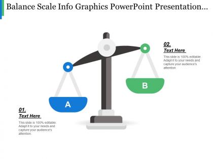
The image shows a graphic representation of a traditional balance scale, which is often used as a metaphor for comparing two different elements or ideas. The slide is part of a PowerPoint presentation template that can be customized for various uses.
The title of the slide, "Balance Scale Info Graphics PowerPoint Presentation," suggests that it is designed for use as an informative graphical representation within a presentation context. Below the title, the slide reads, "This slide is 100% editable. Adapt it to your needs and capture your audience's attention." This indicates that the slide's content and appearance can be tailored to fit specific requirements for a presentation.
On the left pan, labeled 'A', there is a placeholder text "01. Text Here," where a presenter can insert their specific content regarding one side of the comparison or argument. Similarly, on the right pan labeled 'B', another placeholder "02. Text Here" exists for content about the contrasting side.
Use Cases:
Potential industries where this type of PowerPoint slide could be beneficial include:
1. Consulting:
Use: Weighing pros and cons of business strategies.
Presenter: Business consultant.
Audience: Corporate clients.
2. Legal Services:
Use: Comparing legal arguments or evidence strength.
Presenter: Attorney.
Audience: Jury or courtroom attendees.
3. Education:
Use: Demonstrating the balance of different educational theories or approaches.
Presenter: Educator or academic researcher.
Audience: Students or academic peers.
4. Healthcare:
Use: Evaluating treatment options or healthcare policies.
Presenter: Medical professional or health policy analyst.
Audience: Medical staff or policy decision-makers.
5. Finance:
Use: Analyzing investment opportunities or financial risks.
Presenter: Financial analyst.
Audience: Investors or financial advisors.
6. Marketing:
Use: Assessing the benefits of different marketing campaigns.
Presenter: Marketing specialist.
Audience: Marketing team or business stakeholders.
7. Technology:
Use: Showcasing a comparison between different technical solutions or products.
Presenter: Tech industry expert.
Audience: Clients, customers, or internal team.
Balance scale info graphics powerpoint presentation templates with all 5 slides:
Figure out the complexities with our Balance Scale Info Graphics Powerpoint Presentation Templates. Get a good grasp of the essentials.
FAQs for Balance scale info graphics
Start with getting the proportions right - your scale needs to actually look balanced with the fulcrum dead center. Use contrasting colors to make each side pop, and label everything clearly with short text or simple icons. Here's the thing though - it's not just about listing stuff on either side. Show the actual relationship between what you're comparing. If one concept should outweigh the other, make that side look heavier. Keep them level if it's a true toss-up. Oh, and don't forget a solid title that spells out exactly what trade-off you're showing. Colors really do make a huge difference here.
So balance scale infographics are super straightforward - you just put your data on opposite sides to show which thing "weighs" more. Perfect for pros vs cons, costs vs benefits, whatever you're comparing. Everyone instantly gets how scales work, right? The trick is matching your visuals to the actual numbers. Like if one option is twice as good, make sure the scale tips that way. Oh and definitely use different colors for each side - makes it way easier to read quickly. I use these all the time for client presentations because they're so clean and obvious.
So finance and consulting teams absolutely crush it with these - they're always doing that whole cost/benefit analysis thing. Legal uses them tons for arguments and evidence comparisons. Marketing jumps on them when they need to show feature comparisons or value props to clients. HR even does compensation stuff with them, which honestly feels kinda weird but whatever works I guess. The sweet spot is basically any industry where people need to see clear trade-offs. Sales teams dig them too. You want audiences who are actively weighing two sides of something - that's when these infographics really shine.
Colors totally mess with how balanced your infographic looks. Reds and oranges feel super heavy and grab attention, while blues and greens seem lighter. For actual balanced concepts, you want similar visual weight on both sides - matching colors or complementary ones with the same intensity. I swear, half the infographics I see look lopsided just from bad color choices! High contrast works if you're showing imbalance on purpose though. Quick test: squint at your design. Both sides should feel equally weighted unless you don't want them to.
Honestly, Canva's your best bet to start - their balance scale templates are actually pretty decent and you can just drag stuff around. Piktochart works too if you want that same easy approach. Adobe Illustrator is where you go if you need total control over everything, but yeah, there's definitely a learning curve there. Figma's solid for vector stuff and it's free, which is nice. I'd personally just start with Canva to knock something out quickly. Then if you hate how it looks or need something super specific with the scales and weights, that's when you'd move to Illustrator or Figma.
So balance scale infographics are amazing for comparisons - way better than boring bullet points, trust me. They make trade-offs super visual, which is clutch when you're presenting strategic stuff or budget decisions. Your audience gets it immediately because the metaphor does the work for you. Use them for before/after scenarios, pros vs cons, whatever. I've seen people use them for risk assessments too, though that can get a bit complex. But honestly? When you need to show stakeholders why one option beats another, these things practically sell themselves. The visual weight makes abstract concepts click instantly.
Don't make your scales look lopsided when they're supposed to be balanced - readers get confused right away. Too much text on each side makes everything cluttered and ugly. I've seen this ruin so many comparison graphics, honestly. Your colors should match on both sides, and that center pivot thing needs to be obvious and actually centered. Short sentences work better than cramming everything together. Before you post it anywhere, show someone else first. They'll catch the wonky stuff you totally missed because you've been staring at it too long.
So basically, make the heavier side of your scale actually look heavier visually. If 70% picked option A, load that side up with more icons, darker colors, bigger text - whatever makes it feel weightier. The fulcrum shows your threshold or comparison point. I always slap the actual percentages on there too because honestly, people want to see the real numbers even when the visual tells the story. Oh, and make sure it feels right at first glance - like if your data says something's heavier, viewers should instantly get that vibe without having to think about it.
Okay so typography can totally make or break your balance scale thing. You want people to immediately get which text belongs to which side, right? Use clear hierarchy and readable fonts - I've literally seen people ruin perfectly good infographics with some weird decorative font that nobody can read. Size your text based on what's most important. Main concepts should be bigger, details smaller. Stick to maybe two font weights max because more gets messy fast. Oh and make sure there's good contrast with your background colors or people will just give up trying to read it.
Totally! Balance scales are actually perfect for that stuff. You can throw opposing ideas on each side - pros vs cons, strengths vs weaknesses, whatever works. The visual weight shows which side matters more. I've seen people do really cool work-life balance comparisons with them, or use them for deciding between features. Mix up your objects with different sizes and colors to show importance. Just make sure people get what each side represents - though honestly, that's usually pretty obvious once they see it. Short sentences work great too.
Honestly, it's all about knowing your audience. Kids love bright colors and simple stuff - apples vs oranges literally works perfect for balance scales. But professionals? They want those muted colors and actual data, like charts or percentages. Oh, and seniors need way bigger text with high contrast or they can't see it. One thing people forget - some cultures read right to left, so you might need to flip which side looks "heavier." I'd definitely test it with real people first though. Saves you from looking dumb later.
Honestly, it's pretty easy to work your branding into the scale design. Throw your brand colors on the arms or platform, maybe use your logo as the fulcrum - that usually looks clean. The weights are perfect for showing off your products or services too. I've seen companies get creative and actually shape the weights like their products, which is kind of genius. You can style the whole thing to match your vibe - sleek and modern or whatever fits. Just don't go overboard with it. The branding should help tell your story, not make everything look cluttered and messy.
Oh balance scales are perfect for this stuff! They make comparisons so much clearer than just listing things out. Put your pros on one side, cons on the other - or costs vs benefits, whatever you're weighing. People get it instantly since we all know how scales work, right? I actually prefer these over boring bullet points any day. You can play around with different sized icons or colors to show which factors matter more. Works really well when you're helping someone make a tough decision since the "heavier" side jumps out visually.
For balance scales, you can't just use color alone - add labels or icons too. Make your text high contrast with at least 14pt fonts. Alt text is huge here, but describe what the comparison actually shows, not just "balance scale with data" (that drives me crazy). Screen readers have a tough time with complex visuals anyway. Test with real users if possible! Multiple ways to show the same info works best. So visual cues, plus text, plus good structure. Short version: give people options to understand your data however works for them.
So for tracking engagement on your balance scale infographics, definitely look at click-through rates and how long people actually spend viewing them (not just scrolling past). Social shares and comments are huge too - honestly, the visual comparison thing seems to get way more comments than boring regular charts. Check if people are saving or bookmarking your stuff since that means they found it useful enough to come back to later. Oh, and set up UTM tracking on any links you include so you can see actual conversions. Most analytics platforms will break down viewing time vs. just quick scrolls, which is pretty helpful for figuring out what's working.
-
Out of the box and creative design.
-
Helpful product design for delivering presentation.