


Balance powerpoint template slide




Try Before you Buy Download Free Sample Product
 Impress Your
 Audience
 100%
100% Editable
 Save Hours
 of Time


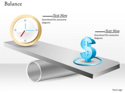
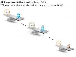
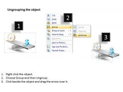
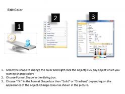
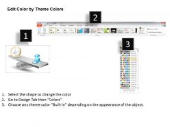
There is a delicate and highly consequential balance between earnings and time management which no forward looking business can afford to ignore; here’s a snazzy PowerPoint template slide to highlight that balance during presentations on a project plan or business strategy. There are certain aspects of every venture, such as timeline and returns on investment or roadmap and financial resources needed that have a direct link with each other; our quirky PPT slide design can help you highlight that link in a visually appealing manner which can also be supplemented with data and statistics based on market research, risk assessment, competitor analysis etc. Next time you have to showcase the details of a new contract and what it entails to your workforce or have to teach the intricacies of project management to your students, just pick up this exquisitely crafted PowerPoint PPT slide to delineate the competitive advantage that productive use of time can offer. Break free from the ennui with our Balance Powerpoint Template Slide. Boredom will get blown away.
People who downloaded this PowerPoint presentation also viewed the following :
Balance powerpoint template slide with all 7 slides:
Ethical success is your burning desire. Illustrate your fervour with our Balance Powerpoint Template Slide.
FAQs for Balance
Effective balance PowerPoint template slides include symmetrical layouts, consistent font hierarchies, strategic white space distribution, aligned visual elements, and harmonious color schemes. These design principles enhance audience comprehension by creating visual stability, reducing cognitive load, and directing attention to key messages, with many presenters finding that balanced slides significantly improve information retention and professional credibility.
Visual hierarchy enhances balance-themed presentations by strategically organizing elements through size, color, positioning, and contrast to guide audience attention naturally. This approach enables presenters to emphasize key comparative data, highlight equilibrium points, and create visual flow between opposing concepts, while ensuring complex balance relationships are communicated clearly and memorable insights emerge seamlessly.
Creating a balanced PowerPoint slide layout requires following key design principles including strategic use of white space, consistent alignment, appropriate font hierarchy, color harmony, and visual weight distribution. These principles work together by establishing clear focal points, enhancing readability through proper spacing, and creating professional presentations that engage audiences effectively, with many organizations finding that balanced layouts significantly improve message retention and audience comprehension.
Color psychology influences balance representation through warm colors (reds, oranges) conveying energy and action, cool colors (blues, greens) suggesting stability and calm, and neutral tones providing grounding elements. Strategic color combinations enable presenters to visually communicate equilibrium concepts, with many organizations finding that balanced palettes enhance audience comprehension and create more persuasive business presentations.
Sans-serif fonts like Helvetica, Arial, and Calibri effectively convey balance through their clean, uniform letterforms and consistent visual weight. These typography choices enhance slide harmony by providing excellent readability, maintaining proportional spacing, and creating visual stability, with many organizations finding that consistent font families across presentations ultimately deliver professional credibility and audience engagement.
Infographics can illustrate balance concepts through visual scales, symmetrical charts, comparison matrices, weighted diagrams, and equilibrium models that demonstrate proportional relationships between elements. These visual tools enable presenters to showcase work-life balance scenarios, budget allocations, and strategic trade-offs across sectors like healthcare and finance, ultimately delivering clearer stakeholder understanding and more compelling business presentations.
Common mistakes include using uneven visual weights, inconsistent spacing, cluttered layouts, misaligned elements, and poor color balance that creates visual chaos. These design flaws undermine professional credibility and audience comprehension, with many presenters finding that symmetrical layouts, consistent margins, and strategic white space usage deliver clearer messaging and enhanced visual impact.
To ensure balance PowerPoint template accessibility, incorporate high contrast colors, readable fonts like Arial or Calibri, alternative text for images, and logical slide structures that work with screen readers. Organizations across healthcare, education, and corporate sectors find that accessible design principles, including sufficient white space and clear visual hierarchies, ultimately enhance comprehension for all audiences while meeting compliance standards.
**INPUT**: What types of images or graphics are most effective in representing balance visually? **OUTPUT**: Effective balance imagery includes scales, seesaw diagrams, yin-yang symbols, symmetrical geometric shapes, and equilibrium charts with balanced elements on opposing sides. These visual metaphors streamline complex concepts by creating immediate recognition, enhancing audience comprehension, and delivering clear messaging, with many presenters finding that symmetrical layouts and contrasting colors ultimately strengthen their strategic communications.
Alignment contributes to slide balance by creating visual order through consistent positioning of text, images, and graphics along invisible grid lines. Proper alignment establishes clear relationships between elements, reduces visual chaos, and guides audience attention naturally across content, with many presenters finding that strategic alignment significantly enhances slide readability and professional appearance.
Animation and transitions significantly influence balance perception by controlling visual flow, directing audience attention, and managing information hierarchy throughout slides. Strategic entrance animations can introduce elements sequentially to maintain equilibrium, while smooth transitions between slides preserve visual continuity, with many presenters finding that synchronized animations enhance professional credibility and audience engagement.
Maintaining balance across multiple slides requires consistent visual hierarchy, uniform spacing, and strategic color distribution throughout your presentation deck. Apply the same grid system, font sizes, and alignment patterns to each slide, while varying content placement to avoid monotony, ensuring your audience experiences cohesive flow and professional polish that enhances message retention.
Peer feedback improves balance PowerPoint template slides by identifying visual hierarchy issues, suggesting clearer content organization, and highlighting areas where information feels overcrowded or sparse. Through collaborative review processes, designers can refine color schemes, adjust spacing between elements, and enhance readability, with many organizations finding that peer input ultimately delivers more polished presentations and stronger audience engagement.
PowerPoint design innovations include improved grid systems, smart alignment guides, automatic object distribution tools, enhanced color palette suggestions, and AI-powered layout recommendations. These technologies streamline slide creation by ensuring visual harmony, reducing design time, and maintaining professional consistency, with many organizations finding that automated balance features significantly enhance presentation quality while enabling faster content development.
**INPUT**: How can you incorporate storytelling elements to emphasize balance in your presentation? **OUTPUT**: Storytelling elements that emphasize balance include contrasting scenarios, before-and-after narratives, dual perspectives, character journeys showing equilibrium, and metaphorical frameworks like scales or bridges. These approaches enhance audience engagement by creating emotional connections, illustrating practical transformations, and demonstrating how balanced solutions resolve conflicts, with many presenters finding that narrative structures make complex balance concepts more memorable and actionable. [Word count: 58 words]
-
Best way of representation of the topic.
-
Best Representation of topics, really appreciable.