


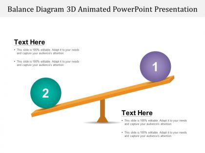
Balance diagram 3d animated powerpoint presentation




Try Before you Buy Download Free Sample Product
 Impress Your
 Audience
 100%
100% Editable
 Save Hours
 of Time


Enter cheery faces due to our Balance Diagram 3d Animated Powerpoint Presentation. Exit hangdog expressions.
People who downloaded this PowerPoint presentation also viewed the following :
Balance diagram 3d animated powerpoint presentation with all 5 slides:
Set a trend with our Balance Diagram 3d Animated Powerpoint Presentation. Capture the imagination of your clientele.

FAQs for Balance diagram 3d
Focus on visual hierarchy first - your main points need to pop with contrasting colors or sizes. Animation pace is tricky though, not too slow or fast. People actually need time to process what they're seeing. Good lighting makes or breaks everything (I've seen so many great concepts ruined by crappy lighting). Your text should be readable without fighting the visuals. Smooth transitions between states help the story flow naturally. Oh, and test it once before showing anyone - there's always some weird timing thing you'll catch.
Dude, 3D animations are seriously so much better for balance diagrams. You can actually rotate around and see what's happening instead of staring at some confusing flat drawing. Real-time force visualization is clutch - especially when you're dealing with crazy complex structures. Plus your clients will actually understand what you're showing them, which honestly saves so many headaches. I mean, our old 2D stuff worked but this just makes everything click faster. Start with basic beam examples first though. Don't jump into the complicated multi-support stuff right away or you'll hate yourself.
Honestly? Start with Blender - it's free and has crazy good tutorials on YouTube. Maya and 3ds Max are the industry standards but they're pricey. Cinema 4D is easier to learn if you're not already into 3D stuff. Oh, and if you're doing more technical/engineering diagrams, SolidWorks or Fusion 360 might be better since they're built for that mechanical stuff. But yeah, Blender's probably your best bet to mess around with first. Won't cost you anything and you can always upgrade later if you get serious about it.
So color theory is actually huge for 3D animation balance. Warm colors like reds and oranges feel way heavier than cool blues and greens, even if your objects are identical sizes. It's weird but true - that red ball just screams for attention while the blue one chills in the background. You can totally exploit this for visual weight distribution. Complementary colors create this awesome tension, while analogous ones keep things harmonious. Oh, and definitely plan your palette before you get too deep into modeling - I learned that the hard way. Think about which elements need to pop to keep everything balanced.
Simple is better with 3D balance diagrams - fancy animations just confuse people. Export as MP4 instead of embedding directly because PowerPoint absolutely hates 3D rendering. Trust me, I crashed a client presentation once doing this wrong! Around 3-5 seconds for the loop is perfect, anything longer gets annoying. Motion blur helps the rotation look smoother too. Always bring a backup static slide though. Some computers are just weird with animations. Oh and definitely test on the actual presentation setup first - your laptop might handle it fine but their ancient projector setup won't.
Add audio descriptions for the animated parts - screen readers need to know what's moving around. High contrast colors are clutch, but don't just rely on color alone. Throw in some patterns or labels too. Alt text for static stuff is obvious but people forget it constantly. Mark up your content properly so screen readers can actually navigate it. Oh, and if it's interactive, tactile feedback is huge. I'd honestly test it with real accessibility tools first - or even better, find someone with visual impairments who can give you actual feedback. Way more valuable than guessing.
Honestly, engineering and manufacturing companies eat this stuff up - turbines, car parts, any rotating machinery where balance matters. Medical schools use them for inner ear stuff and how bodies move. You'll make boring structural meetings actually interesting if you're pitching architects. Physics teachers are gold though - kids finally understand torque when they can actually see it happening in 3D instead of just staring at diagrams. Oh, and definitely target industries where balance screw-ups cost serious cash. That's where they'll actually pay for your animations instead of just thinking they're "cool."
You know how our brains are wired for 3D stuff? That's why these balance diagrams work so much better - people get like 15-30% more engaged vs flat charts. It's wild but makes sense when you think about it. Your audience can basically picture themselves moving around the concept, which makes everything click better. Honestly, they're just more fun to look at too. The depth thing really helps with showing how different pieces connect and rank against each other. Way better than those boring flowcharts we're all sick of. Definitely try both versions in your next presentation and see which one gets people asking more questions afterward.
Don't overcomplicate the visual stuff - nobody wants to squint at a bunch of overlapping mess. Keep your balance points clean and obvious. Those spinning camera moves might look sick but they're honestly just distracting. Your lighting should actually help show how things relate to each other instead of casting weird shadows everywhere. Oh, and timing is huge - if you rush through the important parts, people won't get it. I'd start simple with your main concept first. Build up the complex stuff after. Your audience needs to understand what balance even means in like the first 5 seconds or you've already lost them.
So basically start with your diagram totally lopsided - makes the problem super obvious. Then bring in each balancing piece like they're little heroes fixing things one by one. I do this all the time with presentations and people actually stay awake lol. Add smooth animations between each step and maybe some narration that treats it like a story heading toward balance. The whole point is letting them feel that "ugh this is broken" moment before you show how it gets fixed. Works way better than just throwing a finished diagram at them.
Dude, interactive 3D balance stuff is so much better than just watching videos. People can actually mess around with the weights and pivot points themselves, which makes everything click way faster. I always throw in sliders or drag-and-drop features so users can experiment - that's when you get those lightbulb moments. Honestly, there's something about breaking the balance and then fixing it yourself that just makes the physics stick in your brain. Even adding one simple interactive element where they can screw up the balance (then restore it) works wonders.
So basically, these 3D balance diagrams work by actually moving stuff around as conditions change. Picture a seesaw - when weights shift, the whole thing tilts, right? You can animate arrows getting bigger or smaller to show force changes, or move objects along paths to their new spots. The system responds in real-time to whatever disruption you throw at it. Honestly, it's way more intuitive than those boring before/after comparisons because people can actually see the transition happening. Start with everything balanced, then gradually mess with one factor and watch how the whole system reacts. Your audience gets it immediately since it mimics real physics.
Honestly, just track three things: did people actually get what you were showing them, how long did they stare at your slide compared to others, and can they remember it later when you check back? I've watched so many people make these gorgeous 3D charts that just confuse the hell out of everyone. Quick test - see if you get fewer "wait, what?" questions than usual. That's your best indicator right there. Oh, and do a little pulse check afterward. Ask someone to explain what they saw back to you. Works every time for figuring out if your fancy diagram was worth it.
Oh this is actually pretty straightforward! First, figure out who's looking at it - like if it's healthcare folks, throw in some medical icons and terminology. Finance people? Currency symbols work great. Color matters way more than you'd think. Corporate types want those boring blues and grays, but creative teams can handle wild colors (I've seen some crazy neon ones that somehow looked amazing). Executives just want the big picture stuff. Technical people need all the nitty-gritty details. Honestly, just pick 2-3 visual elements that'll click with your specific crowd and you're golden.
Boeing did this with their 787 - used 3D balance diagrams to catch weight issues way before building prototypes. Tesla's doing it too for battery placement, which honestly makes total sense when you think about it. Medtronic uses them for prosthetics (that whole industry is surprisingly high-tech). Architecture firms love these for load visualization. Check engineering case study databases or hit up CAD companies directly - they're always eager to brag about client wins. You'll find way more examples than you'd expect once you start digging around.
-
Best Representation of topics, really appreciable.
-
Unique research projects to present in meeting.