


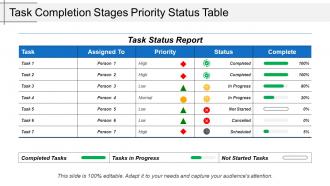
Task completion stages priority status table






Try Before you Buy Download Free Sample Product
 Impress Your
 Audience
 100%
100% Editable
 Save Hours
 of Time


Endure grueling days with our Task Completion Stages Priority Status Table. Find it far easier to carry the burden.
People who downloaded this PowerPoint presentation also viewed the following :
Task completion stages priority status table with all 5 slides:
Generate enormous faith with our Task Completion Stages Priority Status Table. Your credentials will build great belief.
FAQs for Task completion stages
Track completion rates, missed milestones, and how your time estimates stack up against reality. Quality stuff matters too - defects, rework after you thought something was "done." That 90% complete thing? Total trap. I swear teams get stuck there forever. Pay attention when people seem hesitant giving updates - usually means they're hiding problems. Mix the hard numbers with regular check-ins where folks can actually speak up about issues. Once you get into a rhythm with this, you'll catch problems way earlier instead of scrambling at the end.
Honestly, visual stuff beats reading through endless status updates every time. Progress bars are clutch for showing percentages. Color coding works too – green for done, red for "oh crap this is overdue." Dashboards give you everything at once without digging around. Gantt charts are solid if you're dealing with timelines, though they can look intimidating at first. Pick whatever clicks with how your team actually works. I'd start simple with one thing and build from there. No point overwhelming people right off the bat.
Honestly, prioritizing tasks is what saves you from missing deadlines. You tackle the big stuff first when you've got actual energy, instead of wasting time on random busy work. Trust me, I learned this the hard way on my first major project - total disaster. The trick is figuring out what actually matters vs what just feels urgent in the moment. I usually spend Sunday night ranking everything by importance and deadlines, then block out time for my top 3 things before I even think about scheduling anything else. Otherwise you're just setting yourself up to panic later.
Oh man, templates are a lifesaver! I used to spend forever writing these status updates from scratch every week. Now I just have this basic format - what's done, what I'm working on, any roadblocks, next steps. Takes like 5 minutes to fill in. Your stakeholders will love the consistency too since they'll know exactly where to look for the info they want. I'd start super simple with bullet points, then tweak it based on what people actually ask you about. Trust me, you'll wonder why you didn't do this sooner.
Don't be that person who just says "almost done" - it tells nobody anything. Flag problems early instead of waiting until deadlines to panic everyone. Honestly, sugarcoating bad news is way worse than just being upfront about delays. Give actual percentages or real milestones people can track. I learned this the hard way when my manager kept asking for "more specifics" until I finally got it. Always mention what you're doing next and when you'll actually finish. People can handle bad news, but surprises? Not so much.
Oh dude, you'll love this - tools like Asana and Monday have APIs that just pull your task data straight into presentation templates. Super handy for avoiding that last-minute scramble before meetings. Dynamic charts update automatically, so no more copying percentages by hand (which honestly I always mess up anyway). Notion's pretty slick for this with their embedded views. But here's the thing - if you want dead simple, just dump everything into Google Sheets and link it to your slides. Works every time and your status reports stay current without you having to think about it.
So for stuff that's not done yet, go with empty checkboxes and muted colors - grays work well. Maybe throw in a progress bar if something's halfway finished. When tasks are complete, fill those checkboxes with green or whatever bright color you like. Strikethrough text is nice too. Honestly, checkboxes feel pretty standard at this point - users just expect them. The real trick is making sure there's enough contrast so people can quickly scan without reading every single thing. Oh, and whatever style you pick, stick with it throughout the whole interface. That consistency helps people get used to how your app works.
Honestly, having everyone report the same way makes it super obvious when someone's bullshitting about their progress. Like, when the whole team has to show what they did, what's blocking them, and next steps every single time, you can't really hide behind vague "making good progress" updates anymore. It's way easier to compare how different projects are going too - I learned this the hard way managing a chaotic team last year. The transparency thing actually works because people know they'll get called out. Just make a basic template and force everyone to use it for status updates. Sounds boring but it works.
Honestly, good teamwork can bump up your completion rates by like 20-30% which is pretty solid. People catch mistakes faster when they're actually talking to each other instead of working in their own bubbles. No more wasted time on duplicate work either. Knowledge sharing happens right away instead of being trapped in one person's brain (I hate when that happens). Your team will actually like their jobs more too - turns out isolation sucks. Just make sure someone owns each task even when you're collaborating. Otherwise stuff gets forgotten and you're back to square one.
Honestly, color coding is such a lifesaver for this stuff. Your brain picks up on colors way faster than reading text, so you'll instantly know what needs your attention. I stick with the classic green for done, yellow for working on it, red for overdue or stuck. Works every time. When you're juggling a bunch of projects, you can just glance at your list and immediately see where everything stands. No need to dig into details. Start with those three colors - you can always tweak it later based on what matters most for how you work. Trust me, once you start doing this you won't go back.
Honestly, color-coded dashboards are your best friend here - green/yellow/red makes everything so much easier to scan quickly. Break those massive projects into smaller milestones because nobody wants to stare at an endless task list. I've seen way too many status reports that just look like spreadsheet hell! Group similar stuff together and focus on what's actually stuck, not every tiny detail. Give people summary views but let them dig deeper if they want. Oh, and always lead with the main thing - are we good or not? Then add the details after. Trust me, stakeholders will thank you for not burying the lead.
Ugh, cultural stuff makes this so tricky! Japanese and German teams want every little detail documented - like, they'll think you're being sloppy if you don't show your work. But other cultures just want the quick hits, maybe some bullet points about what's actually done. I totally bombed a presentation once because my "almost finished" meant different things to different people on the call. Some cultures get weird about admitting things aren't complete yet (saving face and all that), while others appreciate the honesty. Honestly? Just ask upfront what format they prefer. Way easier than guessing.
Weekly team check-ins work great for this - have people call out confusing updates from that week. Maybe try a simple 1-5 clarity rating system? I swear we all get tunnel vision when we're buried in our own projects. For big updates, get someone else to read them first. Templates help too - force yourself to include deadlines, what's blocking you, next steps. Oh, and before sending anything, just ask yourself "would this make sense to my mom?" Sounds silly but it actually works. Start small with one or two of these.
Here's the thing - good track record means you can keep reports short and sweet. Just hit the basics: what you finished, what's next. But mess up a deadline? Now you're stuck writing novels explaining every delay, new timelines, risk factors, the whole nine yards. It's honestly such a pain, but stakeholders freak out without context when stuff goes wrong. The upside is you can earn back that briefer format once you're hitting targets again. Performance really does dictate how much detail they'll expect from you going forward.
So tracking your team's task completion over time is actually super useful - you'll start noticing patterns in when productivity dips or spikes. Like, maybe certain tasks always take way longer than planned, or there's specific times when everyone's crushing it. Most teams never bother with this stuff, which is kinda crazy tbh. The cool part is seeing if those process changes you made actually helped or just added more steps for no reason. You can use all this to set better deadlines and shuffle work around when needed. Plus having real data makes those planning meetings way less awkward when you need to push back on unrealistic timelines.
-
Topic best represented with attractive design.
-
Excellent work done on template design and graphics.