Priority ranking table ppt design
Try Before you Buy Download Free Sample Product
Audience
Editable
of Time
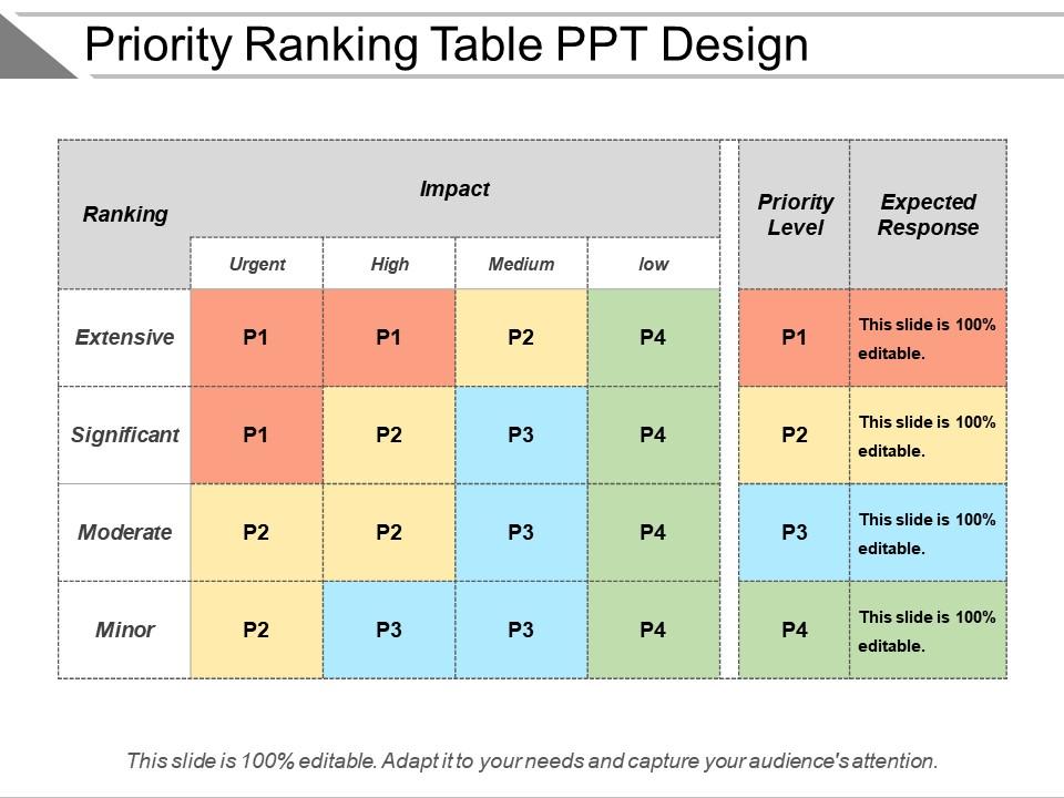
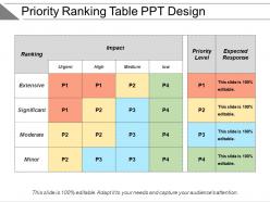
Use our priority ranking table PPT diagram. Every corporate firm make strategies to meet the business objectives and stay competitive in the market. This presentation template helps them to make a strong communication about the order in which the work needs to be managed to ensure the best results. Professionals working in multinational companies are always on their toes as they have to deliver quality work and meet deadlines considering every project holds an importance. Our PowerPoint slide makes the job easier as it helps you to assess the projects on different parameters and then work them according to the ranks. This PPT layout shows four aspects in the ranking such as extensive, significant, moderate and minor. You can use this to present information among your teammates that they should consider the importance of the project according to the severity and work on it. Deciding the priority enables the businesses to show transparency and stay true to their customers. Download priority ranking table presentation graphic and then add it in your next presentation. There is something exciting about beautiful colours and beautiful designs. If you intend to make a presentation that will be remembered for more things than one use our PowerPoint Templates and Slides.
People who downloaded this PowerPoint presentation also viewed the following :
Priority ranking table ppt design with all 5 slides:
Make a difference with our Priority Ranking Table Ppt Design. Change the way people view the situation.
FAQs for Priority ranking
First thing - figure out what you're actually prioritizing. Impact? Effort? How urgent stuff is? Whatever makes sense for your project. I'd go with a 1-5 scale since anything bigger gets messy. Make your column headers dead obvious too. Don't just write "impact" and expect people to guess what that means to you - add little descriptions. Color coding helps a ton for quick scanning. Oh, and definitely test it with a few team members first. You'll catch the confusing parts before everyone starts using it wrong. Nothing worse than realizing your system doesn't make sense after the fact.
Oh yeah, color coding is a game changer! I always use red for the crazy urgent stuff, yellow for medium, and green for the chill tasks. Honestly though, any colors work as long as you stick with them. Just make sure there's enough contrast so everyone can actually see the differences - learned that the hard way when my colorblind teammate couldn't tell my reds and greens apart lol. You can even do different shades within each color if you want to get fancy with sub-priorities. Don't forget to add a little legend somewhere so people aren't guessing what everything means.
Look, if people can't figure out how to use your priority table, they just won't. Make your criteria super obvious - like what exactly are they ranking and why it matters. The whole thing should be intuitive enough that someone can jump right in without hunting around for instructions (because honestly, who has time for that?). Clean layout helps a ton, plus consistent scoring so there's no confusion. Drag-and-drop is nice if it makes sense for what you're doing. Short sentences work. The moment it feels clunky or takes forever, your whole system becomes pointless no matter how smart the design is.
Figure out what actually moves the needle for your business first - revenue, customer happiness, how much work it'll take, deadlines. Get people from different teams involved since they'll catch stuff you miss (and honestly, they'll be way more supportive later if they helped create it). Don't use fuzzy criteria like "strategic importance" - be specific. "Impacts 20% of users" or "could bring in $50K" works way better. Keep it to 3-5 criteria tops or you'll argue forever over pointless details. Weight them based on what matters most right now, then test it on some real examples. If the results feel off, tweak it.
Honestly, the worst thing you can do is throw like 20+ items in there and try to rank everything. You'll just end up with a mess where everything's "super important." Stick to maybe 10-15 max. Also - and I've seen this so many times - people use criteria like "urgent" without actually defining what that means for their situation. Kinda defeats the whole point, right? Oh, and make sure whoever's making the actual decisions is involved in creating this thing. Otherwise you'll have this perfect ranking that gets ignored the second priorities change. Start with criteria you can actually measure and get everyone on board first.
Honestly, color coding is a game changer for priority tables. I always do red for urgent stuff, yellow for medium, green for low priority. Makes scanning so much faster. Bold text helps critical items pop out right away. Oh, and alternating row colors - sounds basic but it actually makes a huge difference for readability. Don't cram everything together either; white space is your friend here. The whole point is making your high-priority items visually scream "look at me first!" while the less important stuff fades into the background.
Definitely go with heat maps - they make your priority table way easier to read at a glance. Scatter plots are great too, especially for plotting impact vs effort (classic combo). Color-coding is honestly a game changer since patterns pop out immediately. Bar charts work if you want to show actual priority scores, and bubble charts are kinda cool where bubble size = urgency level. I'd probably start simple with a heat map overlay first though. Oh, and don't sleep on basic bar charts - sometimes the old school approach just works better than getting too fancy with it.
Okay so mobile tables are basically the worst - you gotta be super picky about what columns you actually show. I'd stack stuff vertically instead of cramming it all sideways, and make those buttons way bigger than you think (trust me on this one). Cards work better than regular tables most of the time. Hide the less important stuff behind taps so people see what matters first. Oh and definitely test on real phones early! I can't tell you how many times something looked decent on my laptop but was completely unusable on mobile. Those screens are tiny.
Honestly, it depends how often things change for you. Interactive tables are perfect when your priorities shift a lot - people can sort and filter stuff themselves without bugging you to remake everything. Static ones though? Way easier to throw together and share around. I mean, sometimes you just want that simple PDF everyone can look at. If your priorities change like every month, definitely go interactive. Your users can reweight things and drill down however they want. But if stuff stays pretty consistent, static saves you time and headaches. Plus it's one less thing to break, you know?
Honestly, user feedback is everything with priority ranking tables. Test your early prototypes with real people - you'd be shocked how often something looks perfect to us but makes zero sense to actual users. Ask them about column clarity and if your ranking criteria even make sense. I've watched so many beautiful designs completely flop because nobody could figure out how to sort anything. Short interviews work great, or just watch people try to use it. They'll complain about info overload or beg for better filters. Those complaints? That's gold. Way better to find out your table is confusing before you build the whole thing.
Track completion rates first - are people actually finishing the ranking tasks or bailing halfway through? Time-to-completion matters too since faster usually means your design isn't confusing people. The big one though is consistency - if users rank the same items differently when you show them again, your criteria are probably too vague. I'd definitely add user satisfaction scores because honestly, frustrated users just bounce. Oh and don't try to make people rank like 20+ items at once - that's where things get messy. Test your current setup first, then experiment with changes.
Start with making the data easy to read - good fonts, plenty of white space. Color coding helps tons for showing priority levels, just don't go crazy with it (I've seen some truly hideous rainbow disasters). Make your high-priority stuff stand out through size or bold text, whatever works. Here's the thing though - test it with actual people early on. Seriously, if someone's squinting at your beautiful design trying to figure out what's important, you've missed the point. Clean and clear beats pretty but confusing every time. You can always add flair once the basics work.
Honestly? Just use Excel or Google Sheets first. Everyone already knows how to use them, and you can sort/filter everything easily. Airtable's pretty sweet if you want something that looks cleaner and doesn't randomly crash on you like Excel sometimes does - plus the collaboration stuff actually works. Notion could work for more complex scoring, or there's specialized tools like ProductPlan, but that's probably way more than you need right now. I'd start simple with a basic spreadsheet. You can always move to something fancier once you figure out what you actually need.
Start with proper table elements - headers, clear row/column structure, the works. Don't rely only on colors for priority levels since colorblind folks won't see the difference. I made that mistake once and felt terrible about it! Alt text and aria-labels help describe what each priority means. Your contrast ratios need to hit WCAG standards too. Test keyboard navigation so people can tab through without a mouse. Honestly, running everything through a screen reader catches stuff you'd never think of. It's extra work but worth it.
Alright, so first you gotta nail down your **criteria** - stuff like cost, timing, impact, whatever matters for your situation. Then there's **weights**, which is basically how much each criterion matters (percentages that total 100%). **Scores** are just ratings you give each option, like 1-5 or whatever scale works. Here's where it gets tricky though - **weighted scores** are your raw score times the weight. I swear this confuses everyone at first, me included. Your **priority rank** just lists everything by highest total scores. Oh, and definitely figure out your criteria before jumping into the rest of it.
-
Very well designed and informative templates.
-
Easily Editable.