


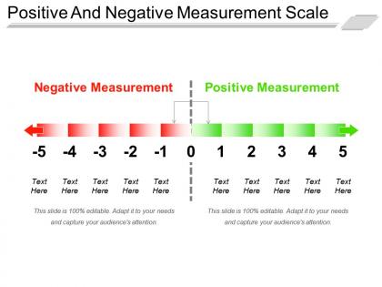
Positive and negative measurement scale ppt design templates




Try Before you Buy Download Free Sample Product
 Impress Your
 Audience
 100%
100% Editable
 Save Hours
 of Time


Highlight acts of generosity with our Positive And Negative Measurement Scale Ppt Design Templates. Ensure it earns the applause it deserves.
People who downloaded this PowerPoint presentation also viewed the following :
Positive and negative measurement scale ppt design templates with all 5 slides:
Build the grounds with our Positive And Negative Measurement Scale Ppt Design Templates. Give them cause to follow your advice.


FAQs for Positive and negative measurement scale
So there are four types you need to know: nominal, ordinal, interval, and ratio. Nominal is just categories - like colors or gender, no ranking involved. Ordinal has order but the gaps aren't equal (survey ratings where "strongly agree" isn't literally twice "agree" - you know what I mean?). Then interval scales have equal spacing but no real zero point, like Celsius temperature. Ratio scales have everything including meaningful zero - height, income, that stuff. Honestly, this matters way more than people think because it determines which statistical tests you can actually run. Always check this first!
Ok so nominal scales are just basic categories - gender, eye color, stuff like that. No ranking involved. Ordinal scales have an actual order though, like rating satisfaction from poor to excellent or education levels. The main thing? You can sort ordinal data from low to high, but nominal is just... categories sitting there doing nothing lol. This matters way more than you'd think when you're picking which stats tests to run later. Trust me, I learned that the hard way in my research methods class.
So basically, pick interval when there's no "true zero." Like temperature - 0°F doesn't mean temperature stops existing, it's just some random point they picked. Same deal with IQ scores or calendar dates. Without that meaningful zero, you can't say stuff like "today's twice as hot" because that's just... weird math, honestly. You can still add and subtract with interval data though. Ratio scale needs that zero to actually mean "none of this thing exists." Test scores are tricky this way - is zero really "no intelligence"? Probably not. Just ask yourself if zero = total absence.
So nominal variables are just categories without any ranking - like gender, blood type, or pizza toppings (personally I'm team pepperoni but that's beside the point). Eye color works too since blue isn't "better" than brown, they're different labels. You'll find this with zip codes, political parties, religious stuff. Can't really do math with these. Only thing that makes sense is counting how many fall into each category and finding the most common one. No averaging or putting them in order - that'd be weird.
So basically, your data type totally dictates which tests you can run. Like, you can't do Pearson correlation on categorical stuff - it just doesn't work that way. Nominal data? You're stuck with chi-square and frequency counts. Ordinal gets you non-parametric options like Mann-Whitney or Spearman's. But interval and ratio scales? Those are the golden tickets - t-tests, ANOVA, regression, whatever you need. Here's what I always mess up though: I forget to check assumptions first. Honestly, figure out your variable types before you even think about which test to use.
Dude, this stuff matters more than you'd think. Wrong measurement scale = garbage results, seriously. Like if you treat ordinal data as interval, you'll run tests that don't work and get totally misleading findings. I've seen people get roasted by reviewers for this exact mistake. Your statistical assumptions get violated too, which makes everything unreliable. Honestly, I always triple-check my data type before doing any analysis now - learned that the hard way. Just match your methods to what you actually have and you'll avoid the headache.
So reliability is just about getting consistent results when you measure the same thing over and over. Like if you're surveying people about job satisfaction, they should give pretty similar answers if they took it again tomorrow (assuming nothing changed at work). You can run fancier reliability tests with interval/ratio scales - stuff like Cronbach's alpha actually makes sense there. With nominal or ordinal scales, your options are more limited. Honestly though, none of that matters if your measurement tool sucks to begin with. Unreliable data is garbage no matter what scale you use. Always test your survey first!
Honestly, your measurement scales can make or break everything. Bad scales = meaningless results, even if your stats are perfect. Like, you could run the most sophisticated analysis ever, but if people are reading your survey questions totally wrong? You're screwed. I learned this the hard way in grad school - spent weeks on analysis only to realize my reliability was garbage. Test your scales first! Run a pilot study, check those reliability numbers. Trust me, it's way better than discovering later that you've been measuring... well, nothing really.
Okay so basically you want your chart type to match your data type or you'll confuse people. Bar charts are perfect for stuff like job titles, but don't even think about using line graphs - makes no sense. Ordinal data shows ranking but not exact differences. Interval/ratio data? Go crazy with scatter plots, histograms, whatever works. Honestly, pie charts get misused ALL the time and it drives me nuts. I've sat through so many meetings where the presenter clearly just picked whatever looked coolest. Match the visualization to what your data actually means, not what's prettiest. Makes such a difference in whether people actually get your point.
The biggest screwup? Treating ordinal data like interval data - satisfaction ratings aren't actually numbers you can just average together. Don't make your scale too narrow or ridiculously wide either. Honestly, Likert scales trip people up constantly! Watch for leading questions that push people toward certain answers. Your scale needs to cover the full range of what you're measuring too. Oh, and definitely test it on a small group first - you'll catch weird issues before launching it to everyone. Trust me on that one.
Oh man, this stuff is trickier than you'd think! Some cultures love hitting those extreme ratings while others stick to the middle no matter what. A "4" on your scale might mean something totally different to someone from Japan versus Brazil, you know? The worst part is when you think you've nailed a "neutral" option but it actually reads as passive-aggressive in certain cultures. I've seen projects go sideways because nobody tested their surveys properly first. Quick tip - pilot your scales with actual people from your target groups before rolling it out. Trust me on this one.
For psychometric stuff, I'd stick with 5 points on your Likert scale. Gives people enough options without making their heads spin - 7 points sounds good in theory but honestly? Most folks can't really tell the difference between that many levels. Make your anchor points super clear though. "Strongly disagree" to "strongly agree" beats any wishy-washy wording. You want people to actually get what each number means, otherwise your data's gonna be all over the place. Oh, and definitely pilot test it first! See if people are actually using all the options or just picking safe middle answers.
Ugh, mixed scales are such a pain! You'll basically be limited to the most basic statistical tests since everything gets dragged down to your lowest level of measurement. So if you've got nominal data mixed in there, forget about those nice parametric tests. The results get messy to interpret too - like trying to compare apples and... I don't know, the concept of purple? I've watched researchers have to ditch good data because nothing lined up right. Try planning your scales ahead of time if you can. Or maybe transform some variables to match each other before diving into analysis.
Ok so measurement scales are literally the backbone of your whole survey. First figure out what kind of data you actually need - are we talking categories (nominal), rankings (ordinal), or the fancier interval/ratio stuff? This decision shapes everything else honestly. Your questions, response options, even sample size math all flow from this choice. I know it sounds super dry but trust me, mess this up and you'll hate yourself during analysis. Short version: nail down your research questions first, then pick the scale that'll actually answer them. The rest builds from there.
Yeah, you can convert between scales, but honestly it's kinda messy depending which way you're going. Going down from interval to ordinal? Easy - just throw your continuous data into bins. The reverse though... oof, that's where things get complicated. You can't magically get back that original precision without making some pretty big assumptions about how the data's distributed. Main thing is documenting whatever method you use and - this might sound obvious but - sometimes just sticking with your original scale saves you a ton of headaches. Converting isn't always worth the statistical gymnastics.
-
Designs have enough space to add content.
-
Excellent work done on template design and graphics.